
5 Beginner Web Design Faux Pas (and How to Fix Them)

As a web design instructor, I see amazing work from student designers every day. I’m consistently impressed by the quality of work, and it’s inspiring to watch students evolve their skills with each new project.
I also get to see some of the same design mistakes repeated again and again. These mistakes often have an easy fix, but even a novice designer who can recognize that something’s wrong might not know what to do next.
The following is a list of 5 common beginner web design faux, and how to fix them:
1. Vibrating Colors and Visual Accessibility

Vibrating color design via Jesse Brown (j-brown.net)
When two bright colors are placed side-by-side, the resulting effect can cause a visual “vibration,” in which the afterimage caused by one bright color interferes with the afterimage left by the other. Vibrating colors make for really cool optical illusions, but when used together on a website, the resulting design is hard to focus on and difficult to read.
The Fix: Place a neutral color between bright colors to disrupt the vibration, and avoid placing bright colors side-by-side in places where readability is key. Likewise, never use bright red and green together on the web. Not only are these vibrating colors—they’re also difficult to distinguish between for those with colorblindness.
2. Competing Saturation
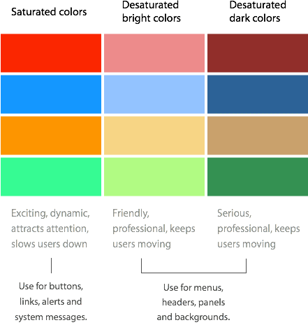
Saturated colors and user effeciency (from uxmovement.com)
Bright, saturated colors can impart a feeling of excitement and energy. In web design, saturated colors make for great accents, and they’re effective in drawing a visitor’s attention to important information—like a weather warning or donation button.
Because saturated colors attract attention, if they’re overused, they can distract and confuse website visitors. Too many saturated colors make it hard to differentiate between the foreground and background of a site. A visitor may be so focused on the colors that they’re not able to fully grasp the site’s content.
The Fix: Use saturated colors as accents, or in places where a call to action is necessary. Intersperse saturated colors with bright or dark desaturated colors and neutrals (black, white, and gray).
3. Decorative Fonts as Paragraph Text

Grafolita script above (from r-typography.com)
In the image above, a decorative font, Grafolita, draws the eyes toward the center of the poster. The red type is bold, unique, and easy to read at such a large size. The font is also emphasized in a punchy tagline: “Sink your teeth into good stuff!” Though both lines of text share the same font, the different sizes and colors help the viewer establish a clear hierarchy of information.
Now, compare the website address below the tagline with the two lines of white text at the bottom of the image. Notice how the san-serif web address is clear—even at a small font size—while the decorative font is difficult to read.
The Fix: As a general rule, avoid using decorative fonts at small sizes. Keep decorative fonts in titles and headlines, and use a clear serif or sans-serif font for long blocks of text. To find fonts that play nicely together, explore articles about font pairings and seek inspiration in exemplary web and graphic design.
4. Underlining for Emphasis

On the web, it’s confusing to underline for emphasis (from fionarobertsongraphics.co.uk)
Since the early days of the web, HTML links have appeared with a default underline below the text. While many web designers are moving away from underlined links, a subconscious association between underlined text and clickable links is still the norm.
Using underlines for emphasis can confuse site visitors, and those expecting a clickable link may think they’ve encountered a broken website. Even in print design underlines can look clunky and cluttered, so underline with care.
The Fix: Use bold or italics—never underlines—for emphasizing text. Alternatively, experiment with using different colors and variable sizes for emphasis (some great examples shown here).
5. Ignoring the Brand Specifications
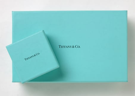
Iconic blue Tiffany & Co. boxes (from mcwade.com)
If a client’s brand is built around an existing color, the site palette needs to match that color. It may not be necessary to feature the color heavily in a design, but the brand color (or colors) must appear on the site in a meaningful way.
If Tiffany & Co. were to redesign their website, it’s unlikely they’d feature neon green, orange, or cobalt blue in the design. If these colors were to appear on the site, they’d be taking a backseat to Tiffany’s long-established palette—pale blue, black, and white. Ignoring a client’s existing brand comes across as inattentive…at best.
The Fix: If a client has established brand specifications, the brand must be respected. If the specifications are confusing, ask for clarification before moving forward with the design. It’s hard work to create mood boards and mockups, but putting this work in at the beginning of a project will add clarity and improve communication as time goes on.
Can you think of other beginner web design faux pas? Post them in the comments, or tweet them to @notesondesign.


 Design Interview: Resistenza
 Minimalist Portfolio Themes for 2018
 Free Font Friday: Objective
NoD Newsletter
Enhance your inbox with our weekly newsletter.