
Google Unveils New “Material Design” Language
The theme of last week’s Google I/O conference was “design, develop and distribute.” Amidst presentations about the latest and greatest in handheld tech, Google unveiled Android L, the newest version of its mobile OS.
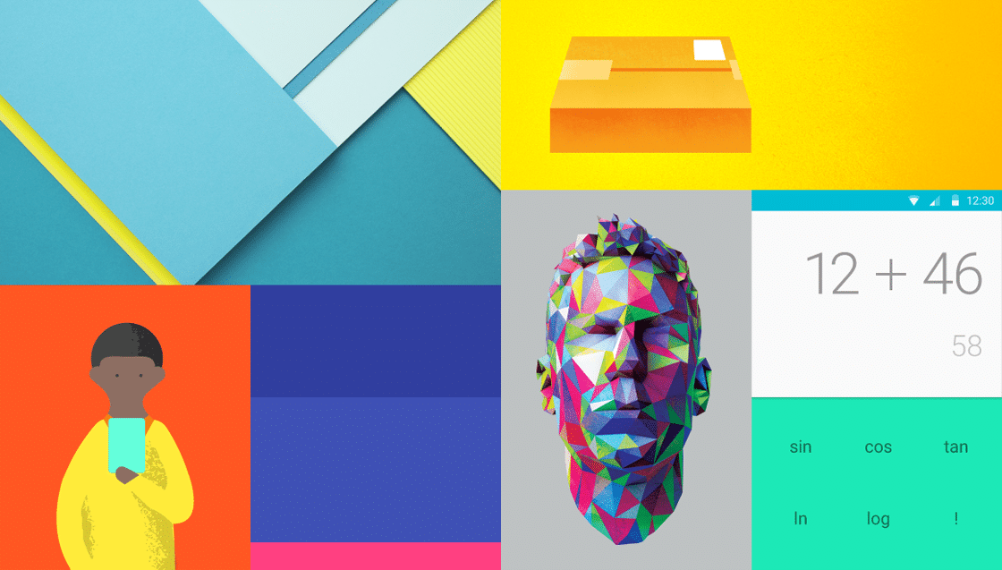
The look and feel of Android L marks a new direction in interface design, which Google is calling Material Design. The goal of Material Design is to create a unified design language that will help streamline the user experience across devices.
In Google’s own words, Material Design aims to:
Create a visual language that synthesizes classic principles of good design with the innovation and possibility of technology and science. Develop a single underlying system that allows for a unified experience across platforms and device sizes.
What are the main principles of Google’s Material Design?
1. Material is the metaphor
The first principle, the material metaphor, is an attempt to ground our digital experience in tactile reality. The material metaphor moves away from skeuomorphism while embracing its source—ink, paper, shadows, depth.
Material Design reinvents and reimagines objects that exist in the physical world (notepads, photo albums, and buttons) without breaking the laws of physics.
2. Bold, graphic, intentional
The second principle has its roots in print design. Visual elements shouldn’t just look good, they should also create meaning. Color, scale, and spacing impart a visual hierarchy of information.
Material Design emphasizes deliberate color choices, large typography, and the intentional use of white space—all in the service of a pleasant, intuitive user experience.
3. Motional provides meaning
The third principle of Material Design emphasizes subtle movements. Motion should provide visual feedback without being distracting. It should feel authentic, and should respect the physical reality of mass and weight.
The tenants of Material Design say that objects shouldn’t start and stop at abruptly. Objects should use swift acceleration and gentle deceleration to provide the user with a believable sense of motion.

“Emphasize bold shadows and highlights. Introduce unexpected and vibrant colors.” From Material Design: Color
The above is just an aperitif—a quick glance into the world of Material Design. For an in-depth look, visit Google’s Material Design document, which includes guidelines on everything from accessibility standards to image transitions and page structure.


 Design Interview: Resistenza
 Minimalist Portfolio Themes for 2018
 Free Font Friday: Objective
NoD Newsletter
Enhance your inbox with our weekly newsletter.