
Interview with Christo Allegra
by Margaret Penney | June 27, 2016
You’re a multi-disciplinary artist, designer and programmer, can you tell me about how you define your creative practice and what the main ingredients are in that mix?
I am an information designer and media artist that works with generative systems to engage or challenge our understanding of representational forms.
I am fascinated by how we can construct media and communicate. Learning the methods of a media format is what keeps me going in the design/art discipline.
My creative education started in writing — learning how to construct media narratives and translating that into an experience for an audience is core for me. Photography, programming, drawing, design, visual art, installation work, data visualization & experience strategy are the primary ingredients in my practice.
These different areas do influence each other but oftentimes in surprising ways. It is interesting to bring experience design strategies to installation work, or to learn from painting technique compositing and color approaches that translate to digital design. Tension and slippage between disciplines is exciting and inspiring and the application of tangential techniques and processes is where possibility resides. Collaging different approaches to solve a new problem has always been where I’ve felt the spark of potential energy.
For a while I said that my design work was about making information utile and my art practice was about showing that comprehension is futile — now I think utility and futility are a lot closer than we think. There is a great term that Kenya Hara uses called exformation — an understanding of everything we don’t know — sometimes that is a more powerful tool than having all the information at your fingertips.
I love to learn and I love to learn from people who are excited about what they do. I think it’s the best thing about being a multi-disciplinary creative. There are so many different ways in which you can pivot on an idea and find a direction.
Sound visualization sketch, Processing, 2012
How did you get your start as a creative? What inspired you?
I had an Apple IIe when I was a kid and would write random programs on it and also loved art, film and writing as well. In college, I tried to combine those things but at the time they were very different disciplines, computers were for engineers and writing longhand was a badge of honor. Still, I liked the edges.
I took a class called Exploring the Internet in 1995 and it completely reoriented me and helped me see a way to combine the logical and the intuitive. When I realized that there was an emerging medium that could combine the things I had gravitated towards, I felt truly lucky. My first job title was web master. Wow.
I wasn’t formally trained as a designer, so learning design was my big focus at first, Muller Brockmann, Otto Neurath & Gerd Arntz, the Eames, Muriel Cooper, Neville Brody, Peter Saville, Willi Kunz and Tufte… but that opened up into Syd Mead, Matthew Barney, Bill Viola, Agnes Martin, Mark Lombardi, Felix Gonzales-Torres, Gilbert & George, architecture and its processes, everything really.
Muller Brockmann’s Grid Systems is still such an amazing reference. His way of creating a dimensional grid for physical spaces changed the way I thought about design and helped me understand its relationship to programmatic approaches.
There was so much experimentation on the web in the late 90’s, Jodi, Praystation, Dextro, Volumeone, Vir2l, Futurefarmers, The Designers Republic, tomato. I used to spend all my money at Zakka buying IDEA magazines and architecture monographs. Neil Denari changed the way I thought about interactive spaces and concept design.
Music is also a big part of my inspiration, I have always listened to music when I work and I think it has a subliminal effect. I sometimes play with music visualization as a way to understand the graphic potential of a visualization approach. Music can be a data feed.
Years later I went to UCLA’s Design|Media Arts MFA program and it was am amazing opportunity to be influenced by so many talented artists who bridge many different worlds, get deep on Media Art history and develop my own artistic process.
Since then I’ve always been surprised by how much inspiration is around us if we really pay attention and get past the yeah, yeah, yeah of it all. Like, next. I consume so much visual culture and it just feels flat, tap, tap, tap. More and more I am engaged by nature and material.
The questions I try to ask myself are “How do we think about mapping in new ways that stretch our expectations and reasoning.” “How do we create sublime experiences?”
Butterflies (Oil Stocks – 2003-2014, Change, Nologscale), 2015
How do you use programming in creative ways? What languages and processes do you use?
For me programming is a way of creating a system, with expected or unexpected results. Programming allows me to make structures, feed them with inputs, review the outputs and then iterate on both. I am very much interested in the permutational opportunity within a system and how variables can influence the outcomes. I like being surprised as I hack on code by the outcomes… I should never write production ready code basically, but I do think there is a poetic opportunity when writing code to find a space between your expectations of outcomes and possibility. Information is an amazing input to feed into a system, as you map its ranges into a spectrum of representational possibilities — forms emerge, patterns are identified and creative feedback loops are played.
I’m not a hardcore coder, my programming IQ still feels stuck in AppleBasic and at times OO programming can feel too philosophical for me. It takes me awhile to feel fluent again. When I jump back in to make something there’s a bit of brain shift and unsticking that happens for me. Every time I launch an editor, I feel like I am learning to code again — it is not my native language, but it is one that opens up new connections and landscapes. The goal is to never be intimidated and just start typing.
My go to language is Processing, I took a workshop with Ben Fry a decade ago and I still love it for working up ideas. It’s surprisingly robust as well, I’ve had it communicating via serial to DMX dimmers controlling a lighting rig, while tied to a SQL database that was generating files being line feed and printed on paper to a printer array all while running an Arduino that was circuit bending police car lights. It was shockingly stable with all of that going on, I would let it run and run and it never crashed.
I also find the community support great and the library additions helpful. I’ve played with P5.js and it’s a pretty awesome port for browser based work, plus Dan Shiffman’s videos are super fun and awesome. I also took a workshop with Josh Davis and the Hype framework leverages lots of Flash conventions that are helpful if you are doing time-based work, plus any time spent with Josh is always a great learning experience.
Recently I started using openFrameworks while I was at SFPC. It took a little bit to get accustomed to some of the aspects of C++ but all of that was offset by its advantages in speed, libraries, and code resources. Plus it’s nice to work in a full on IDE.
Recollection. 9/11 Text Messages, Automated Performance, Processing, 2010
Can you tell me about your projects that use computation for realizing data in beautiful ways?
I am interested in the opportunity for emotional relationships with information. Less rational and more irrational. How do we move beyond information design as an answer-led discipline?
There is a great Moholy-Nagy essay called “Theater, Circus, Variety” and he talks about the future theater as being a place where information is not conveyed by the actor the information is the actor. I love that idea. How does the data perform?
One of my projects used a database of 9/11 text messages live printed in an automated environment. I wanted to understand how to use information design in an emotional way that could be both material and ephemeral and deal with unanswerable questions. A lot of the analysis of the Wikileaks messages up to that point were about looking for word counts or trying to see if there was evidence of the attackers in the records. I was interested in how the pager messages actually told an account for a person that day. When you read those pages that were sent that day to the person’s pager you are reading the mundane and the frantic, the server pings and the work check-ins alongside the “i love you”’s. The algorithm that I wrote was pulling messages in their sequence so that these stories on paper drifted from laser printers installed in the ceiling to pile up on the floor. Mass. By also tying them to that point in the day they started to perform as individual pieces in an unfathomable story. The beauty for me was finding that simple organization methods could shift the information from records into identities and experiences. In the minimal cast of information, lossy as it may be, there are people, places, things, and emotions.

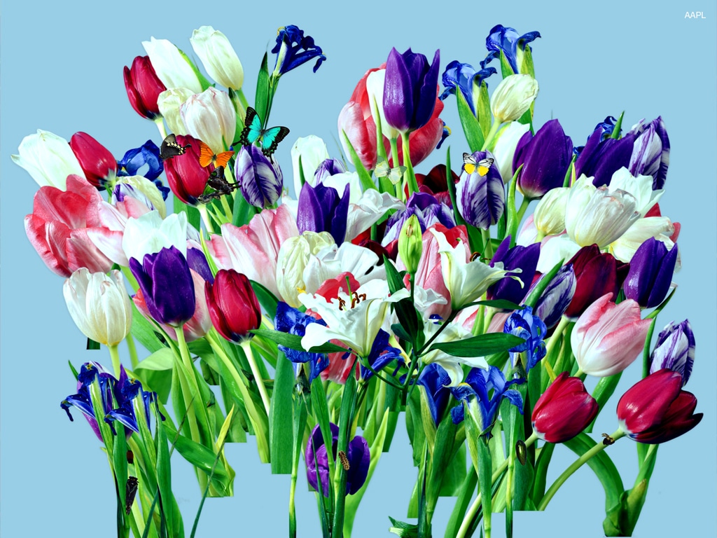
Tim Cook, AAPL 2012-14 (cash, gross profit, revenue, stock price, net income, eps, debt), Digital composite, 2015
I do a lot of work with financial data, sometimes loading large volume, dynamic time based data into dimensional representations. It has a beauty of scale and rhythm. I do like to use sound visualization as a way of playing with forms, manipulating them until I can see change, velocity, patterns and shifts and then use that understanding to map to a dynamic time-based data set. Music is information that can be structured into visual representation. It is all a matter of spectralizing it and spatializing it.
In recent projects I’ve been mapping stock data using photographic images to represent the information. Not so much in an answer oriented way but in a metaphorical way or poetic way. Data art.
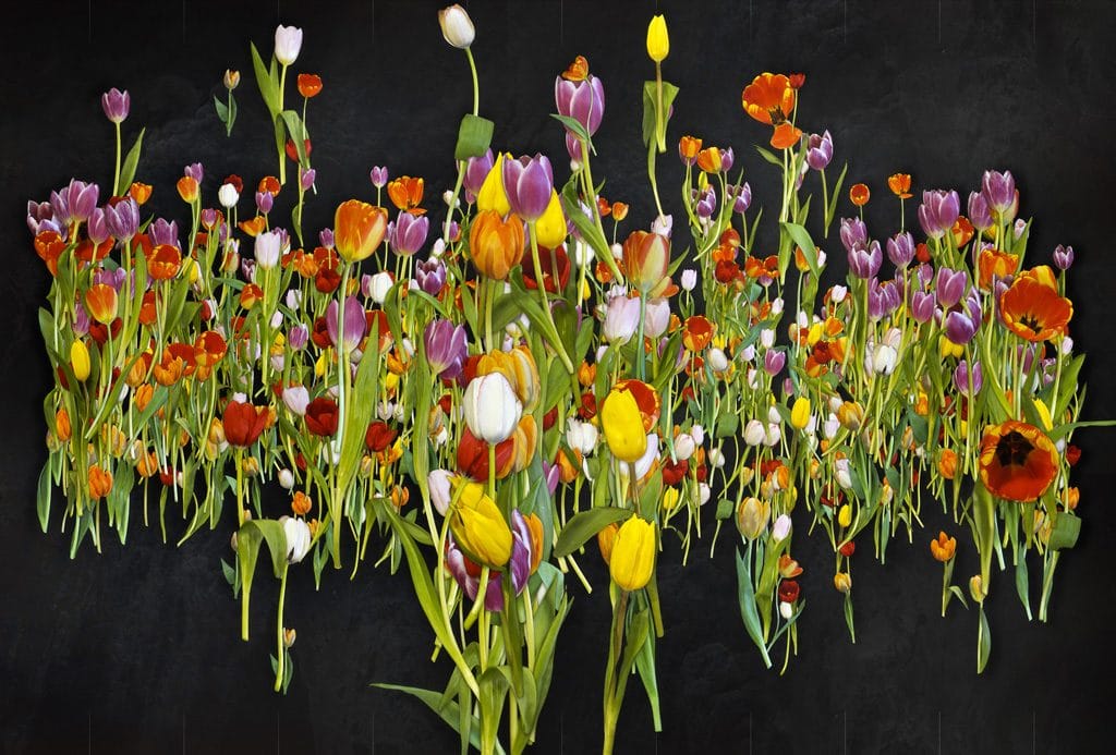
Energy Sector Growth (2003-2015) inspired by Dutch flower paintings, OF, 2015
Dutch flower painting interested me so I built a program that would represent stock histories with tulips that I had photographed. Different color tulips were mapped to different stocks, butterflies and insects marked highs and lows respectively and the growth of the tulip was stock growth. Since Dutch flower painting and its realism was a way for merchants to see their fragile investments year round and oftentimes overlaid with the symbolism of mortality and spirituality, it was fascinating to research it and create a simple generative piece for it that used our own technology heroes of the stock market in a more pop way.
I think with information people expect that if you use it, it must provide an answer. I don’t think that’s the only reason to use data. To me art is about questions, where the verbal fails and the symbolic takes over.
I also recently did a project where I used global data to make portraits of world leaders based on GDP, military expenditures and death rate. In that case I didn’t do it programmatically but used a data-driven process to composite these portraits in Photoshop. I think computation doesn’t always require code or a computer. It’s about thinking of and defining a system, creating and managing process, working with the inputs and then understanding and refining the outputs in total.
Basically, design thinking 🙂
What are the social or cultural implications of some of your projects? How do you use information to tell stories about our collective social and cultural realities?
I think my goal as an artist is to change our relationship to information. I feel that our statistical and answer-oriented bias can create a reductive, deterministic approach to the possibility of information. I am interested in notions of the sublime, the knowability and unknowability, texture and the amorphous. We have inherited a way of thinking about technology that is derived from Cold War information theory. A harsh Boolean logic can define it. Since our contemporary information systems are derived from a very efficient and non-humanistic place, that is a good challenge for artists. Sometimes it can feel difficult to really play and make with something whose origin was a business machine, but it’s our material of experience.
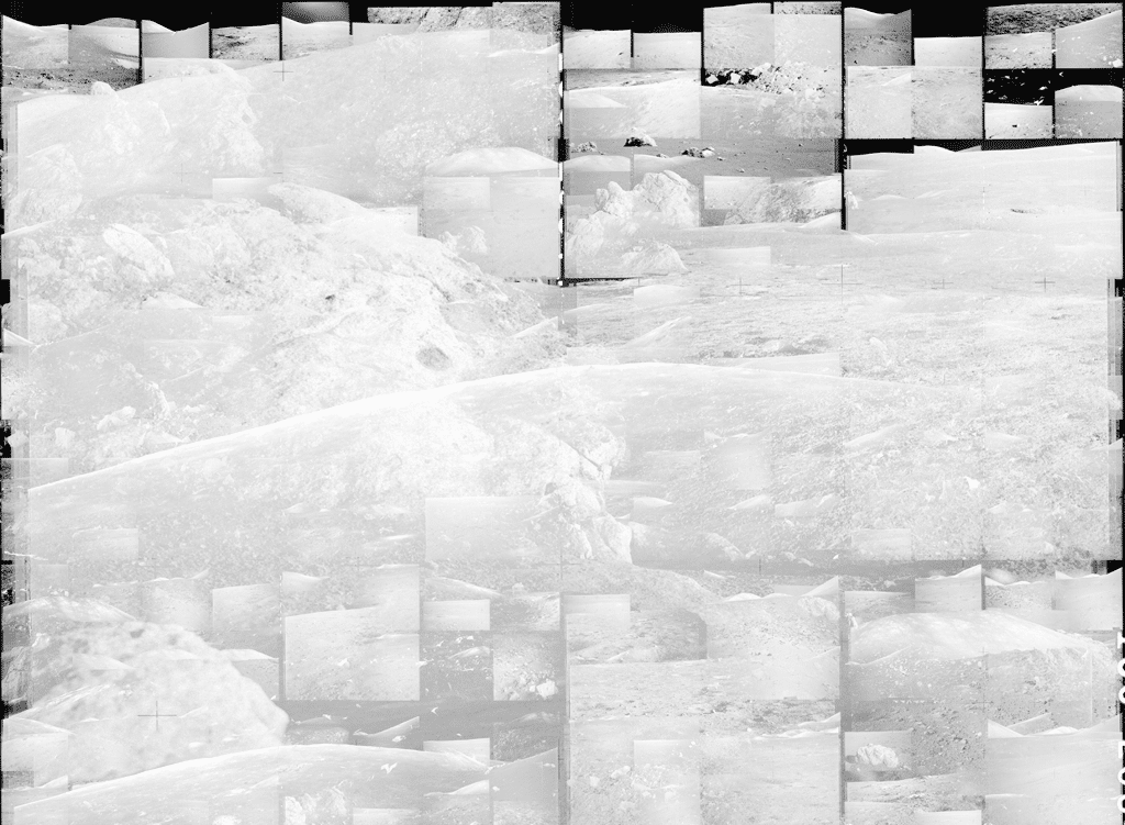
Moonscapes (composited landscapes of Apollo project photos), Processing, 2016
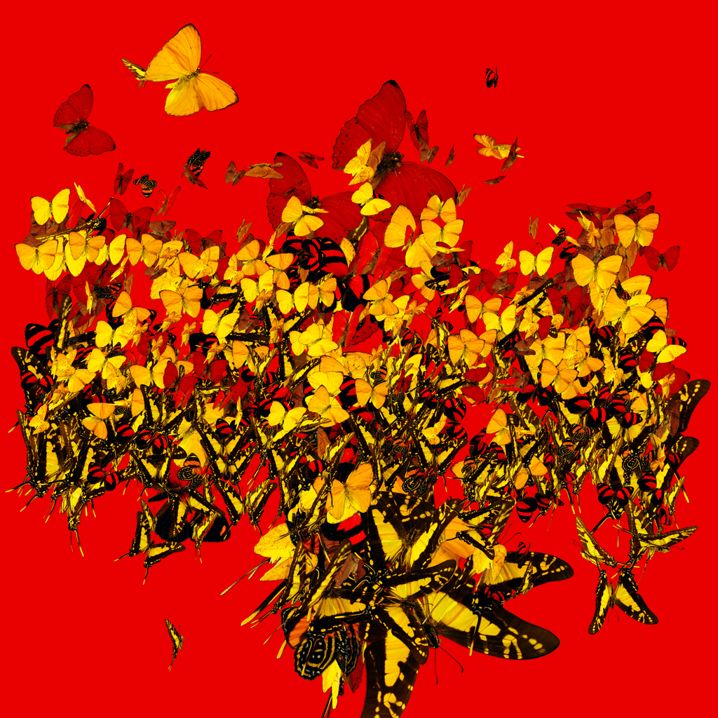
What would it mean to our information society if Wall Street traders looked at interfaces of forest landscapes with changing leaf colors to denote the changes in the markets? If we watched butterflies simulate energy trading, how could that help us understand the fragility and mortality of our grand systems? How do we start to move into a space of exformation where we can start to think about something bigger than the answer on the dashboard but the implications of an action over generations of people. As designers, artists, scientists and poets this is where our language conventions are breaking down and our formats are woefully incomplete in modeling our actions and explaining the complex interdependencies in our systems.
We can become so obsessed with our control over signal that we don’t even listen to what we instinctively label noise. Information art can challenge that desire and compel us with textures of data over answers and alternative futures where our transactional notion of experience could be expanded into a sublime and spiritual idea of our own connectedness.
That is what I would like to do, I don’t think I’ve achieved any of that by a long shot, but it is what I care about.
For me storytelling is about making these abstract connections, tangents that somehow connect things that are thought of as far apart. Sometimes you can find a way into this space through language. Lakoff & Johnson’s Metaphors We Live By, was a big influences as it describes the places where language breaks and how those are access points into something interesting. My writing background does come into play when creating structures for information experiences — breaking things down into actors with motives and needs, proclivities that emerge because of situations. I also did get great advice once that a story is not necessarily all about linear sequence but can be looked at as a series of expansions and contractions in time. In interaction design I think that is a very apt metaphor for the modal dynamics in an experience.
Can you tell me about your professional work and what you do?
I have been working as an information designer and creative director for about 20 years, primarily in finance and media, generally with large institutions. I’ve worked with Bloomberg, Reuters, NYTimes, Financial Times, Goldman Sachs, Merrill Lynch, Charles Schwab, UBS, Credit Suisse and others. The work I’ve done has ranged from infographics, experience design, application design, mobile, brand & identity, visualizations and lobby installations. I’ve also found that the areas where design is really needed is in finance, health, science, and business.
Strategy, concept and design is how I break down my process stages, but fundamentally it is about how information + behavior constructs experience. I think as a designer once you have a process that works for you its about understanding how it can extend in different ways, from the spoon to the city.
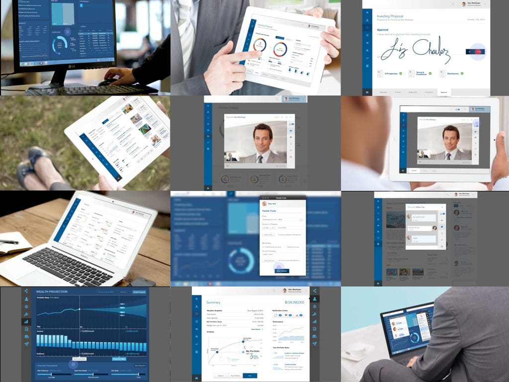
Financial Workflow Experience Design
I use a narrative approach to construct workflows for users to complete tasks and reach goals. Visualization is where it gets a bit more interesting. I’ve found that oftentimes data scientists and visualization folks are focused on getting the analysis and visual right instead of understanding the moment in the experience so the two get bolted together and the user falls through the cracks. Making those connections seamless, intuitive and “just right” is where I really enjoy the more traditional UX work. Collaborating with a team to map information to forms and potentially find unique, appropriate methods that help to define a new, specific representational opportunity.
I recently started my own studio, Spatialize. Our goal is to focus on multi-dimensional visualization that is time-based and dynamic. I think that information design is shifting, it is exhausting the conventions that were built on graphic print conventions and we will need a whole new set of methods to deal with the time and space we are about to have access to through cinematic and spatial representations of information. We are about to see lots of bad 3D ….again. I’d like there to be a better design response than “People don’t understand 3D.” Tell that to gamers. We exist in a dimensional, time based sense experience and process massive amounts of data in it, how can we translate our design tools in that information space.
Right now Spatialize is working with an NGO that is looking at GIS maps of deforestation and the associated data layers to visualize and identify risks through trend analysis and projection. It’s a bit different than working for financial firms, but there are moments when I am talking with these knowledgeable folks and I can feel their passion to literally save the world.
It really is the best thing about being an information designer, you have to dig in, get dirty with the data, understand its context and the audience and then once you’ve learned something you have to figure out how to teach it back to people through a system that accommodates unknown variability in the future. It’s a challenge, but you get to keep your brain after every project so it’s a pretty cool way to stay learning and stimulated, IMHO.
How has your professional work related to your creative projects?
I have been lucky to work with patient, smart people who have explained super complicated things to me because they believed that we could make ideas better through creativity. Being respectful of all of the things we don’t know gives our creative sides so much to work with on a daily basis. Being exposed to interesting data has been one of the real perks for my creative projects. Getting familiar with that new data, engaging with concepts outside of my knowledge base, and learning people’s perspectives all feeds into new creative ideas I experiment with from an art perspective. And more often than not that exploration will come back to the professional work.
I think over time, I’ve found that strict compartmentalization isn’t a great strategy if you want to bring all of yourself to the table — whichever table that might be. Sometimes my professional work feeds by creative work and other times its vice versa.
I remember pitching the idea of using unique digitally generated flower bouquets to represent wealthy individuals portfolios at one financial institution and the look I got was kind of amazing. They didn’t go for it — yet.
Can you share some thoughts on realizing data? What are some of the key elements in creating elegant and effective data visualizations?
I highly recommend Ben Shneiderman’s approach, “Overview first, zoom and filter, then details-on-demand.” Giorgia Lupi’s work and her inquisitiveness, rigour, and mapping skills are worth studying, her new book is coming out Dear Data and that’s going to be awesome. Ben Fry’s, “Acquire, parse, filter, mine” is a great way to work through a visualization process. Anything you can find by Muriel Cooper or Lisa Strausfeld is worth studying. Mark Hansen’s art projects with Ben Rubin are super valuable to look at as well, oftentimes they are physicalizing data as a full sensory experience and their strategies for making time-based installation work are powerful and elegant. For awhile I was working out of the NYTimes building and when I needed to feel a sense of wonder or magic I would go hang out with Moveable Type.
Drawing is fundamental and I’ve been really excited to do more digital drawing. Illustrator on the iPad has been great, so is Paper. I do lots of sketches once I’ve steeped in the data. Going back and forth between loose and refined sketches is crucial.
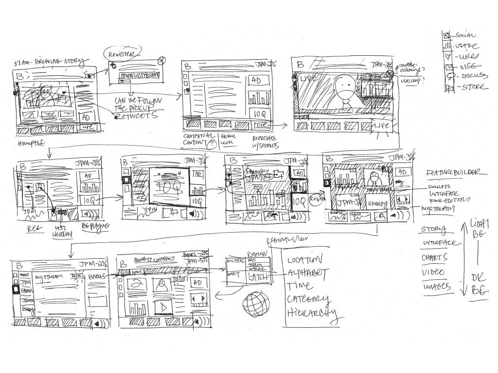
Thumbnail sketches for Information & Workflow Design
One of my UCLA DMA professors, Carla Barr was a long-time Art Director, she is amazing. She taught me the value of thumbnail sketches. I will sketch at S,M, & then L, each time getting more refinement, adding in more detail with every iteration to start to understand how the creative vision will manifest the information through the experience. It is the simplest and the most powerful tool at my disposal.
Knowing the needs of your audience is fundamental to data visualization. Visualization is a shiny jewel, but it needs a setting and a ring to hold it in place. I’ve learned never to underestimate the pre and post-experience moments in UX.
As a visualization designer, I think it is key to know your data, experiment with appropriate presentation methods, use your design craft well (type, color, layout, those are all crucial), think about dimensionality in the work, show your designs, appreciate beauty as a communication method, engage with emotional potential (great experiences are emotional), and learn to simplify the presentation while you embrace the complexity of meaning.
There is subjectivity in our work as authors and creators. We can’t hide from our own mark even if (especially when) we are dealing with data. How well we work with our own subjectivity makes all the difference in the ability of our designs to communicate.
Do you have any words of advice for designers interested in data visualization?
The main thing I would say is to not be intimidated. Opening an Excel spreadsheet can feel daunting, but think about how well we know our way around Photoshop or any other design application. If it feels too wonky, bring your data into a comfortable environment, a sketch pad and illustration, whatever you need to help you begin your exploration of the relationships that you may find in the material of the information. Stretch it, pull it, mark it up, make it yours. I find printing things and then X-Actoing them apart and reassembling them is super satisfying. “When you cut into the present the future leaks out.” — WSB
A great visualization can be as simple to create as a hand drawn line. As designers we are interpreting information stories and telling them through our talents and skills all of the time. Find the techniques and approaches that are innate to you and your interests and build with them.
Everything is information, you already are visualizing data in text, form, image and sound. It all comes down to your process — how do you collect, synthesize and represent it?
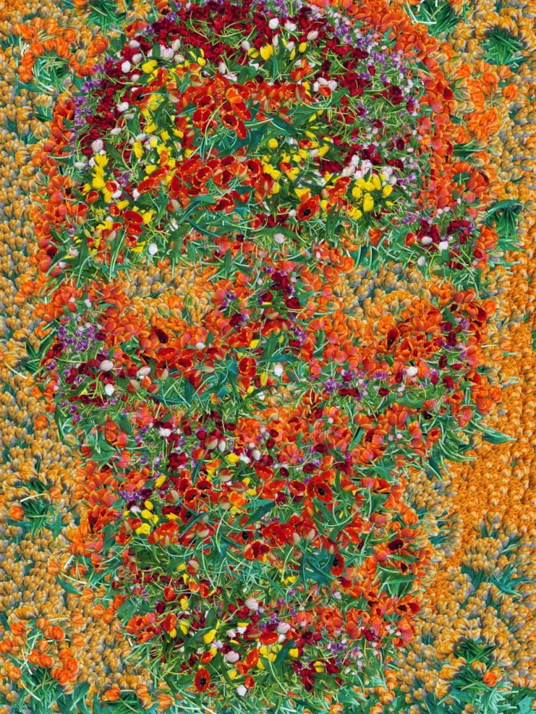
Blooming Skull, Processing, 2015
What’s next for you and where do you see data visualization and creative coding going in the future?
I want to take my design skills and apply them in ways that make a difference. My personal goal is to work on projects that help us understand the environmental, health and social risk in our world today. More than making smart, interesting or challenging work, I want to find ways in which we can communicate something profound for change.
From a design and tech standpoint, coding platforms and frameworks are becoming more and more accessible. There are more and more talented folks who are really teaching students how to access the power of computation in a deeper and more open way. That is transformational for new and old creatives. The lines between concept/production, designer/fabricator, product/service, architect/builder and designer/technologist are getting blurrier and blurrier for the good. It’s a challenge for the design discipline that will strengthen and expand its influence. Creation is accessible by anyone now, it is astonishing.
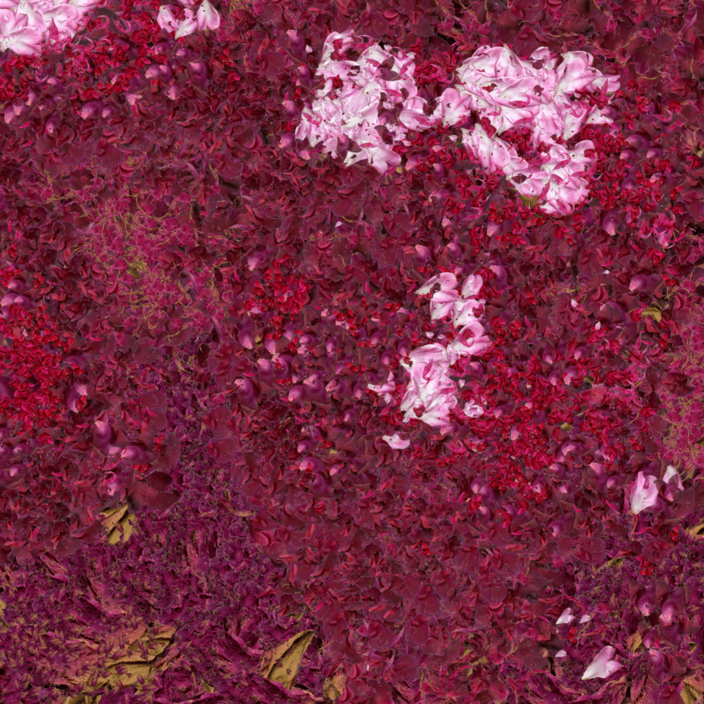
Peony Study (6.12.16, 48/49), Processing, 2016
From a visualization standpoint, spatializing data is going to really affect the way we process data and manipulate it. We have so many platforms now that are accessible and integrated for the creation of dynamic, time-based dimensional experiences. I expect we will see a counterpoint to the quick transactional workflows that we have been designing for short attention spans. Experience design will begin to leverage the lessons that gaming and cinema have been teaching us about immersive, immediate, media experiences in order to help us understand complexity and find deep relationships.
I believe that this is one of the coolest moments of convergence for digital experience that we’ve seen yet. We are about to get super dimensional.
To see more of Christo’s work, visit his website http://retrodictable.com/.
Margaret Penney is the Managing Editor of Notes on Design. Margaret is a teacher, designer, writer and new media artist and founder of Hello Creative Co.
For creatives seeking a thorough training in design, digital video, and motion graphics, Sessions College offers accredited, fully online digital media certificate and digital media degree programs. Contact Admissions for more information.


NoD Newsletter
Enhance your inbox with our weekly newsletter.