
Molly Ampersand: Part 1
by Clara LaFrance | December 22, 2011
Do you ever see a font on a shopping bag or advertisement in the mall and recognize the font? Ever watch a movie and exclaim “Bleeding Cowboys!” or “Garamond!” (It’s okay to admit it!) Today, we are going to meet with Molly Ampersand McLeod, a graphic designer and font designer in the Pioneer Valley of Massachusetts. We’re going to talk a bit about fonts, board games, game design, graphic design, and the circus!
Let’s talk about fonts. We see so many fonts every day: on advertisements, in the newspaper, in a book, on posters, on our laptops. We’re constantly bombarded with messages. Few people look at the shapes of the fonts that create the letters that create the messages. What do you find compelling about typography?
Fonts have a hidden impact on how we receive any particular message. Many people don’t realize the subtle influence of typography and design, and I find that fascinating. Think of the damage caused by poorly designed election ballots or confusing public way-finding signage, or how clever cereal packaging can trick you into believing something is healthy when it’s not. Good design and font choices can add legitimacy to evil corporations, or to social causes. Good design fosters emotional connections with brands, for better or worse. I’m interested in exploring how to use typography for culture jamming, media education, and socially responsible businesses.
You make fonts and, notably, hand-letter them! What is your creative process like, and how do you combine digital work with hand drawn lettering?
As much as I love Adobe Creative Suite, staring at a computer all the time is very draining, so I always start any project by sketching concepts or wireframes on paper.
My lettering process is influenced by the Friends of Type, and a workshop I did [with them] last summer. I start by rapidly sketching on tracing paper, layering sketches and drawing over them, with thick brush pens and thin pens, big sketches and small sketches. Then when I have something I’m happy with, I’ll scan it in, do an auto-trace in Illustrator, smooth out the curves, and start adding colors and textures.
I always have a hard time deciding when something is finished and letting it go, but then I just jump in to the next project!

A series of sketches leads to a beautiful final result.
(More photos of her process can be found on Molly’s blog here.)
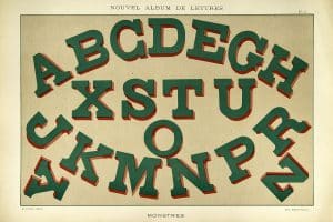
We see the ampersand all the time. It holds words together, it is a shortcut to the word “and,” it is often used in logos. Where did the ampersand come from and why did you choose it for your nickname?

A Garamond Italic ampersand combines the ‘e’ and the ‘t’ in the Latin ‘et’ for “and.”
The ampersand began as a ligature for the Latin word et, meaning “and.” You can see the ‘et’ shape in early ampersands like Garamond Italic or Caslon Italic. I’ve always been obsessed with ampersands; I have notebooks full of doodles of them. I love the visual form, how it can take so many different shapes and capture the spirit of a font, but always have the same meaning. I also love the ampersand as a metaphor for connection, collaboration, and compromise. I used the ampersand to connect all the different projects I wanted to do for my thesis (plasma cutting, sewing, photography, education, writing, design, baking, and so on).


(Check out more of the Ampersand Project here.)
Ok, the elephant in the room for many designers, the Font That Shall Not Be Named… Comic Sans. Do you share the bile that so many express toward Comic Sans?
Molly: Ban Comic Sans! I think it’s a really interesting debate in the design world, actually. I hate it, of course, but I can see all sides of the issue. It was originally designed for a Microsoft kids software, and sort of accidentally became bundled on every computer in the world.
I can forgive its use in, say, a kindergarten, but any restaurant, protest flyer, or professor who uses it I just can’t take seriously. It’s like showing up for a black tie dinner in a clown suit! People need to choose context-appropriate fonts more often.
In the same vein, what’s your least favorite font and why?
That’s a tough one. Generally speaking, I think fonts tend to lose meaning with widespread overuse (like many of the fonts that come as defaults on our operating systems). Papyrus isn’t inherently a poorly designed font, but it’s so ridiculously overused (It’s Egyptian! It’s organic granola! It’s yoga! It’s wild west! It’s ambiguously foreign!) that it’s not special at all anymore. My least favorite is probably Curlz – at least with Comic Sans, people use it with the excuse that it’s “friendly” and “readable,” but there’s no excuse to ever use Curlz.
![]()
And a question I’m sure you’ve been asked a thousand times if once: what’s your favorite font? (You can even pick two if you would like: one display and one body).
My favorite font for a long time has been Chaparral Pro, designed by Carol Twombly (one of the few female font designers, whom I love so much I named my bike after her!). It’s a friendly humanistic slab serif, and I’m attracted to all slab serifs. Lately I’ve also been obsessed with pretty much all the Lost Type fonts.
We will continue this conversation in Part II, in which we will discuss mural design, how to change the world with board game design, how bicycles lead to inspiration and a little bit of acrobatics. Stay tuned …

Clara LaFrance is a freelance graphic designer when she is not pursuing her dreams as a circus teacher and performer. Clara has an M.F.A. in graphic design from Boston University.
If you are interested in learning to use typography, Sessions College offers Basic Typography and Advanced Typography courses as well as a course in Web Typography. Contact Admissions for more information.


NoD Newsletter
Enhance your inbox with our weekly newsletter.