
Packaging Design for Summer
What images come to mind when you think of summer?
This past weekend, I sat down with a notebook and pencil and did a quick summer word association. The first words that popped into my head were: sun, picnic, beach, heat, and seagull.
I happened to be visiting a beach at the time—with a seagull perched beside me—so it kind of felt like cheating. For good measure, I added “tropical” and “refreshing” to the list.
Marketers go through a similar process when dreaming up seasonally-appropriate packaging design. Sometimes, the task is as simple as changing the hue of a box, or embellishing a design with a smiling sun.
When a company has a widely recognizable brand, a seasonal redesign can pose some challenges. Can the logo be tweaked but remain easily identifiable? Will consumers still reach for their favorite products if the shape or color has changed?
I turned to two of my favorite design blogs, The Dieline and Packaging of the World, to see how other designers have handled the challenge.
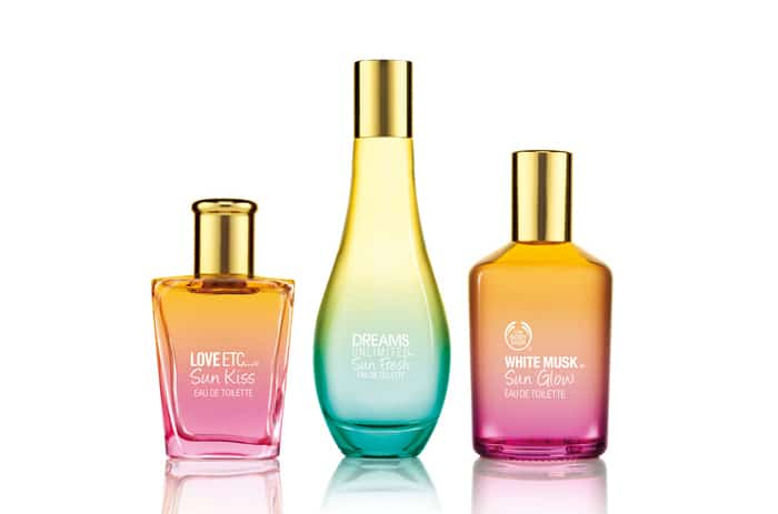
The Body Shop’s limited edition summer fragrance line. From The Dieline.
Ah, mi amour. Looking at the Body Shop’s 2012 summer fragrance line, I can almost smell the sand and the surf—with a hint of sangria carried in on the breeze. The warm, pink and orange gradient of one bottle is reminiscent of a summer sunset. The blue and yellow gradient of the other is reminiscent of cool waves lapping at a sandy shore. Paired with airy typography, it’s the perfect recipe for summer design.
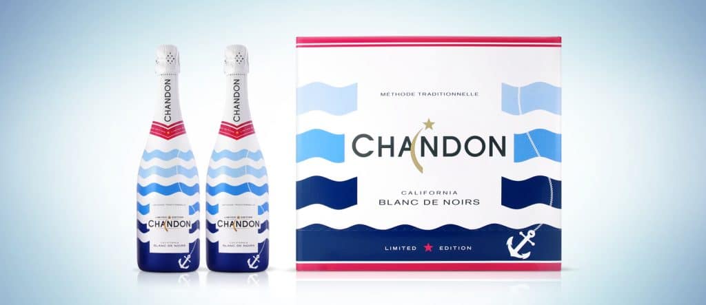
Chandon 2014 summer edition sparkling wine. From The Dieline.
Chandon took a different approach in designing their limited edition summer pack. Rather than strive for “soft and romantic,” Chandon used bold colors—blue, red, and a splash of gold—set against a white background. The design is at once elegant and casual. If this bottle could talk, it might say, “Let’s go hang out on the yacht. Just like old pals.”
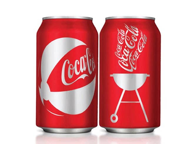
Coca-Cola, 2009 Platinum Pentaward winner. From Packaging of the World.
Coca-Cola might be the world’s most iconic brand identity, and there’s no mistaking the owner of these cans. Designed by London-San Francisco agency Turner Duckworth, the above is a creative spin on a familiar name. Coca-Cola’s signature red cans and cursive logo are combined with an American summer motif: outdoor BBQs, beach balls, sunglasses, and stars n’ stripes.
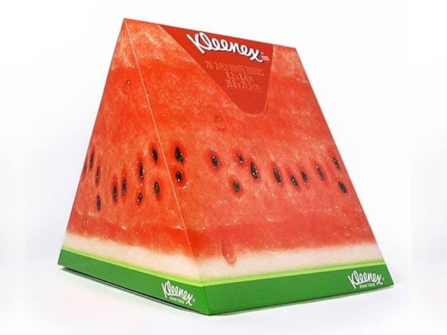
Kleenex, 2009 Diamond Pentaward winner. From Packaging of the World.
Another 2009 Pentaward winner. For Kleenex’s “Slice of Summer” packaging, illustrator Hiroko Sanders designed a trio of juicy fruits that look good enough to eat. Though we don’t recommend taking a bite, the popup boxes make for a great conversation piece.


 Design Interview: Resistenza
 Minimalist Portfolio Themes for 2018
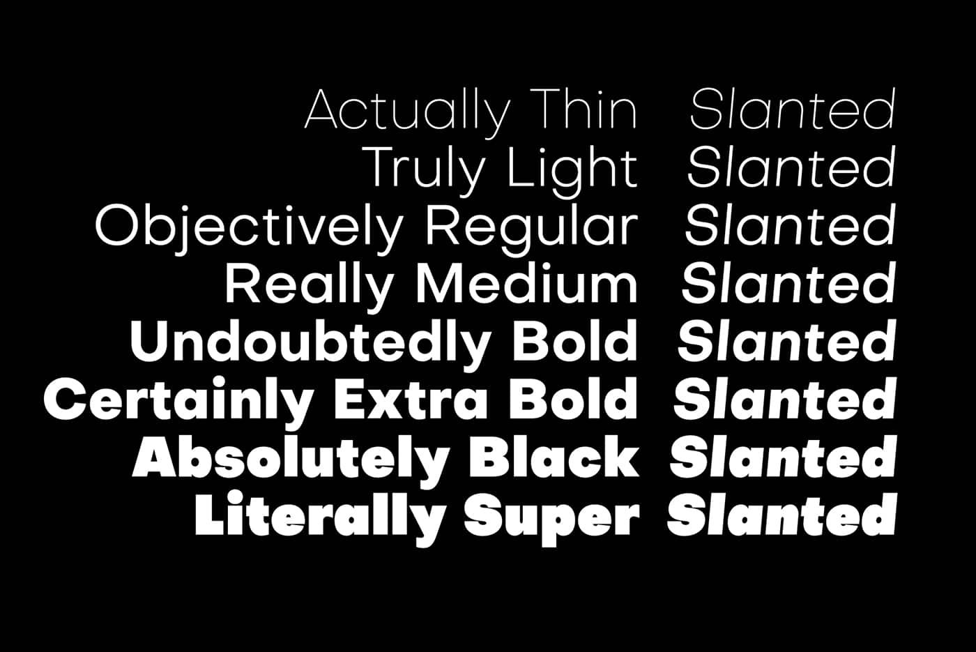 Free Font Friday: Objective
NoD Newsletter
Enhance your inbox with our weekly newsletter.