
Trendspotter: Nature-inspired, Organic Shapes, Nostalgic and Sweet
by Rob Pullins | December 1, 2011
Design trends ebb and flow just like fashion, literature, and the seasons. As designers, we have to stay aware of current trends to keep our work fresh and contemporary. We have to stay aware of the trends to keep our work from being faddish, and strive to be timeless. So use your knowledge of trends wisely, because if your work is rooted too deeply in the current hot style it will eventually look as dated and out of place as a blue leisure suit or a side ponytail.
Good design may be timeless, but we have also heard that there is “nothing new,” or “all the good ideas have been done” (just not yet by you, of course). Designers constantly reinvent the past to create work that feels modern and new.
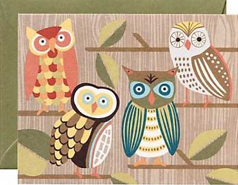
Currently we’re experiencing a form of design nostalgia. The popular browns and olives, beiges and stripes are reminiscent of an autumn in 1973, peering out a kitchen window from an avocado countertop. Woodsy browns and leafy greens twist in organic vines, leaves, and are combined with large-eyed owls and elegant birds. Organic, nature-inspired shapes and textures are appearing left and right, on stationery, home décor, personal apparel, and social media. Why are these colors and shapes so appealing?

The organic swirls, vines, and texture are part of a current design trend, as well as being entwined with our favorite micro-blog site, Twitter
A few reasons spring to mind. One reason is that the popular color schemes of the ’70s are long enough past now to elicit romanticized memories. Nostalgia and retro are tricky emotions to work into design. When it’s done successfully, the viewer is left with a pleasant feeling of nostalgia and a fondness for the design, but when done poorly (or simply too much), the viewer is left with an overwhelming feeling of kitsch. The greens and browns (and even pinks) are emotional links to a romanticized version of an earlier time, bringing along only the charm and leaving those leisure suits and fluffed hairstyles in the past where they belong.


Another reason for the ’70s resurgence is authenticity. The texture of this nature-filled trend is appealing in the same way that wood prints are appealing. Wood prints are imperfect; each one is very slightly different from the next depending on the amount of pressure used to apply the ink, how much ink was used, and so on through the entire process. The imperfections lend a humanness to the final piece and are a reminder of the artist and the process used in its creation.

An owl perched on a branch benefits from warm wood textures and swirls in this iPhone background design by Rosaura Ochoa, Creative Commons.
Contrast this idea of imperfection-as-desirable with a computer-generated graphic, perfectly and flawlessly rendered or a perfect circle mathematically drawn on a smudge-free white background. Perfection has been the mainstay in modern design, with vast white backgrounds and clean black lines (think: Swiss design, IKEA, or minimalist interior design) but computer generated work can appear flat or thin. Computers make it simple to create and multiply a pattern, but more difficult to re-create the human touch. Wood textures and round forms can soften a design.

These round birds on a wire even make it on to your socks! From sockdreams.com
One aspect of this organic trend is imitation of handmade pieces, and no one knows handmade like Etsy. The site hawks handmade authenticity with a success unlike any other business on the Web. As with any trend, however, there is a saturation point. How much is too much? Moderation in all things (even moderation), and that goes for following trends, as well. Hand-made, nature-inspired art can be touching and comforting. The New York Times recently discussed the saturation point of authenticity; if everything is authentic, is nothing authentic? This may sound like waxing more philosophic than you want to think about while designing! However, my point here is simple: moderation. Authenticity, originality, and nostalgia are all excellent antidotes to sterile open space and sharp black lines, but any style can easily be overdone. Keep your eyes open for inspirational trends to work into your own style!

Strawberry Luna, a Philadelphia-based artist, uses feathers and wood to create textures in her screen prints.
 Clara LaFrance is a freelance graphic designer with an M.F.A. in graphic design from Boston University. She is currently a Course Producer at Sessions College, maintaining and updating online courses, as well as a freelance designer and circus teacher and performer.

Rob Pullins is a new media marketer and world traveler. In 2013, Rob was Managing Editor of NOD while he was Director of Marketing at Sessions College.


 Design Interview: Resistenza
 Minimalist Portfolio Themes for 2018
 Free Font Friday: Objective
NoD Newsletter
Enhance your inbox with our weekly newsletter.