London 2012 Olympic Games: A Logo in Controversy
by Rob Pullins | August 3, 2012


2012 London Olympic Games logo via DavidAirey.com
The 2012 Olympic Games are fully underway and amongst the buzz of gold medals, world records, and outstanding athleticism is the controversy over the London Olympic logo.
A colorful depiction of the year 2012, this jagged and modern design has received more confusion and distaste than acceptance. Design firm Wolff Olins was chosen over 6 years ago to create the 2012 London Olympic Games logo. When it was revealed in 2007, a petition circulated Great Britain that was signed by over 48,000 citizens to have the £400,000 logo scrapped and redesigned.
London Olympics chairman, Lord Sebastian Coe, defends the design at launch in 2007 by saying, “It won’t be everybody’s taste immediately but it’s a brand that we genuinely believe can be a hard working brand which builds on pretty much everything we said in Singapore about reaching out and engaging young people.” Today, the logo is even more contested and controversial amongst all ages. The London Olympic committee, however, stuck to the original design and built a complete brand around it using the 2012 font nearly everywhere in the Olympic Park, including the running track.
View images of the Olympic Park and the branding that has so many people in London and around the world talking.
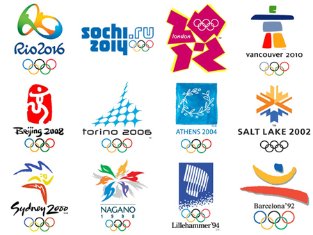
Aside from this controversy, we thought it would be interesting to look back at the Olympic logos from the past to see the evolution. All of them are colorful and show a bit of the host country’s personality. You can see a few of them below.

Image via Designer Daily
Click here to see all of the Olympic logos since 1924! Each logo directly reflects the current trends in design and fashion from each country and around the world.
The evolution of the Olympic Games logos really picked up steam with the creation of the Olympic flag. These 5 colored rings on a white background that we are so familiar with today was created by Pierre de Coubertin, the founder of the modern Olympic Games, in 1914.
Although the London Olympic logo is not embraced by all who see it, we still come together as citizens of the world to take part in a centuries old tradition of competition and athleticism. What do you think of the Rio de Janiero logo for the 2016 Olympic Games?

Image via Design Boom.

Rob Pullins is a new media marketer and world traveler. In 2013, Rob was Managing Editor of NOD while he was Director of Marketing at Sessions College.


