
Type in History: The Fell Types
by Margaret Penney | March 24, 2016
Type in History is a monthly article series where we explore how typography has been used through the ages.
An essential part of all communication, typography is everywhere from street signage to our cell phones. Typography is used in nearly every form of publishing, advertising and design. For centuries, designers and typographers have dedicated themselves to the demanding task of creating new type forms that speak to the era in which they exist. History itself can be charted by the changing forms of type and provides a way to learn about our collective past as much as other art forms like painting or fabric arts.
As designers, understanding the history of type helps us create works that are informed by the past and interpret the visual message of these time periods.
For the first installment of this article series, let’s start a long time ago with the Fell Types.
The Fell Types

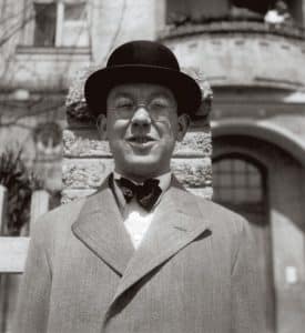
John Fell’s Portrait (P.Lely).
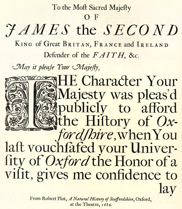
John Fell was an English bishop, academic and publisher who was dean of Christ Church Oxford. From 1666-1669 he served as the vice-chancellor of the University of Oxford and established the renowned Oxford University Press. The publishing house became one of Fell’s favorite projects and engaged much of his energy and devotion. Fell was motivated to “help pass on the knowledge and criticism that lived on the printed page.” Under his direction, the house published many classics of philosophy, philology and literature and the typography used in these early publications became known as the Fell types.
Fell hired the best typographers and printers of the day from Holland, Germany and France and declared that:
“The foundation of all successe must be layd in doing things well, and I am sure that will not be don with English letters” (to Jenkins, 2 Dec. 1672).
The typefaces that were created under his direction included:
Garamond
Granjon
Haultin
Van Dijk
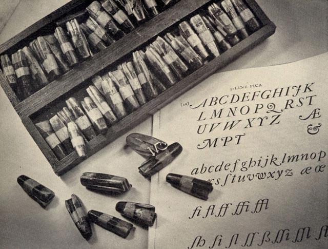
Fell developed these typefaces in their own workhouse with Peter de Walpergen as the type-founder. The style of the type was a hybrid of both Dutch and French which gives the type forms a visual personality that is quite unique. The Fell types fell out of favor with the advent of Dutch Caslon type and were unused for centuries.
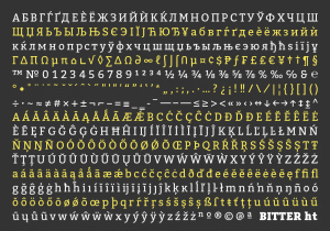
An excerpt with the De Walpergen’s larger bodies.
In the year 2000, a revival of these typefaces happened when they were lovingly recreated and digitized by Igino Marini who has generously made them available for download at his website. Now you can see them in use in many new design projects like this Meditation XVII Box by Philip Chapman-Bell and “Jules Destrooper” Biscuterie where they lend each project their own distinctively classical style.
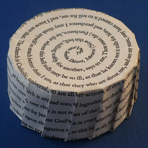
Philip Chapman-Bell Meditation XVII box
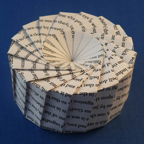
Philip Chapman-Bell Meditation XVII box

Margaret Penney is the Managing Editor of Notes on Design. Margaret is a teacher, designer, writer and new media artist and founder of Hello Creative Co.
If you are interested in learning to use typography, Sessions College offers Basic Typography and Advanced Typography courses as well as a course in Web Typography. Contact Admissions for more information.


NoD Newsletter
Enhance your inbox with our weekly newsletter.