Typography, Typewriter Art and Creativity

Communication and language are constantly, organically shifting. Letters and words are universal, but language changes by location, slang phrases change with fads, and dialect changes by region. The modern alphabet has stayed consistent for centuries; what has changed is the life surrounding our letters, and the means by which we can manipulate them. We have shifted from endless pen and paper and the time with which to write languorous letters to frenetic emails and missives containing just 160 characters. As designers, it’s our choice as to how we manipulate those letters and use them (or choose not to) in our work. Typography is a large element of graphic design (and one I am particularly partial to) and not one to be ignored!
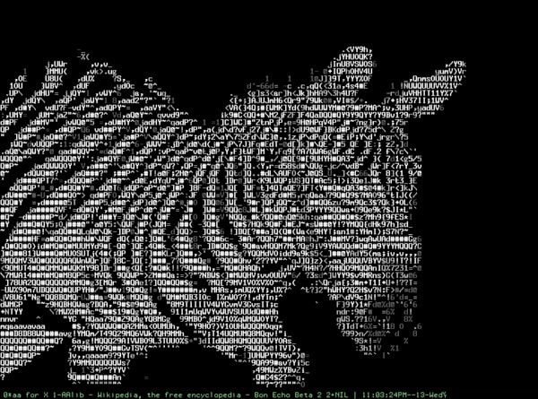
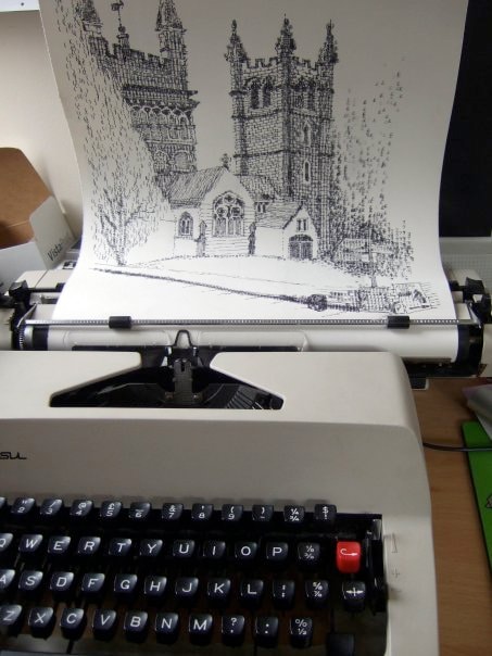
Typography uses letters, plain and simple. Playing with words and letters is not a new phenomenon and is not confined to the realm of the computer. Let’s check out the work that was created before Facebook became the third-largest ‘country’ in the world and before computer graphics! Typewriters were clunking, loud machines with a fixed font set and limited capabilities. Folks got creative, though, and used typewriters to create type-based illustrations in the 1940s, per this Popular Mechanics instructional guide:

Owls were popular in the 1940s, too. Check out those eyes!
Typewriters are far more limiting than, say, Adobe Illustrator, but those limitations can also be freeing. Without the options of font style, size, or the multitude of options available to graphic designers, typewriter artists worked creatively with the available symbols to draw caricatures, shapes or landscapes.
Speaking of typewriters, an orchestra consisting of typewriters came out of Boston! Letters (and the machines they are made on) can be used in creative and totally unexpected ways. I don’t think Rev. Rasmus Malling-Hansen (the inventor of the first typewriter) ever suspected his machine would be used as a musical instrument!
The allure of using typography to create a visual message was not lost on artists during the Futurist movement in the early 20th century. F.T. Marinetti turned letters and symbols over to create a visual as well as literal representation of the words on the page.
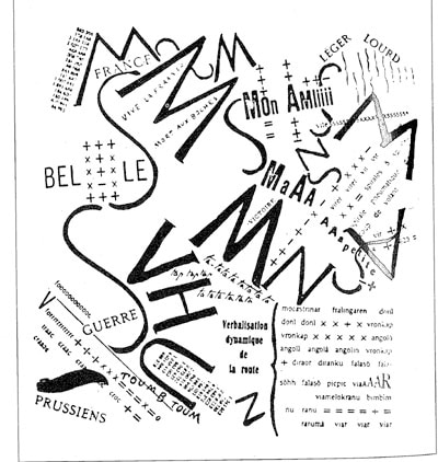
F.T. Marinetti used expressive type to push beyond the literal words to create visually rhythmic work.
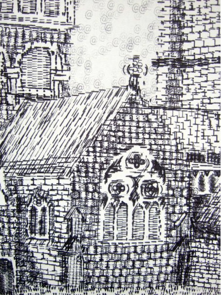
In the very early days of the internet and email, computer users used symbols available on their keyboards (ASCII) to make filled shapes, lines, and shading to create visual pieces. We still use ASCII to ensure a proper tone with smiley faces, and to create a heart <3 and some may remember when the kindness of a friend could be represented by a single rose: @}-,-`- . Gmail chat users have the benefit of a pig face :(:), monkey face :(|) or crab V.v.V for their most crabby needs. If you have a situation that needs more cowbell, Google has you covered +/’ . (Note: type these key combinations in a Google chat box and send the message. The keystrokes will turn into the emoticons they represent.)
Typography offers designers the opportunity to use letters to create something brand –new, to stand for something besides a part of the alphabet or a representation of a sound. Type can be used as a painting tool, which Sergio Calvo does very successfully here:

by Sergio Calvo
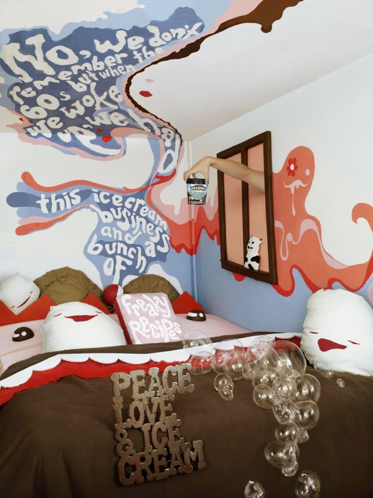
or as a texture that doubles as a message and leads the eye through this ad for Ben and Jerry’s ice cream.
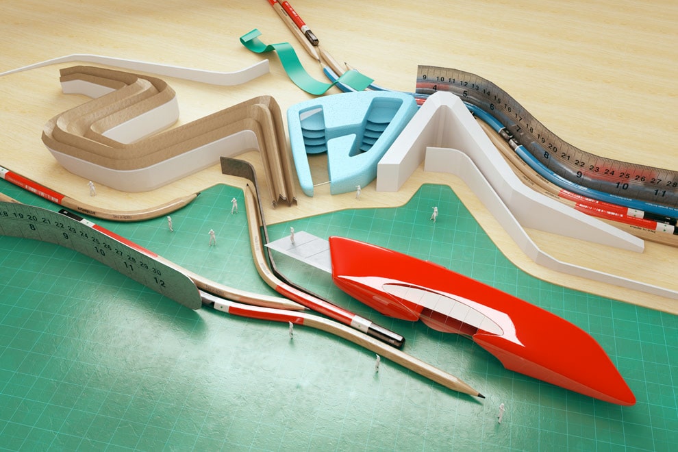
Christopher Labrooy creates a three-dimensional world around letters here:
Typography is, ultimately, just letters. Letters are meant to be read and sounded out as we were taught when we first learned to read. But those letters are also SHAPES.
While it is entirely possible to just stick letters on the top of an advertisement and call it good, if we take the extra time to consider the letters as individual shapes, to consider their place in the design as well as the literal message they represent, we will create strong and engaging work. When we twist the letters around to use their shapes as design elements, we add an additional level of depth to our work. The words double as a visual element and a literal message.
Use the inherent limitations of typography to your advantage to make creative, fun, and thoughtful work. Be creative!
 Clara LaFrance is a freelance graphic designer with an M.F.A. in graphic design from Boston University. She is currently a Course Producer at Sessions College, maintaining and updating online courses, as well as a freelance designer and circus teacher and performer.





 Design Interview: Resistenza
 Minimalist Portfolio Themes for 2018
 Free Font Friday: Objective