Interface Design with Michael Hamm

Q: Mike, you recently completed a large project for Expedia that involved a redesign of search results. How does a large site like Expedia break such a task into manageable pieces, and what was your role?
Our team, the Hotels team, has a dedicated team of developers, product managers, business leaders and user experience folks who come together to size the project at hand. We look at the requirements and estimate how much time we’ll need for research, design, development, testing and so forth.
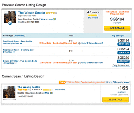
In this instance, we weren’t looking to redesign the entire page as various components are released all the time but our focus was on the individual search listing. So my role in this particular project was the visual design of the listing as well as thinking through how users would interact with it–things like “where does the user go if they click on a map link or a photo?” There’s a lot to keep track of. And that’s in addition to keeping track of other projects that are going on concurrently.
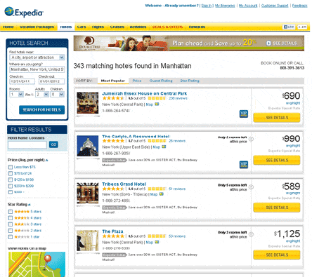
With so many different hotels being represented on Expedia it is essential to understand what visitors want to see first as they search the site.
Q: What were your primary goals in this project? And what steps did you take to accomplish them?
In a company such as Expedia, a primary goal is, of course, shopper conversion. How can we make it easy for the customer to make a confident decision about a hotel? Providing the essential information about a hotel to enable the customer to continue down the shopping path is critical.
We start with assessing the current design and data points within an individual listing. Does everything still do what it’s supposed to do? Is some information unnecessary now? I try to simplify things as much as I can and eliminate redundancy of design and copy. It’s at this stage that I work closely with our information architect, user researcher, and copywriter. And, I should point out, we’re already simplifying our listings further now that this project is complete. At this point, it’s a reduction of visual clutter and some slight reformatting of how we display the hotel’s location.
Q: So how do you go about reducing visual clutter and improving scannability?
One specific example that comes to mind about reducing clutter is over a data element in each listing that’s called Expedia Extras. It’s displayed whenever there’s a freebie – such as event tickets or free breakfast – that comes with a room listing. Each time, we question whether we can shorten it to Extras or something more explicit such as Freebies. Because we’ve put marketing behind this labeling, we have to keep it. Maybe the next time! As for scannability, that’s all about how and where we display elements such as the photo, the hotel name, guest ratings and so forth. In each listing, we try to keep these elements placed consistently so that the user doesn’t have to hunt and search for it in each listing.
Q: Do you mind “walking us through” the search results page and the hotel product detail page from the perspective of an interaction designer?
Most of the elements on these two pages are heavily tracked and analyzed so we’re able to adjust and innovate designs based on user behavior. For instance, on our hotel product page, we started the year off with a handful of photographs for any given hotel. We had a hypothesis that we could increase engagement and shopper conversion by introducing double the amount of photos. Mockups were created, approved, developed and then tested on the site. In testing, we saw confirmation of our hypothesis and, as a result of the success, we rolled out the additional photos to our global points of sale.
Continuing to focus on the photos as an example, we’ve also worked up ideas of where we should position the photos: Higher on the page or lower? Should photos be displayed on a dark or white background? Should they all have a border? Do users access them by clicking on them or just hovering their mouse pointer over them? Is the competition doing something that we can use on our site? These are all things we test and then learn from. So when you look at all of the elements on the page, the way they look and how they’re communicating with the user, know that we’ve had lengthy discussions over them.
Q:With the rapidly expanding presence of mobile devices with internet access Expedia has an optimized mobile site as well. Were any efforts made to align the mobile site with the growing trend of “responsive Web design?” (If not by you, are you aware of any?)
Because of the fast pace we move at and the continuous need to improve existing product paths, I wasn’t available to work on our mobile efforts but kept up to date with what they were working on. Our work influenced their designs and I can say that they work is now influencing ours as well. And at this stage, they’re two separate paths but I can foresee a merging of the mobile and desktop experience in the near future so we support just one development channel. Responsive design is on our radar though and the merging of the two paths will provide an impetus for its use.
Q: What traps should designers avoid in a project like this?
The one big trap I fell into when I started with Expedia was not thinking through how a design would look or work for, say, our German point of sale. Words are notoriously longer in that language. And our Mexican point of sale needs to support longer currency formats. I had to take this all into account as I was working through a design. Just when I thought I had a solution, it would fall apart in another language. Some may see this as limiting but it’s really quite a fun challenge. You definitely have to think more creatively when coming up with design solutions.
The other trap is to think your design is ever final. It’s the Web so it’s never finished. You just try to come up with a foundation that’ll accommodate a lot of change over time so you need to work through and test a lot of different ideas while still meeting a deadline.
Q: You mentioned in a previous exchange that there’s a “QuickView” concept that you’re working on. Can you tell us a little bit about what this is and the goal for it?
The concept of QuickView may be familiar to folks who have visited sites such as Target.com or Walmart.com. You click a product photo and more information is displayed. This all happens from the search results page so that a user doesn’t have to go to a product page, then back. We’re applying this concept to hotel search results in an effort to make shortlisting hotels easier for the customer and have them avoid the frustration of going to a different page for each hotel. We’re currently putting this in front of users in our research lab to see if they notice it and find it useful.
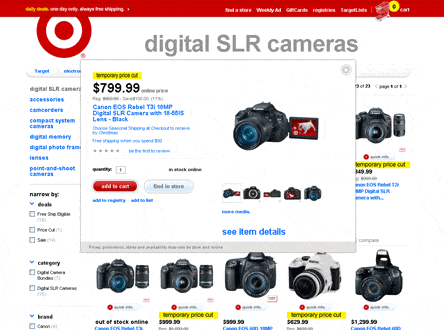
The inner window showing multiple images of the same camera is an example of a QuickView on Target.com
Q: Are there any changes ahead in this design field that you’re excited about?
You alluded to responsive design, that’s interesting to me. I’m also excited about design and development tools that can take full advantage of what HTML5 and CSS3 have to offer. Those are just starting to come around. Also, animation and motion in the design of sites is becoming more mature with the latest languages so that’s exciting to see and think through how it can be applied intelligently in a design. Providing context to a user about where the map they see before them came from is one example. Does it grow from an icon into a large map or does it slide out from somewhere? There’s going to be a lot more of that going forward.
Michael Hamm is a freelance designer and Web developer with over a decade of experience in the creative field. He is currently employed at Expedia as an interaction designer. His work has been published in various Web design books and magazines. He is a regular contributor to Layers Magazine, has served as a technical editor for Friends of Ed publishing, and co-authored the book “Introduction to Web Design Using Dreamweaver” published by Glencoe/McGraw-Hill.

Sessions Staff is a restless soul who loves to share Campus News stories with current and prospective students.


 What Photoshop’s new AI Tools Mean for the Creative Community
 Helping Creatives Find Careers
 Illustrator Discovers Cosmic Realms and Witchy Inspiration