Exploring Mobile Web Development with Piper Nilsson

Web design is constantly changing with new technology, and technology changes incredibly quickly. In the last 10 years, we have gone from reading our email on computers at home to reading our email on smartphone screens and tablets on the train. Technology advances in leaps and bounds, and often designers are scrambling to catch up. In this interview, we will talk with Piper Nilsson about designing for mobile devices, as well as the impact new mobile technology has had on Web development.
Q: How do you find that most people use their mobile devices to access the Web? What kinds of content do people look for, and does that information impact your design process?
Personally I use my mobile device with a specific task in mind⎯to check a movie time or look up the address of a restaurant, for example. Consider why your users would access your Web site from a mobile device and make each task as easy as possible to accomplish, whether in the carpool lane or on the subway platform.
Q: What differences do you find between creating sites to be viewed on a computer screen and creating Web sites for mobile devices?
On a computer screen, you have plenty of space for graphics and decorative images, and it is easy to depend on imagery to create an original and compelling Web site design.
On a mobile device, you only have space for content, but you can still maintain site branding with color, logos, and typography. Compare nytimes.com to newyorker.com to npr.org⎯each mobile site has a distinctive look and feel based on color and type alone.
Q: Many of our readers are Web designers, but many don’t yet design for the small screens of a mobile device. What would you say to someone making the plunge to creating Web sites for cell phones and small screens?
It is a lot easier if you start with a minimalist design⎯keep the graphics as simple as possible and focus on good use of color and typography. Minimize the use of decorative background images by using CSS3 to create rounded corners, drop shadows, and gradients. Build your sites according to current Web standards and validate your HTML and CSS markup.
The cleaner your site design, the less work you’ll need to do to adapt it to different devices.
Q: What limitations (besides the obvious: small screen) exist for the mobile Web that you simply don’t come across on a full-size screen?
Navigating on a small cell phone trackpad can be a challenge. Simplify navigation options whenever possible; reduce the levels of navigation and prioritize links based on user needs.
Anyone who has tried to fill out a lengthy registration form on a mobile device knows how tedious that can be. Limit the number of required fields, and use options like “start from current location” to make input quicker. Short URLs that are quick to type and easy to spell are also appreciated.
Q: Apple mobile products (such as the iPhone, iPad, and iPod Touch) do not support Flash. Do you avoid using Flash altogether (even for full Web sites) because of this? Do you think Flash will fall away in popularity?
Flash isn’t a good solution for a typical public Web site. Remember the dinosaur Flash sites of the early dates of the Web with the slow-loading intro screens? Early Flash sites were hard to search, tedious to navigate, and time-consuming and expensive to update. Jacob Nielsen killed it with his classic article Flash: 99% Bad.
However, this doesn’t mean that Flash doesn’t serve a purpose. Flash’s rich media, plug-ins, and database interaction make Flash a great solution for corporate training sites, intranets, and more specialized Web applications. Flash can do some pretty amazing things that HTML5 can’t touch yet.
If your Web site includes video files, then you’ll need to use both HTML5 video (for newer browsers and iPhones) and Flash video as a fallback (for older browsers that don’t support HTML5). This article [from diveintohtml5.org] explains it well.
Q: Certainly, some companies are simply expected to have mobile-friendly Web sites: movie listings and weather sites spring to mind as obvious sites to check when you’re on the go. Are there any companies that will not need a mobile-friendly site, or is it necessary to have a mobile-friendly Web presence in this day-and-age?
It depends on the content. Right now, I’m building a small site for a gardener who specializes in window-box herb kits. I doubt that many people will be sitting in traffic and decide that they need to buy an herb kit right at that moment. It seems more like something you would do at home.
If a mobile Web presence isn’t a priority, you can probably get away with a standard Web design as long as you’ve built it according to Web standards. Test the site from a mobile device to make sure that the content scales to fit smaller screen sizes and that key information like the address and phone number are accessible.
Q: HTML5 is the next big thing on the Web design front, as we learned in a recent interview with Christopher Schmitt. How will this new version of HTML impact mobile Web development?
On a basic level, HTML5 offers better semantics by organizing content into sections with Nav, Header, Article and Aside tags. There are also new HTML features for forms, making data easier to input into mobile devices.
Some of the flashier new features include custom typefaces with font face loading, canvas animations, editable content areas, and 3D graphics. There’s a lot to be excited about.
Q: Speaking of updates, Adobe has updated Dreamweaver to version 5.5. What kind of support have they added for mobile Web design?
Dreamweaver CS5.5 makes it really easy to write Media Queries to specify different style sheets for phones, tablets, and desktops.
If your user opens your Web page on an iPhone, the browser will identify that the width of the device is 320px and format the page content according to a phone.css file that you’ve optimized for iPhones.
For example, let’s say you are using a two-column layout, which looks great on a desktop computer, but doesn’t fit an iPhone. You can modify the phone.css external style sheet so the content displays in a single column.
You can also create a different set of styles for tablets. Tablets tend to be slightly narrower than a standard laptop display, so you might make the font size a little smaller and adjust the column widths.
Q: Web sites such as The New York Times and Facebook have mobile versions as well as apps. The newest version of Dreamweaver supports app creations using something called PhoneGap. Tell me a little more about that!
Dreamweaver CS5.5 provides sample pages to get you started with jQuery Mobile (PhoneGap). You don’t need to know a lot of JavaScript. With PhoneGap, you can insert and format content, then choose from different widgets, including flip toggle switches, sliders, radio buttons, dropdown menus, and text areas.

Q: Based on your experience, where do you see mobile Web development going in the next two years? What wild and crazy things could we all be doing with our cell phones and laptops in the future?
Everyone is talking about “cloud” now. Rather than downloading files to personal computers, we will be streaming music, movies, TV, podcasts, and apps, all while viewing and editing documents and data across multiple devices. I imagine that there will be a lot of new applications to make access to this “cloud” completely seamless.
Geolocation features and social networking are merging in interesting ways; you can search for a restaurant that is within five blocks and “liked” by your Facebook friends, for example.
Augmented reality sounds like science fiction, but basically it is about centering on the user’s location and allowing them to access information by branching out from that starting point. There is a lot of potential for user-driven design and personalized applications!
Piper Nilsson has been a key member of the Sessions College Faculty for nearly 20 years and is head of Web Design Programs.
Interview by Clara LaFrance, Sessions College Course Producer

Clara LaFrance is a freelance graphic designer when she is not pursuing her dreams as a circus teacher and performer. Clara has an M.F.A. in graphic design from Boston University.
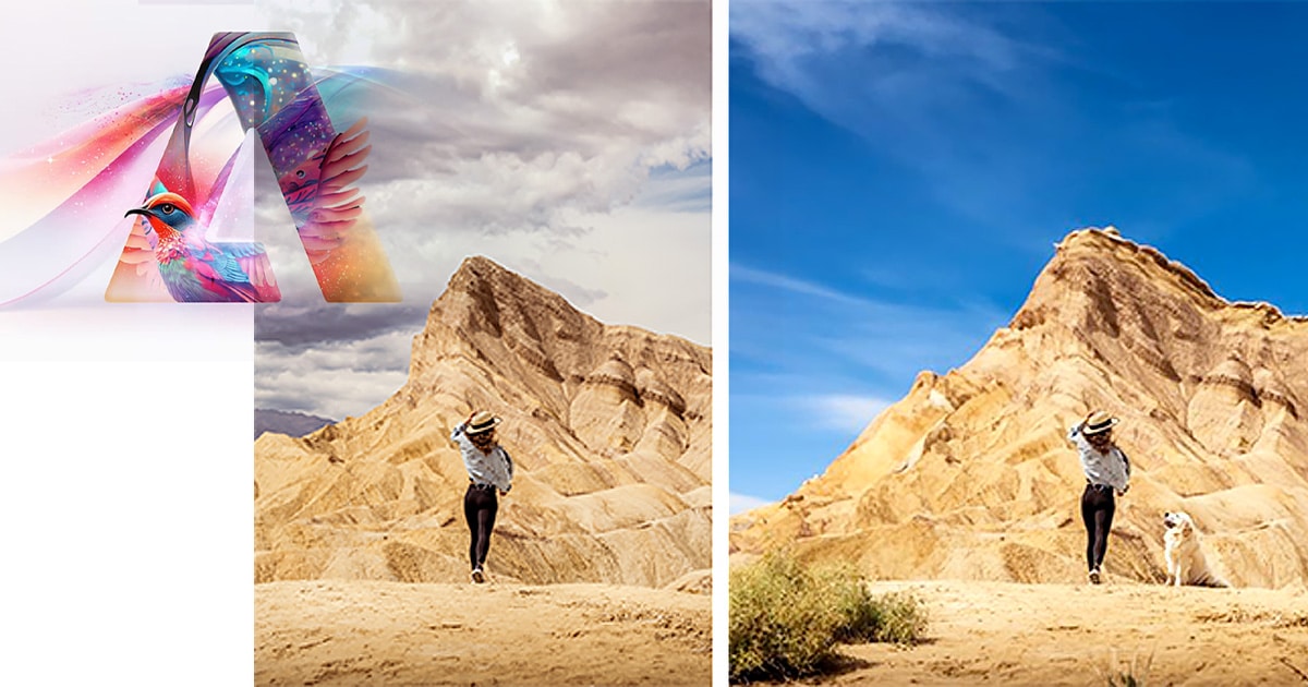 What Photoshop’s new AI Tools Mean for the Creative Community
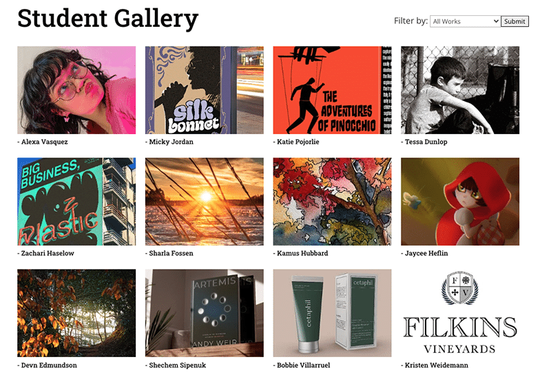
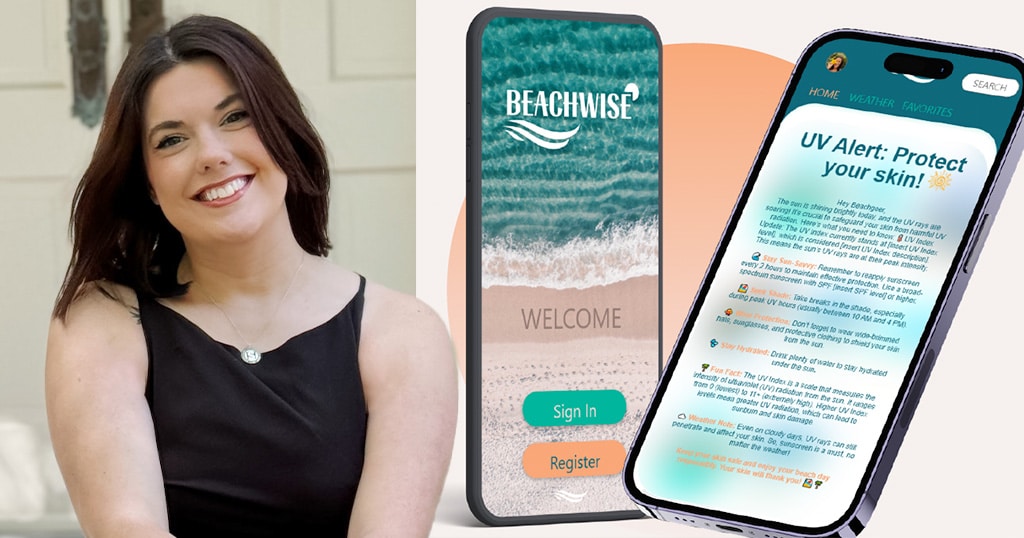
 Helping Creatives Find Careers
 Illustrator Discovers Cosmic Realms and Witchy Inspiration