Designing with Disabilities in Mind
by Clara LaFrance | December 13, 2011
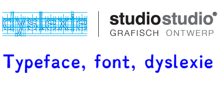
“Dyslexie, a font that helps dyslexics read”
The practical role of design is to communicate a message. Designers are visual communicators, and design is more than aesthetic. We must consider the target audience while still retaining an aesthetic, communicating a visual message, and doing it all to the client’s expectations. That can be a lot to handle! This can be further complicated when our target audience is a broad slice of the population and our designs have to reach a broad spectrum of individuals with an array of different needs and expectations, such as accessibility.
Consider wheelchair ramps and railings, which are expected in new building designs and retrofitted to older buildings to accommodate people with different physical needs. Where are their counterparts in graphic design? Creating accessible design does not always come to the forefront of our conversations regarding our target audience, but designer Christian Boer is here to change at least part of that.
Boer designed Dyslexie, a font that makes it easier for people with dyslexia to read without the confusion of letters or words which is characteristic of the disorder.
Boer began his work on the typeface by trying to understand his target audience. When we read, our brains see letters as groups, and then our brains process those groups to create words. The human brain thrives on pattern recognition and, in a sense, reading is just that: pattern recognition. However, dyslexia changes how people perceive letters. Boer described reading with dyslexia as watching the letter shapes seem to float off the page and become three-dimensional balloons that twist in the air. The shapes of certain similar letters (d and b, for example) are easily confused and reading becomes laborious.
Boer (who has dyslexia himself) drew Dyslexie very specifically to keep the letters grounded, and to give each letter more unique characteristics. He did this by weighting each letter using a specific ratio of thick to thin strokes to distinguish similar letters. These letters are less likely to be confused by people with dyslexia and the letters “stay on the page.” The font has proven to do its job; the University of Twente ran a small study with twenty-one people with dyslexia. The group made fewer mistakes while reading text in Dyslexie compared to the same text set in other typefaces.
How else can we make our designs approachable, interesting, and accessible? One way is to stay aware of the relationship between form, function, and design. Do not lose form and function for the sake of design.
While gray type on a white background may fit a design beautifully and create a pleasing texture on a minimalist Web site, it may ultimately be difficult for people to read on different kinds of screens. Use the gray on white color combination, but make sure the gray is dark enough to be legible (or outfit the site with features to allow the viewer to change the font color and size).
Similarly, gray or white type set on dark backgrounds can seem to be an appropriate aesthetic choice; we’ve all seen blogs with this color scheme. But have you ever read a blog set in white type on a black background, then switched to another site and been surprised by the moment it takes your eyes to adjust? This is called an after-image and will occur after looking at one image (or even a color scheme) for 30-60 seconds. Which, if you are a blogger, you sure hope your readers are! In Web design, use contrast between text color and background to your advantage to keep your reader’s eyes comfortably scanning the lines, as well as narrow column widths and sans serif fonts for body copy.
Typography, design choices and color choices all make an impact, regardless of what you do or where you go. Use these choices wisely and to your advantage!

Clara LaFrance is a freelance graphic designer when she is not pursuing her dreams as a circus teacher and performer. Clara has an M.F.A. in graphic design from Boston University.




 Design Interview: Resistenza
 Minimalist Portfolio Themes for 2018
 Free Font Friday: Objective