
Packaging Design for the Holiday Season
by NoD Staff | December 16, 2015
With the winter holidays right around the corner, it’s hard to ignore the seasonal shift in branding and packaging design. Take a walk through any store to see boxes bespeckled with snowflakes, gift wrap awash in red and green, and candy canes galore.
While red and green are two of the more popular holiday colors, there are tons of creative ways to approach holiday packaging design. Here are some of our personal favorites from the past few years!
Editor’s note: This post was originally published in December 2014. We’ve curated it back for you as a holiday favorite.
Vi Novell 2014
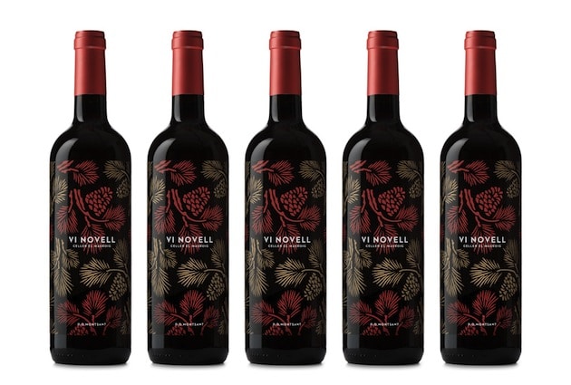
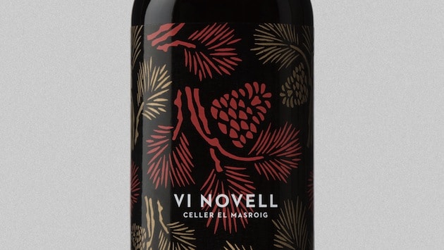
Images via The Dieline
From Barcelona-based design group, Atipus: “This fresh and fruity wine is bottled before its fermentation is finished. Therefore, it must be consumed within a short space of time. For the 2014 edition, we were inspired by an old tradition of local bars. Usually, they hang a pine branch outside to indicate that they were serving Vi Novell.”
Colors: black, deep red, gold.
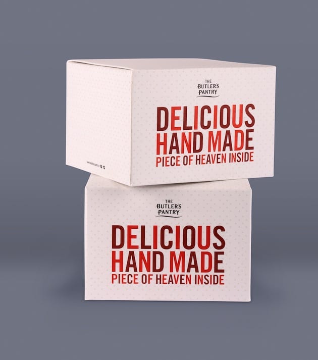
The Butler’s Pantry
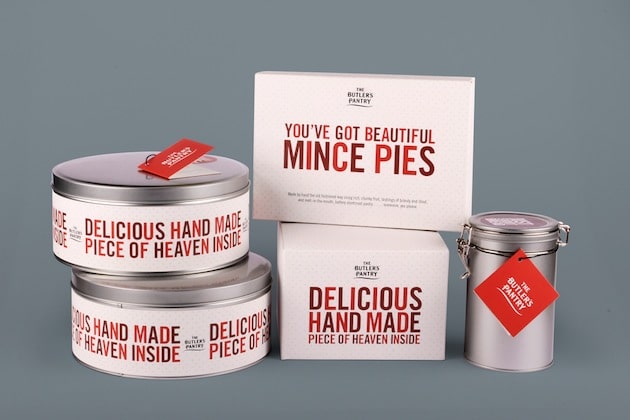
Images via The Dieline
Designed by LA-based Brandcentral, The Butler’s Pantry line of cakes and pies uses a minimalist design and a simple dot pattern to create anticipation around the contents inside. The red letters communicate holiday cheer, and the use of a simple san-serif font keeps the focus on the food.
Colors: dark red, bright red, pink, gray.
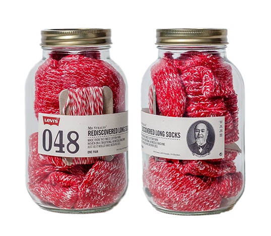
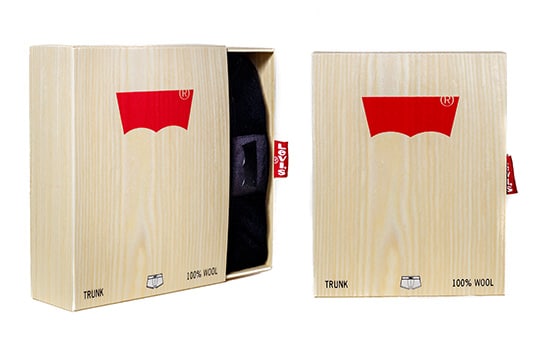
Levi’s Basic Long Socks
Images via Lovely Package
When MAD Projects launched the Levi’s Basics brand, they wanted to think “outside the box” with the design. They knew the product needed to look and feel traditional, but who said the packaging couldn’t also be functional? Each package in the 3 series line was designed as a reusable keepsake. The 200 series box is a working match strike, the 300 series is a resealable Tyvek bag, and the 400 series uses authentic wood paneling.
Colors: red on natural materials (glass, wood, paper).
Glintwein
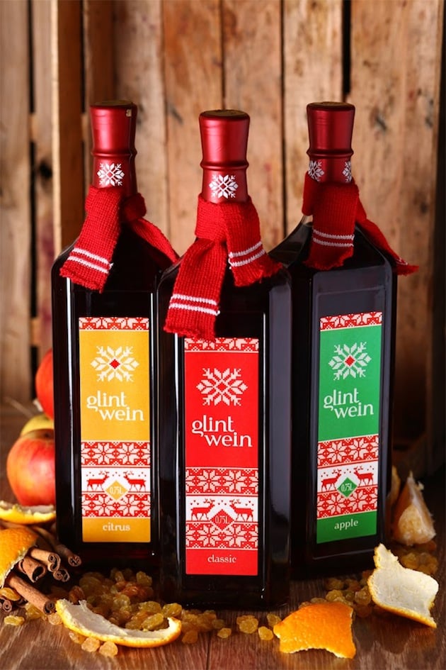
Image via Packaging of the World
From Alex Kodimsky, the packaging designer behind Glintwein: “…Gluehwein is associated with warmth of a winter evening among familiar friends. We tried to transmit exactly this feeling of homelike and warming aroma of cosiness for the series of label design of mulled wine. To achieve a desired effect we used a classic pattern that is widespread for knitted sweaters. The final product is improved by a knotted little scarf around a bottleneck. Wine range is presented in assortment of three tastes – citrus, apple and classic, which is divided by a scale of colours.”
Colors: black, red, yellow, green.
Method Holiday Collection
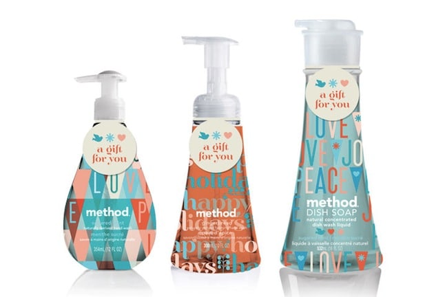
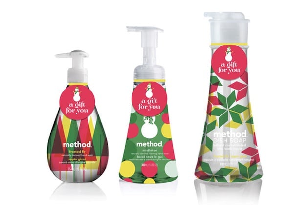
Images via The Dieline
The 2012 Method Holiday Collection is a great example of holiday branding that feels traditional, without overdoing the red/green color trope. The Sugar Spice Collection features a geometric blue and peach pattern, and the Evergreen Nice Collection adds a dash of yellow and silver into the traditional mix of red and green.
Colors: blue and peach, red and green with yellow and silver.
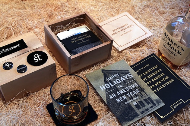
Upstatement Holiday Gift box
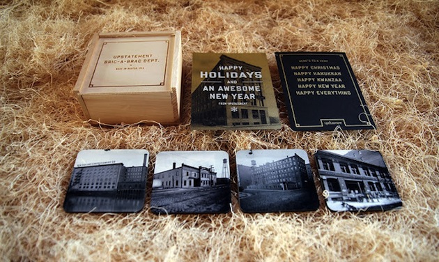

Images via Packaging of the World
The Upstatement Holiday Gift box is an inspiring, personalized take on a simple holiday gift box. The Boston-based Upstatement agency milled, sawed, and cut 100 gift boxes for family, friends, and clients. They then filled the boxes with sets of screen printed cards and coasters, featuring images from Boston’s Fort Point neighborhood at the turn of the century.
Colors: black and navy blue on natural materials (wood, paper).

This post was authored by NoD staff. Notes on Design is a design industry blog sponsored by Sessions College for Professional Design.


 Design Interview: Resistenza
 Minimalist Portfolio Themes for 2018
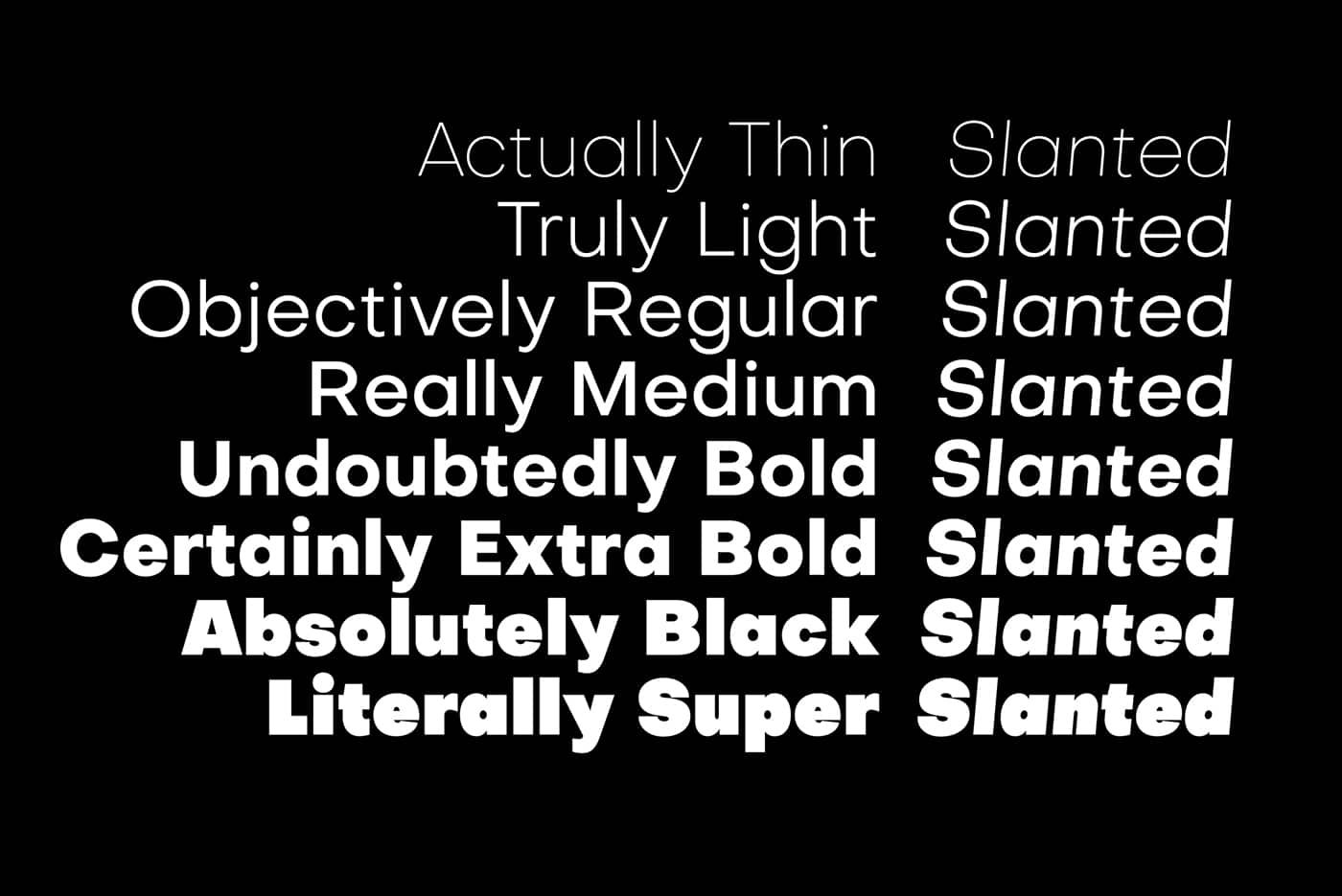 Free Font Friday: Objective
NoD Newsletter
Enhance your inbox with our weekly newsletter.