Visual Hierarchy: Key UX Principles That Drive Results

Imagine you just designed a sleek new webpage. You’re proud of your layout, until the first batch of usage data rolls in. Users are bouncing in seconds and heatmaps dart like they’re lost in a maze. You sweat bullets thinking about your next client call. Where will your next mortgage payment come from if you lose the account?
Great UX tells the eye where to go, what to see, and what to do next. It’s your bread, butter, and lifeblood.
Below, we’ll cut through the stack-up and lay out exactly how to make your designs impossible to ignore. As Jakob Nielsen would put it, the goal is clarity, not cleverness. Nail your visual hierarchy, and your designs will “just work.” Users will glide through your layout and remember it for all the right reasons.
There are key steps and tools great designers use to get there. You’ll find them all served up for you below.
IN THIS GUIDE:
What Is Visual Hierarchy in Design?
Principles of Visual Hierarchy
Equipment You Actually Need to Get Started
Where to Find Your First Freelance Clients
How to Build a Filmmaking Portfolio That Lands Gigs
What Is Visual Hierarchy in Design?
Visual hierarchy is the arrangement and presentation of elements in a way that clearly communicates their order of importance. In UX and UI design, it tells the user where to look first, what to do next, and what they can ignore. Visual hierarchy is the strategy behind visual communication.
Effective hierarchy smooths friction and gives your content rhythm. It leads the eye and makes decisions easier. It turns attention into action.
Designers use size, contrast, typography, placement, and spacing to create visual hierarchy. Tools like Figma let teams refine these elements together, while avoiding the dreaded “eye-candy trap” that sacrifices usability for aesthetics.
“Design is the conscious effort to impose a meaningful order.” — Victor Papanek

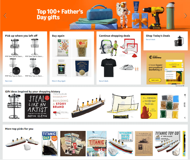
Visual Hierarchy at Amazon.com
Why Visual Hierarchy Can Make or Break UX
You load a webpage. There’s no visual order. No bold headline. No clear CTA. Your eyes wander, and then you click away. That’s design failure.
When layout lacks structure, it breeds design debt: an accumulation of small missteps that gradually erode UX clarity. Without deliberate laddering, even helpful content becomes unusable. Don Norman’s The Design of Everyday Things teaches us that our designs must guide the user, or confusion will.
Core Principles of Visual Hierarchy
Users form design opinions in just 50 milliseconds. That’s all it takes for a layout to succeed or fail. Visual hierarchy organizes attention and separates memorable designs from visual noise. Here’s how the core principles shape what users see first, and what they remember.
Size and Scale
Big gets noticed. Elements that are larger naturally draw the eye and signal importance. A large headline dominates, while a small disclaimer fades into the background. So, use scale intentionally. Don’t let the “CTA spotlight” shine on the wrong element. Pair big with small to build contrast and guide the flow.
Color and Contrast
Color creates emotion. Contrast creates clarity. High-contrast combinations help content pop, especially in accessible design. Think of it as contrast pop: a vibrant CTA button on a muted background is a guaranteed attention grabber. Use color theory to highlight action items, warnings, or key content without overwhelming the visual system.
Typography
Typography is both style and structure. Use headers, subheads, and body copy consistently to create a readable rhythm. Differentiating font size, weight, and case helps show the user what’s most important. Fonts like Helvetica offer legibility and neutrality. Good type choices make scanning effortless and reinforce your layout’s intent.
Whitespace
Whitespace makes designs feel more inviting while it guides the eye. It creates breathing room that reduces cognitive load. Generous padding around content and between elements builds a sense of clarity. Whitespace wizardry is especially important in mobile-first design, where space is at a premium.
Position and Alignment
Users tend to scan in predictable patterns, like the Z-pattern layout on desktops or the F-pattern in dense content. Leverage these scanning behaviors with smart positioning. Place key messages “above the fold,” align content in clean columns, and avoid visual drift. Good alignment builds trust and makes layouts intuitive.
Repetition and Patterns
Repetition reinforces recognition. Consistently repeating styles, icons, or layouts strengthens understanding and speeds up navigation. Patterns create expectation. And when patterns break—with intention—they grab attention. Avoid component creep, where reused UI parts lose distinctiveness and blur your hierarchy’s structure.
Visual Hierarchy Examples: Good vs. Bad
Imagine it’s two years from now. You just redesigned a landing page for a small e-commerce brand after users repeatedly skipped the promo code CTA. The old version buried it in a block of body text, near the footer. You used some “hierarchy heroing”—enlarging the CTA, giving it a strong contrast pop, and placing it above the fold. A week later, click-through rates jumped by 28%.
| Design Element | Bad Example | Good Example | Why It Works |
| CTA Placement | Footer, same size as body text | Top-right, bright button | High pixel priority, stands out fast |
| Typography Hierarchy | All caps, all bold | Clear levels: H1 > H2 > body | Easy scan and comprehension |
| White Space | Cramped text blocks | Ample padding around elements | Reduces overwhelm, improves clarity |
| Visual Flow | Random image-text mix | Follows a Z-pattern | Aligns with natural Z-scan zone |
Tools That Help You Create Visual Hierarchy
Design clarity feels like magic when the right tools are in your hands. With today’s software, what once took hours of hierarchy hustle can now happen in minutes.
- Figma: The go-to tool for collaborative layout design. Smart guides, spacing tools, and plug-ins help fine-tune your visual structure fast.
- Adobe XD: Great for prototyping with dynamic interactions and layering, helping you test hierarchy in real-time.
- EyeQuant: Uses AI and heatmaps to predict where users will look first—no guesswork required.
- UXPin: Combines wireframing with logic and interactivity, ideal for testing layout flow and prioritizing key content.
- Awwwards UI Kit Library: An inspirational database of award-winning UX/UI patterns to spark ideas when you’re stuck.
- Contrast Ratio Checker (WebAIM): Helps your colors pass accessibility thresholds and your “click magnets” really pop.
How to Test Your Visual Hierarchy
Your eyes aren’t enough to test your design. You know your layout too well, and your brain fills in gaps your users won’t. That’s why real-world testing is essential.
- Eye-tracking heatmaps: Reveal where users actually look first. What you think is your top element might be getting ignored.
- A/B testing: Test different layout versions to see which one drives more clicks, scrolls, or signups. Actual behavior trumps gut feeling.
- User interviews: Quick 5-minute sessions can uncover whether your hierarchy communicates clearly. Ask, “What stood out first?”
- First-click tests: Let users perform tasks and analyze their initial tap or click. If it’s off-mark, your pixel priority is off.
- Figma prototypes + feedback: Use commenting tools to see where users get lost and where they engage.
Steve Krug nailed it: Don’t make me think. Testing makes sure your hierarchy speaks instantly.
Common Mistakes That Kill Visual Flow
She was a solid mid-level designer with glowing Awwwards inspiration boards. But her new landing page tanked. Bounce rates spiked and engagement cratered. The culprit? Visual gridlock. Her layout was stunning, but it failed to guide the eye. Here’s how even seasoned pros get stuck, and how to fix it.
Overusing Bold Colors
A dashboard with six different saturated button styles looks urgent, but it feels chaotic. Bright colors everywhere turn every element into a click magnet, making nothing feel prioritized.
Fix it: Limit bright hues to CTA buttons only. Use a neutral base and lean on color theory to direct attention purposefully.
Misaligned Elements
One icon just slightly out of line. A CTA drifting a few pixels too far right. Misalignment kills flow and creates visual tension.
Fix it: Use Figma’s smart guides or apply a 12-column grid system to keep spacing consistent and hierarchy clean.
Inconsistent Spacing
When paddings vary and margins shift between sections, users subconsciously disengage. It feels sloppy even when the design is polished.
Fix it: Establish spacing tokens in your design system. Adopt Material Design spacing guidelines for intuitive rhythm and clarity.
Competing Focal Points
Two headlines, three images, and a glowing CTA, all yelling for attention. That’s not design. That’s noise.
Fix it: Choose one hero. Apply Z-pattern layout thinking to guide users naturally from top-left to bottom-right, one step at a time.
Ignoring Mobile Hierarchy
A beautiful desktop layout that collapses into a mess on mobile loses users in seconds. Buttons shrink. Text wraps. Tap targets disappear.
Fix it: Design for mobile first. Use responsive design principles to maintain visual order across screen sizes.
Visual Hierarchy by Platform (Web, Mobile, App)
Designing for a phone isn’t the same as designing for a desktop. Different platforms have different rules of engagement. What works on a 27-inch monitor may fall apart on a 6-inch screen. To maintain clarity and usability adapt your visual hierarchy to the context.
Here’s how hierarchy shifts across platforms:
| Web/Desktop | Mobile | Apps | |
| Layout Flow | Horizontal scanning (Z-pattern, F-pattern) | Vertical scrolling with stacked content | Vertical flow with simplified navigation |
| CTA Placement | Top-right or near hero image | Bottom of screen within thumb zone | Persistent bottom nav bar with sticky nav savior |
| Whitespace | Ample margins and padding | Condensed but clear—avoids crowding | Balanced for clarity and efficiency |
| Tap Targets | Not a concern | Crucial—must be at least 48×48 px for usability | Highly interactive—big, bold tap targets |
| Typography | More flexibility with font sizes and spacing | Simplified hierarchy to fit screen width | Prioritized readability over style |
| Image Hierarchy | Large hero images for visual storytelling | Smaller visuals, focused on performance | App icons and small visuals must be instantly recognizable |
| Navigation | Top bar, sidebar, and breadcrumb options | Hamburger menu or sticky bottom nav | Tabs, swipe gestures, context menus |
Responsive design is non-negotiable. Tools like Adobe XD make it easy to preview layouts on multiple screen sizes and adjust hierarchy without starting from scratch.
Best Practices for B2B and B2C UX
A SaaS onboarding flow may get rave reviews thanks to a clean layout, CTA ladder, and not a pixel wasted. Meanwhile, an ecommerce homepage on Dribbble could go viral for stacking product cards in a crisp hierarchy. Both designs thrive because they respect how their audiences think and click.
Here’s how B2B and B2C UX differ and how to design for each:
| B2B Best Practice | B2C Best Practice | |
| Visual Tone | Professional, minimal, trust-focused | Bold, emotional, experience-driven |
| CTA Strategy | Step-by-step ladder with clear conversion paths | One strong click magnet per screen |
| Content Density | More detailed—includes charts, use cases, testimonials | Light and visual—benefits over features |
| Hierarchy Style | Grid-based layouts, strong typographic clarity | Large hero images, playful type and color choices |
| White Space Use | High—used to signal credibility and focus | Moderate—supports scannability without slowing flow |
| Navigation Flow | Logical, predictable, aligned with decision-making stages | Fast, scrollable, intuitive with thumb-first access |
Quick-Reference Hierarchy Checklist
You’ve tweaked the layout and polished the visuals. Now lock in your hierarchy. Use this checklist to make sure your design grabs attention and flows intuitively. It’s your last defense against layout fatigue before launch.
- Headline size: Bold and clear. Establishes priority and scanability.
- CTA visibility: CTA buttons must pop. They’re placed logically and easy to find.
- Spacing and padding: Use consistent white space for clean grouping and readability.
- Visual grouping: Related elements should be visually connected using proximity and alignment.
- Image weight: Hero image should support—not overshadow—the message.
- Layout pattern: Follow Z-pattern layout or F-layout depending on content type.
- Contrast ratio: Text and background should meet accessibility standards.
- Responsive hierarchy: Test on mobile and desktop for clarity across devices.
- Grid alignment: Use grid systems to anchor content structure and rhythm.
- Visual balance: Avoid overcrowding or excessive whitespace. Aim for harmony.
Learn Visual Hierarchy and Design Principles
Done right, visual hierarchy feels effortless, but its impact is Brad-Frost-level. It transforms clutter into clarity, guiding users like the Nike Swoosh. Every CTA button and every heading serves a purpose: to direct, not decorate. With the right structure, you’ll hold attention, drive action, and leave a lasting impression.
Ready to build IDEO-class design skills? Explore these Sessions.edu courses:
- Web Design Certificate: Build responsive, accessible sites with a focus on layout, navigation, and usability.
- Graphic Design Certificate: Master composition, typography, and visual storytelling across digital and print.
- Advanced Web Design: Learn UX/UI design, interactivity, and advanced hierarchy techniques.
- Digital Design Masterclass: Elevate your skills with pro-level projects and portfolio development.
- Graphic Design Certificate: Build visual foundations in layout, typography, and digital design.
- BFA in Graphic Design: A full degree program that blends creativity, strategy, and portfolio development.

Tom Gerencer writes and edits in the fields of education, design, science, tech, business, healthcare, and the outdoors. He has written over 1,500 high-traffic articles, web pages, and ebooks with more than 70 million readers worldwide. Read more articles by Tom.
RELATED ARTICLES:
SESSIONS NEWS:
ENROLL IN AN ONLINE PROGRAM AT SESSIONS COLLEGE:


