Color Calculator
Color Wheel
Color Palette Generator
Whether you’re designing a logo or painting your guest room, choosing colors can be frustrating. Where do you start? Which colors work together, and why? How can you go from theory to using themes and tools to get the job done?
Use the free Color Calculator to try different colors for your project. Choose your base color(s) and color harmony to create a color palette. You’ll get a color chart with hex, RGB, and CMYK color values and see your colors applied to design samples. You’ll be able to immediately evaluate your color choices against real-world design examples. Adjust, share, print, rinse, and repeat. For an explanation of color harmonies (including complementary colors and monochromatic color schemes) continue reading past ‘How to Use the Color Wheel’.
How to Use the Color Wheel
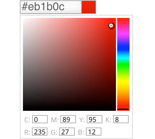
1. Pick a Color
Click the first field (where it says #ffffff) to open the color picker. Then click the square and drag the dot to select a hue (such as red, violet, or blue). Drag it right and left to adjust saturation or up and down to adjust value.
If you know the hexadecimal, RGB, or CMYK values for your base color, enter them in the fields. Click plus to add up to three base colors.

2. Choose a Harmony
Choose one of six color combinations to work with your starting color. Click the color harmony symbol to complete the color scheme.
There are 6 types of color harmonies (complimentary, monochromatic, analogous, triadic, tetradic, and split complementary colors). We use the color wheel (also called a color palette calculator) to find working color combinations, harmonies, or schemes that create beautiful color palettes.
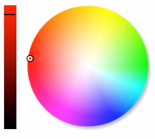
3. See Results
The colors in your harmony will display in the color calculator swatches and on the interactive color wheel picker.
Tweak these by selecting and comparing different harmonies, viewing the same harmony with different colors, adjusting saturation or value, or adding additional input colors. Click Clear All to start over with a fresh color palette.

Like what you see? Click Get Color Scheme to see a color report. Then use the color scheme generator to print or save the hexadecimal, RGB, and CMYK colors for your web or other projects.
See your swatch applied to design samples. Print the page, save it as a PDF, share it with friends and family. It’s a colorful world.
ON THIS PAGE:
RESOURCES:

Winter Whites Palette Inspiration
The Dynamics of the Analogous Color Scheme

Software Secrets: Lab Color

Color Feel: Citron Yellow

Must-Learn Apps for Designers & Creatives: Beginner’s Guide
Sessions College – Color Theory: Video Tutorial
Learn How to Use the Color Wheel
What is the Color Wheel?
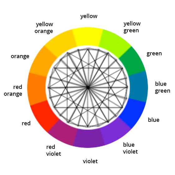
The color wheel is a chart that represents the relationships between colors. Artists and designers use it to choose sets of colors that work well together. It typically includes primary colors (red, yellow, and blue), secondary colors, and tertiary colors. Sir Isaac Newton first created it in 1666.
Newton’s colour wheel serves many purposes today. Painters use it to choose colors to mix. Designers use it to pick colors for their projects. The classic color wheel arranges hues in a circle, connected by lines or shapes. Secondary colors are created by mixing primary colors. For example, mixing red and yellow creates orange. Mixing yellow and blue creates green.
Colors in the color wheel:
- Primary colors: Red, yellow, blue
- Secondary colors: Orange, green, violet
- Tertiary colors: Yellow green, blue green, blue violet, red violet, red orange, yellow orange
Color Theory: Build Color Schemes
Designers often start a project by creating a color scheme. That’s a set of colors that will work well together for a client, task, or project. You can start from scratch, but generally you’ll start with one or two base colors, then build the other colors around them. Learn more about color harmony and color schemes in our guide: Intro to Color Harmony and in our online color theory course: Color Theory 4017.
Use Color Harmony to Create Color Themes
How to choose colors that really work? Use the color wheel (also called a color calculator) to find working color combinations. The color harmonies below are based on geometric relationships on the color wheel. That’s why we show them as shapes. Rotate the shapes around the central point of the color wheel picker to create limitless color combinations. Then export them with the color palette generator.

Complementary color schemes use two opposite colors on the color wheel, like blue and orange for high contrast.

Monochromatic color schemes use three different values of the same color, like light, medium, and dark blue.

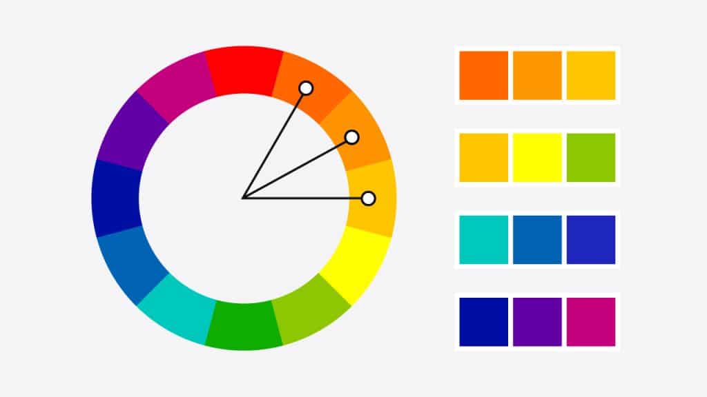
Analogous color schemes use three adjacent colors on the color wheel, like red, orange, and yellow to add harmony.

Split complements use a color and the two adjacent tertiary colors of its complement, like green, red-orange, and red-violet.

Triadic color schemes use three evenly spaced colors on the color wheel, like red, yellow, and blue.

Tetradic color schemes use two complementary pairs like red and green for dynamic designs.
Choose the Right Colors
Be creative and experiment to find the right color palette for your project. Bear in mind that color is very psychological, and different color harmonies produce different effects. For example, analogous colors are similar in hue, creating a smooth transition from one color to the next. Complementary colors are opposite to each other on the color wheel picker, so they create strong contrast. Monochromatic color schemes can be subtle and sophisticated.
Experiment with different harmonies to achieve the desired mood or effect.
Learn more about analogous colors in our guide: The Dynamics of the Analogous Color Scheme

In this magazine spread from Martha Stewart magazine, for example, an analogous color scheme creates a gentle transition from yellow to yellow-green to green. It’s pleasing to the eye.
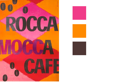
In this color scheme, the pinks and oranges are the lightest values, contrasting with the dark lettering.
Adjust Color Value and Saturation
Once you’ve selected your colors, you may want to adjust the value of a specific color or colors—how light or dark the color is. You can also adjust its saturation—how rich it is. Each hue on the online color wheel has a different value. Yellow, for example, is lighter than blue.
To increase contrast in your color scheme, you may need to adjust the value of a color—by making a yellow darker or lighter, say. Or perhaps adjust the saturation to vary its intensity. You can make both changes with the color wheel.
Color Palettes
Think of a color palette as your design’s foundation—it sets the tone and ties everything together. Start with a color you love, then use the color wheel picker to find others that work well with it. Maybe you pair it with its opposite for bold contrast, or stick to neighboring colors for a softer look. A good palette has a mix of light, medium, and dark shades. This adds contrast, balance, and the flexibility to play around. Tools like Adobe Color or Coolors can help you create one in minutes. Don’t overthink it—experiment until it feels right for your project.
Layering Colors
Layering colors is like adding personality to your design. Start with a base color from the color theory wheel. Next, add lighter shades for highlights or darker ones for depth. Want to take it up a notch? Try layering with colors that are next to your base on the wheel for a smooth, blended effect. Or use a complementary color for a pop that grabs attention. If you’re working digitally, tweak the opacity to soften things up. Layering doesn’t just add depth—it’s a chance to play and discover how colors work together in unexpected ways. Learn more about layering colors in our guide: The Art of Layering Color and Images.
Level Up Your Design Skills with Our Expert-Led Online Programs
Sessions College offers a range of flexible, online programs designed to help you build the skills you need for a successful creative career.

DEGREE PROGRAM
Bachelor’s Degree (BFA)
120 credits • 4 year degree program

DEGREE PROGRAM
Associate Degree
72 credits • 2 year degree program

CERTIFICATE PROGRAM
Undergraduate Certificate
24 credits • 8 month program

CERTIFICATE PROGRAM
Professional Certificate
Continuing education • Flexible, 9 months or less