5 Key Elements of an Effective Eblast

Creative business tips to kickstart your career as an artist, designer, or content creator.
Email marketing campaigns are a key way for businesses today to promote themselves. As a Web designer, you’ll find your work in demand if you know how to design a truly great eblast for your clients. Outlined here are some key elements of effective emarketing designs.
Everything Important Must Be At the Top
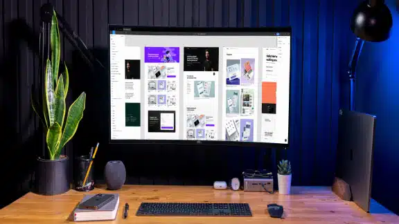
Email design is kind of like web design, since its screen-based and customers are viewing it on computer or phone. Like with web design, it’s important to make sure all the important content is at the top of the email so there isn’t too much scrolling.
What is important content? First and foremost important content includes any call-to-action. Examples include details about a 20% off sale, an event invitation, or links to a survey. You need this information high up in the design so you can immediately engage the viewer so they don’t click out of the email.
In addition to having any call-to-action high up in the design you should also have links to their online presence. A logo that links to their site, a navigation bar similar to their website, and social media links are all content elements to seriously consider keeping right at the top of the email.

Everlane Email Design
Balance Text with Imagery
You want your email to be informative and in the case of e-newsletters, educational, however you don’t want it to be too wordy either. Keep the copy concise and to the point. If you want to tell a longer story, include links to sections of your website where you might have a full biography of new team members or the company brand story, for instance.
You want to balance the text with the imagery pretty evenly. So, you want to not overdo the design either. Remember, this is something that is going to people’s emails and many will be looking at it on their phone. The design should be visually interesting but not too overdone, since it can appear cluttered within an email app or on someone’s phone.

Starbucks Email Design
Plan for Plain HTML, Web-Safe Fonts and No Images
Many email clients still do not support the rainbow of font options found in Google fonts, so plan your emails so that they support plain web-safe fonts like Verdana, Arial or Palatino. If you use an email marketing application like Mailchimp they make it easy for you to design with Google fonts but also with the ability to default back to plain web-safe fonts.
Make sure all the images have Alt tags as well, since mail clients sometimes have images turned off. If you have a promotional message in an image, the message will be lost if the Alt tags are not added that include a plain text version of the promotional message.
Make the Subject Line Sing
Make the subject line sing, or just make it something that appeals to people. Write it in a creative way and an active voice. Ask them a question. Tell them you have something really great. Thank them for something. Keep it concise, clear and snappy.
Avoid words that are flagged as spam in people’s inbox, like “FREE” or “NOW.”
Don’t make the subject line manipulative or showy in a way that is obtrusive or disrespectful. Don’t tell people they will regret not clicking or that it is urgent that they click the email.
It’s possible to add the person’s name to the subject line, to make it more personal, but think twice about doing that as it can seem disingenuous especially if you don’t know your customers well.
Keep the Layout Simple
The layout for an eblast should be fairly simple because it already is being viewed from within an app or on a phone, so there is less screen real estate to work with in the design. Keep the design about 600 pixels wide and no more than two columns of content. Use background colors to differentiate different content areas.

Simple, Effective Email Design
If you want the design to appear to have a more interesting layout consider creative typographic designs in a call-to-action graphic. Combine text and image in this layout in unexpected ways, break up text graphically or use it on a diagonal.
One lesser known fact about eblasts is they are very conducive to using animated gifs. Fashion and bespoke brands have recently started to make their entire eblast as a short animated GIF. It’s a visually effective approach and you don’t have to worry about how it may display differently in different email clients.
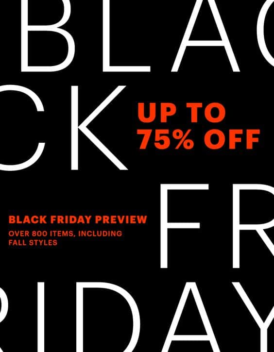
Typographic Email Layout
If you want the design to appear to have a more interesting layout consider creative typographic designs in a call-to-action graphic. Combine text and image in this layout in unexpected ways, break up text graphically or use it on a diagonal.
One lesser known fact about eblasts is they are very conducive to using animated gifs. Fashion and bespoke brands have recently started to make their entire eblast as a short animated GIF. It’s a visually effective approach and you don’t have to worry about how it may display differently in different email clients.

Margaret Penney is an experienced Brand Designer and Art Director as well as a teacher, designer, writer, and new media artist and Founder and Principal Designer of The Design Craft and 9& Studio.Read more articles by Margaret.
RELATED ARTICLES:


SESSIONS NEWS:

ENROLL IN AN ONLINE PROGRAM AT SESSIONS COLLEGE: