5 Chrome Extensions for Designers

Creative business tips to kickstart your career as an artist, designer, or content creator.
If you’re a web designer, chances are that a bit of additional design-focused functionality to your chrome browser would be a welcome addition. Whether you’re studying the aesthetic of someone else’s site or testing the functionality of your own, here’s a list of five Chrome extensions you might find useful.
Page Ruler
Page Ruler allows you to overlay guides without leaving your browser, so you can see the exact width and height of any element on the page. When you inspect the code of a site, you’re able to see the sizes of its various elements and their context within the layout, but if you want to really dissect a layout’s proportions, that might require a 3rd-party software like Photoshop.
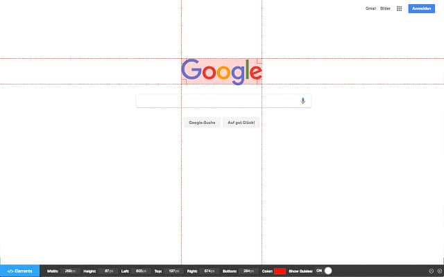
This is a great tool for dissecting sites to reveal their hidden design systems of proportion and hierarchy. You can find Page Ruler here.
SVG Grabber
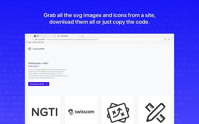
SVG grabber makes sourcing company logos and various other SVG assets a breeze. Rather than scouring the web to find the perfect logo to update your list of clients, simply navigate to their site, and let this extension take it from there. It lets you download all the SVGs from a site en masse. Maybe you’ll even find a few surprises. You can grab SVG Grabber here.
Colorzilla
ColorZilla is the go-to extension for any sort of web-based color analysis. It boasts a range of features including a color picker, a gradient generator, and a webpage color analyzer which generates a palette based on the site of your choice. It functions just like the color picker tool in Photoshop and even copies your sampled colors to your clipboard.
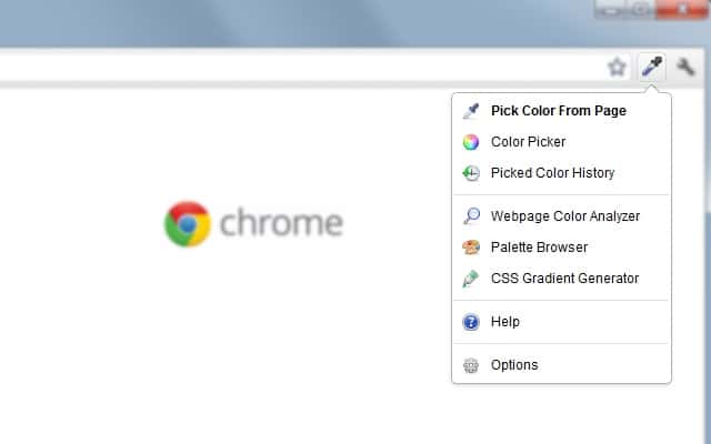
It’s Swiss Army knife of color. You can find it here.
Whatfont
WhatFont allows you to determine a webfont’s name, style, weight, and color, all by simply hovering over the type with your cursor. It’s a great tool for studying different font pairings and how typographic hierarchies work within the context of a site.
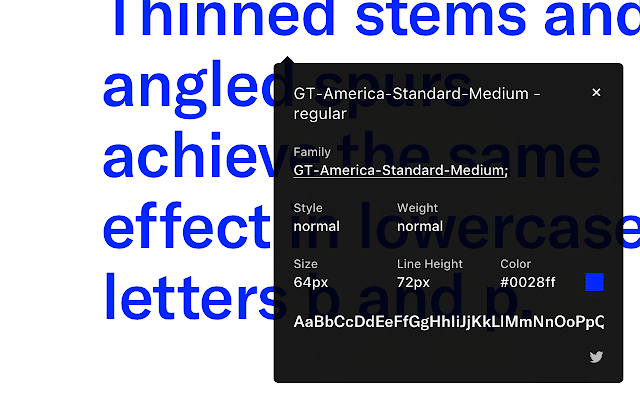
You can find WhatFont here.
Window Resizer
Window Resizer allows users to quickly resize their browser window to match that of a range of mobile devices. You can pick from a preset list of common screen dimensions, or add your own. It’s great for quickly testing a site’s responsiveness.
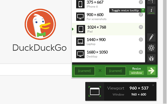
You can find Window Resizer here.
Even if you aren’t a web designer, you may be able to find some utility with these tools. Make sure to check them out via the links above.

Taylor is a concept artist, graphic designer, illustrator, and Design Lead at Weirdsleep, a channel for visual identity and social media content. Read more articles by Taylor.
RELATED ARTICLES:
SESSIONS NEWS:
ENROLL IN AN ONLINE PROGRAM AT SESSIONS COLLEGE:


