The History of Graphic Design: A Designer’s Guide
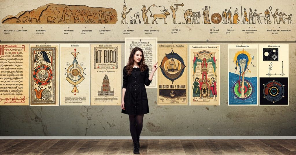
You’re hunched over your screen in the middle of a crunch, nudging type by fractions and picking colors like your 4K monitor depends on it. You’re not just pushing pixels. You’re crafting something that might land your first gig, fan, or client. But your inner chatter nags: Does this make me a real designer?
Below, we’ll trace the fingerprints of giants like Paul Rand, who made corporate logos iconic. You’ll see how Bauhaus and Swiss Design built the grid systems you use in Figma without thinking. And most importantly, you’ll learn how every scroll-stopping trend is rooted in something older, deeper, and much more intentional.
Because to design well now, you need to know your roots.
What Is Graphic Design?

Graphic design is the art of communicating through layout, typography, color, and branding. It translates ideas into visuals that inform, inspire, or persuade. You might see it on a billboard, app screen, album cover, or in an Instagram Story. It’s as old as Lascaux and as pervasive as the web.
Designers use structure (layout), emotion (color), voice (typography), and identity (branding) to control the way people see and feel about a message. Whether you’re choosing a font for your band’s poster or building a pitch deck, you’re shaping perception.
The building blocks matter. Learning the anatomy of type and how to avoid a kerning crisis helps your text read clean. Understanding contrast and spacing keeps your layouts from grid-lock. Knowing how color affects mood makes your work more powerful.
Great designers like Massimo Vignelli believed you could do more with less. He turned the chaotic New York City Subway into a masterpiece of minimalism and order. That’s graphic design at its best: solving complex problems with elegant solutions.
Why Design History Still Shapes Your Work
Design doesn’t live in a vacuum. It builds on decades of breakthroughs. The tools and styles you use today are built on design revolutions.
| Era | Key Movements | Lasting Impacts |
| 1920s–30s | Bauhaus | Grids, sans-serif fonts, utility-first design |
| 1950s–70s | Swiss Design | White space, Helvetica, corporate minimalism |
| 1980s–90s | Postmodernism | Layered effects, expressive typography, mass design tools |
| 2000s–10s | Flat Design | Icons, flat interfaces, mobile UX clarity |
| 2020s–Now | Brutalism | Scroll-stoppers, raw type, rebellious aesthetics |
Bauhaus

Born from chaos after World War I, Bauhaus taught us to strip away ornament. The Bauhaus grid is baked into Figma templates, UI cards, and minimalist branding. It’s the DNA of every clean landing page you’ve ever admired.
- Use it today: Stick to grid-based layouts. Limit your color story to two hues. Prioritize form that follows function.
- Try this: Fonts like Futura or Avenir; black, red, and neutral tones.
Swiss Design
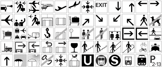
Swiss Design refined Bauhaus principles and gave us what we now call The Grid System: a clean, logical approach that made Helvetica a household name. Today, it’s why smart logos breathe with white space and apps feel crisp on any screen. Thank the white space warriors who built the grid.
- Use it today: Embrace white space. Align type with precision. Ditch decorative fonts.
- Try this: Helvetica, Univers; crisp black-and-white palettes with a single bold accent.
Postmodernism
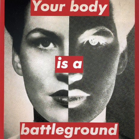
Designers like David Carson shattered the grid with chaotic layers and expressive typography. His ’90s layouts for Ray Gun magazine made “font fail” look intentional. You’ll see his legacy in brutalist web design and even TikTok memes.
- Use it today: Layer elements. Break the grid. Add textural overlays to evoke retro grit.
- Try this: Fonts like OCR-A, Impact, or distressed type; glitch-inspired palettes.
Flat Design

As smartphones took over and Web 2.0 matured, design had to adapt. Gone were the shadows and textures of skeuomorphism. Flat design was faster, cleaner, and easier to code. Icons were the new hieroglyphs. Layout clarity was essential. Every mobile-first UI you swipe today comes from this shift.
- Use it today: Design mobile-first. Keep elements clean and clickable. Use iconography over words.
- Try this: San Francisco, Roboto; soft gradients or bold flat colors.
Brutalism
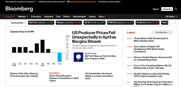
Brutalist design’s raw layouts are inspired by architectural brutalism. Brutalist websites might look broken on purpose, yet you can’t stop scrolling. They just feel more honest. You’ll see brutalism in Gen Z portfolios, underground brand sites, and social visuals. When everything looks perfect, imperfection stands out.
- Use it today: Ditch polish. Use raw type. Make it scroll-stopping, weird, and human.
- Try this: Neue Haas Grotesk, bespoke type; unfiltered colors or hand-drawn elements.
Graphic Design’s Analog Roots
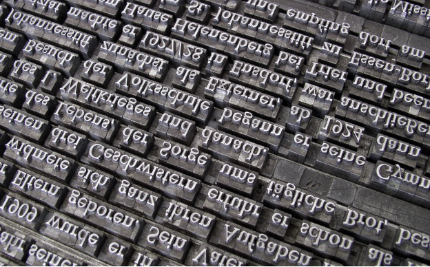
Imagine it’s 1977. You just saw Star Wars for the first time. Now you’re at a bus stop with your illustration board under one arm, and a bulky T-square dangles from your fingers. You spent most of the day setting type by hand. Before there were pixels to push, there was physical craft. And every curve and letter had to be right the first time.
The Tools Shaped the Rules
Pre-digital workflows were slow and unforgiving. You couldn’t hit undo. That’s why The Grid System was gospel. It kept layouts clean, especially when every crop mark had to be drawn in blue pencil. These constraints gave us some of design’s most enduring principles.
Designers worked in grids, rulers, and paste-ups. They didn’t download fonts. They ordered them as sheets of Letraset, or hand-drew them with stencils. They cut images, resized by hand, and glued things into place. And don’t even talk about the Pantone panic that hit when print colors didn’t match your proofs.
From Analog to Bitmap
The Macintosh showed up in 1984, along with Susan Kare’s new bitmap icons. Her simple, pixel-perfect graphics—like the Happy Mac and paint bucket—turned physical design digital. She made skeuomorphic ideas intuitive long before the word existed.
Today’s tools like Adobe Creative Suite and Figma owe a debt to this analog start. Today’s grid obsession traces back to a time when design was less about style and more about sweat.
Ancient History and the Printing Revolution
Print isn’t dead. It’s hiding in plain sight. The digital tools you use today are built on the logic of ink, paper, and press. Font choices, layout grids, and scroll-stopping ads all carry the DNA of a 500-year-old medium.
| Year | Milestone | Design Impact |
| 1440 | Gutenberg invents movable type | Type is standardized. Reading spreads. Typography becomes power. |
| 1700s–1800s | Posters and early advertising rise | Visual hierarchy emerges. Lettering meets layout. |
| 1900s | Mass branding takes over | Logos, color systems, and design consistency go mainstream. |
| Now | Print principles rule digital spaces | Web fonts, bleeding the margins, and grid-based UI dominate. |
Print’s Ghost Lives on in Your Pixels
When you design a hero banner, you’re using the same structure that once organized French posters in the 1800s. When you adjust a font’s tracking, you mimic hand typesetting, where slivers of lead kept spacing even. When you export for screen or print, you race the clock just like paste-up artists with X-Acto knives.
Typography still dominates, and readability is king. Books like Just My Type by Simon Garfield remind us that even the fonts we default to are soaked in personality and history.
Print didn’t vanish. It evolved. It’s baked into every dropdown menu, clean margin, and single-line logo. If you’re using digital tools like Figma or Adobe Creative Suite, you’re part of a lineage that started with Gutenberg and never stopped.
Design Heroes You Should Know

Portrait of Paul Rand
You don’t have to worship every designer, but you should know who built the grid. Today’s clean logos and experimental layouts didn’t come out of a hat. They were built by visionaries who worked for clientzillas just like you do. Between their coffee breaks, they rewrote the rules of the craft. Here are five you’ll want in your creative quiver.
- Paul Rand: He made logos smart by branding IBM, UPS, and ABC with visuals that still feel modern. Your deck design owes him its grid.
- Saul Bass: He turned film titles and posters into emotional previews and showed that motion graphics and static visuals can make us feel.
- Susan Kare: She gave the original Macintosh its face, and did UI design before Figma was a glimmer in Dylan Field’s eye.
- Massimo Vignelli: His New York subway map and Helvetica-heavy layouts proved that Modernism isn’t boring.
- David Carson: He shattered the rulebook with messy, punk-inspired design that showed real personality.
These designers’ work lives on in every Behance project, Wacom sketch, or perfectly spaced headline you see.
Where Design Is Headed Next
Every time you open Dribbble, you’re stepping into a jungle of design history. You’ll see AI brutalism and glitch art pastel gradients. Your perfectly gridded layout suddenly feels like it came from another era. That’s not a bad thing. It means design is still evolving. Here’s how to make that work in your favor.
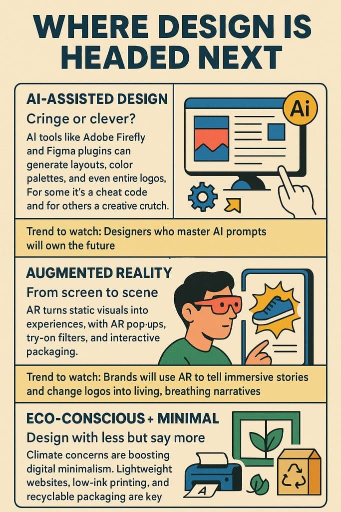
AI-Assisted Design
Cringe or clever? AI tools like Adobe Firefly and Figma plugins can generate layouts, color palettes, and even entire logos. For some it’s a cheat code and for others a creative crutch. Some say that designers who master AI prompts will own the future.
Augmented Reality
From screen to scene. AR turns static visuals into experiences, with AR pop-up ads, try-on filters, and interactive packaging. In the next few years, brands will use AR to tell immersive stories and change logos into living, breathing narratives.
Eco-Conscious + Minimal
Design with less but say more. Climate concerns are boosting digital minimalism. Lightweight websites, low-ink printing, and recyclable packaging are back in style. Trend-watchers predict sustainable aesthetics with functionality, like Bauhaus with green tech.
Learn More With Sessions
Design is shaped by Modernism, challenged by Postmodernism, and still echoing with Bauhaus. Every decision you make—from fonts to layouts—has a legacy. By studying where design has been, you’ll create with more intention. You’ll build smarter and present better.
Next, sharpen your skills with training that goes deeper than Pinterest boards and typography anatomy charts. Sessions.edu offers classes and programs built for today’s designers.
- Typography Course: Study how to choose, set, and design with fonts.
- Graphic Design Degree Program: Earn an accredited associate or bachelor’s degree in visual design principles, software, and portfolio development.
- Logo Design Courses. Create brand systems with logos, type, and color that work on print and digital platforms.
- Digital Media Degree Program: Learn motion graphics, web design, and multimedia tools for modern digital design.
Whether you’re building a portfolio or breaking into the industry, these courses and programs can help you create with purpose—and context.

Tom Gerencer writes and edits in the fields of education, design, science, tech, business, healthcare, and the outdoors. He has written over 1,500 high-traffic articles, web pages, and ebooks with more than 70 million readers worldwide. Read more articles by Tom.
ENROLL IN AN ONLINE PROGRAM AT SESSIONS COLLEGE:


