
5 Controversial Logo Redesigns
For large companies and multinational corporations, rebranding can be a slippery slope. Design trends change with time, so logos often need to be revisited to keep a company’s brand fresh. Because a good logo is so iconic, companies must strike a balance between contemporizing their brand while staying true to the original design.
The following are 5 logo redesigns that divided audiences and stirred up no shortage of controversy.
Tropicana
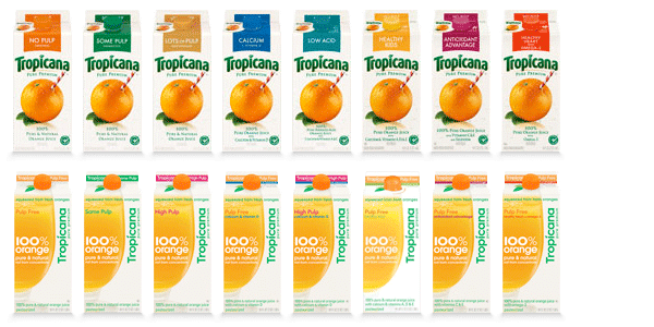
Classic Tropicana cartons pictured in the first row. Redesigned cartons pictured below. (Image via astuteo)
In 2009, Tropicana gave their recognizable orange juice cartons a full-body makeover. Though the white background color of the cartons didn’t change, the rest of the design marked a drastic change in the packaging Tropicana fans had come to know and love.
The iconic “sippable” orange was removed in favor of a flattened design, which was meant to convey the simplicity and purity of the brand. Unfortunately, because customers could no longer spot the familiar packaging on the shelves, Tropicana sales plummeted by 20%. Tropicana eventually caved to customer backlash and reverted back to the original design.
University of California
![]()
University seal on the left. Controversial UC logo on the right. (Image via AIGA)
A few years ago, the University of California undertook a massive rebranding campaign, which included a new minimal, “modern” logo.
The monogram was created as an attempt to unify the UC system under a common brand, but it instead caused outrage in the UC community—and in the design community at large. Many students and alumni feared that the logo would replace the classic university seal, while others thought it was just plain ugly. Ultimately, the university agreed to suspend further use of the logo.
GAP
![]()
GAP’s classic square logo on the left, with the failed redesign on the right. (Image via 1stwebdesigner)
GAP’s 2010 logo redesign was so poorly received that the new logo was withdrawn in one week’s time. The redesigned logo was an odd mix: minimal Helvetica text paired with a blue square gradient in the upper right corner.
GAP responded to the criticism by returning to the former logo, but only after enduring lots of jokes at its expense. The controversy even inspired a 99designs contest to create a better GAP logo.
BP
![]()
BP’s old logo to the left, redesigned logo to the right. (Image via creativebloq)
Back in 2000, BP inspired a collective eyebrow raise with their $200m rebrand. The “Helios” logo (named after the Greek god of the sun) was meant to represent a sunny eye toward a greener future. But, the logo was met with heavy criticism.
Many people were upset by the implication that oil drilling was “green” energy. Though the initial upset died down, the 2010 Deepwater Horizon oil spill in the Gulf of Mexico brought the logo back into the spotlight. Greenpeace even sponsored a contest to redesign the Helios logo, with many not-so-favorable results.

The winning logo for the BP rebrand, designed by Laurent Hunziker. (Image via Greenpeace)
Starbucks
![]()
The simpler, redesigned Starbucks logo on the right. (Image via icscreative.com)
Sometimes, people just can’t handle change. The Starbucks 40th anniversary logo redesign is a great example of this phenomenon. The redesign was subtle, clean, and maintained all of the key features of its former iteration.
Though the new logo was still instantly recognizable, many people complained about the new design. Rather than cave to critics, Starbucks stuck with the design, which can now be seen around the world.


 Design Interview: Resistenza
 Minimalist Portfolio Themes for 2018
 Free Font Friday: Objective
NoD Newsletter
Enhance your inbox with our weekly newsletter.