Summerized and Julie Nolan: A Tale of Two Web Sites
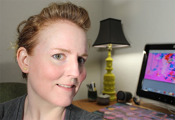
Margaret was recently called upon to create Web sites for two fabulous jewelry designers: Summer Powell and Julie Nolan, the former an innovative 3D designer, the latter a mainstay of the Anthropologie jewelry collection. Here is an interview with Margaret about her experience designing http://www.summerized.com/ and http://www.julienolanjewelry.com/.
Q: These are two fantastic projects. How did your relationship with each client come about?
I’ve known Summer since 1998 when we worked at Delia’s Girls Clothing as designers, she was designing for their boy’s line Droog and I for their little girl’s site Dot Dot Dash. Around this time catalog companies and brick and mortar stores were just starting to create Web sites and e-commerce stores. It was a great time to be in New York as a dotcom designer.
I met Julie later in 2006 and in a very New York way: I rented her apartment in Chinatown when she was moving to a larger space in the boroughs with her boyfriend Pete from the Magik Markers. She introduced me to the landlord and helped me get a great deal, I will forever be indebted! Around that time she’d just started creating jewelry. I thought her work was very cool, and bought a bracelet with a periwinkle colored chain and a little brass bell that jangled ever so slightly when I walked.
Q: The two clients couldn’t be more different. How would you characterize the style of each artist?
Summer’s work is created using 3D printing and so the forms resemble wireframes come to life. The general feel is technological and futuristic, but her source designs created using CAD run the gamut in style from classic to Mod to figurative.
So you’ve got this interesting clash of elements and identities… a piece inspired by baroque jewelry also appears minimal and ethereal in a 3D printed form. A rock star “diamond ring” 3D printed has an entirely different edgy feel. I would describe her work as forward-thinking, synthetic, bold, and high-contrast.

Julie’s work is inspired by things like a Swiss constellation calendar from the 1900s, ancient geoglyphs of the Nazca desert, and vintage charms. The designs are created using materials like brass, bronze, silver and gold. She uses both traditional approaches to creating the hand-made designs and unusual ones like the “lost wax” technique to create castings from twigs found in a neighborhood park.

My sense is that each piece from Julie’s collection follows the idea that what you wear on you is a talisman or keepsake, something that identifies you or even protects you. An element of mystery and wonder encapsulates the design and each collection tells a story. I would describe her work as organic, mysterious, warm and inspired by the past.
Q: What design choices did you make to express the designer’s style and just as important, complement the work, since both sites have an e-commerce goal?
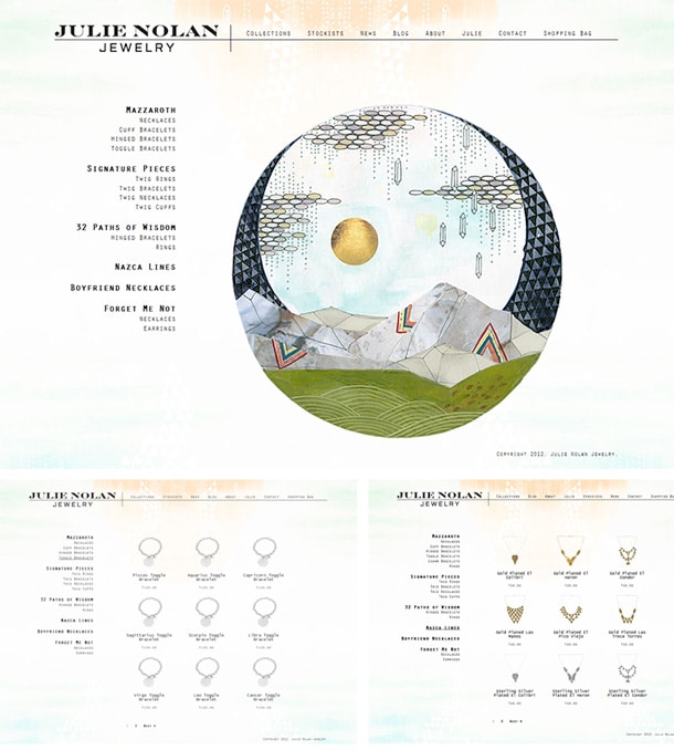
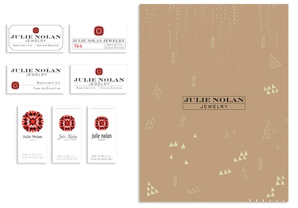
For Julie’s designs we started looking at archetypal pattern and forms in ancient art and design from divergent cultures from Morocco to Medieval Europe, we went through different ideas to come up with a logo design that is a complex star, with overlapping areas of color, brightness. The final design could be at home in a Sultan Suleyman era castle or Roman Hall, it’s culturally charged yet culturally non-denominational.
The typography for the logo is a modern revival of the Fell types. Other typography used was old engraver’s type mixed with a modern ‘computer’ type—to bring some visual contrast and make sure the design lives in both the past and present. The general shape forms in the design were more playful and mysterious, crystal shards spray down on a wash of colors, triangles weave in and out of pattern, the constellation dots create a map on a hang tag.
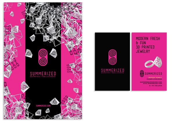
Summer’s design is quite bold and high contrast in color, black mixes with the most intense hot pink and citroen yellow. The typography is very of-the-moment and tends to have a rounded quality to match the logo mark Summer created. Summer’s logomark is inspired by sacred geometry and spirals in and out in an intricate ‘S’ shaped form. I brought in the shapes of Summer’s logomark as a patterning elements in the design and put together collages out of the jewelry to create visual interest.
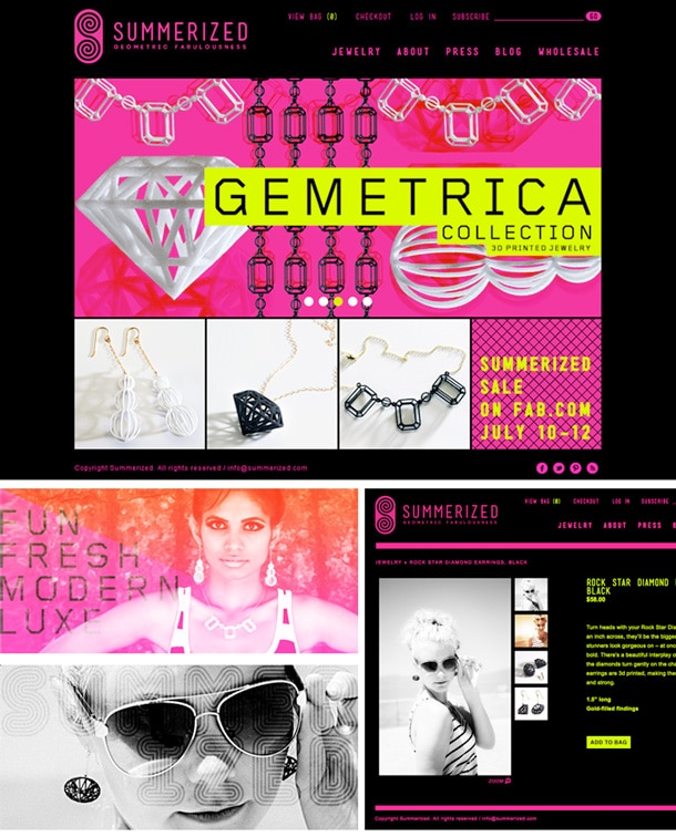
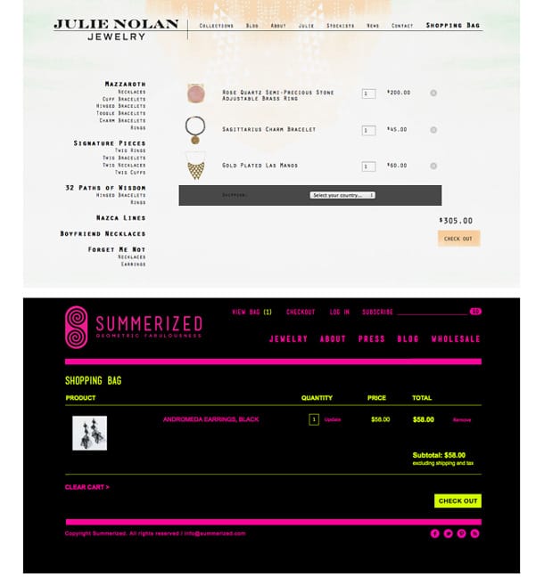
Most importantly, the Web design for each client exists to support the jewelry so a key element for both projects was to simply make sure the visual system supported the function of the site as an online store with clear information design that makes the purchasing process simple and painless.
Q: Did the clients each start out with a strong vision for their sites or did the design styles evolve as you worked with them?
Julie and Summer are both very talented creatives who are selling their own creative work, so they had ideas about what they liked and wanted. The goal of any design project is to amplify what your client wants and to hopefully exceed their expectations.
I start each project with a discovery where I gather all kinds of materials from the client, from everywhere, in order to totally inform myself. After that it’s a matter of translation, interpretation, and amplification.
Design evolves from piece to piece and morphs depending on the purpose and product being showcased, so there were changes in the design. Sometimes evolution can happen too quickly though so a key ingredient in building a visual system is also making sure it is consistent even as it grows and changes.
Q: What opportunities were there offer a more complete package for the client, by fulfilling other design needs such as logo, packaging, and so on?
For Julie, I work as her designer quite a bit. I designed the ID kit, line sheets, graphics for banners, website and hang tags. I am currently updating her site with a whole new product line, so we’ve been doing product photography over here as well. Summer had me collaborate with her on a postcard and business card in addition to the Web site. However, Summer is also a graphic designer so she creates her own materials too. I’m brought in where needed and when needed on a project by project basis.
Q: What were some major technical or production choices or challenges to overcome in each project?
I would say the key element in having a seamless development and production process is to make sure you understand the scope of the project and all the functionality requirements of the project from the start. You want to have a plan and you want it written down.
I didn’t have any major challenges with either of these projects because I made sure I understood the requirements and scope. My background as a coder makes it easier for me to translate a Web design into a Web site and hire the right people to help me. Still, you have to choose how the payments will get processed, what e-commerce environment to use, and how to host the site, and you need knowledge of what’s out there to make informed choices in this area.
Q: You’ve been working a lot with women business owners this year, helping them define their brand/online presence. That’s awesome. Do you see this as a trend—more and more women getting involved in online businesses?
I’m not sure if it’s gender-specific but I do definitely think that it’s easier for anyone interested in selling products via the Web to do so using something like WordPress, Big Cartel, or Shopify.
However, just because you can set up a store doesn’t mean that it looks like a real business. An entrepreneur needs help designing it so that it doesn’t look too DIY, too home-made. The cost of entry for e-commerce has gone down but the needs of the marketplace have remained the same for any entrepreneur—design is important. A cohesive and effective visual identity and system matters. A Web design is the first thing your customers are going to see in the online marketplace, so you better make it look good.
As well, these sites that make e-commerce easier don’t really make it easy, so a business owner will need help with site development regardless, just not as much help as they used to need when e-commerce was only for the Ebays and Amazons.
For more information about Margaret Penney’s work, visit the Hello Media site or her Sessions Faculty bio page. To view more gorgeous jewelry designs created by Summer Powell and Julie Nolan, visit Summerized.com and Julienolanjewelry.com.

Gordon Drummond is the President of a Sessions College, where he is Director of Instructional Design, among many roles. He's passionate about education, technology, and the arts, and likes to surround himself with more talented people.

