Alumni Patrick Rhodes Gets His Work Out There

Q: First of all, explain Cowork Memphis. Who are they, and what do they do?
Cowork Memphis is a shared working environment. People who work remotely, freelance, or are in a startup can come to work in a collaborative environment with like-minded individuals. Members pay a monthly fee to use the building and the services.
I am a member at Cowork Memphis, and when I first started coming here to do my work, my first thought was, “Where is all the art?” The walls were blank and the environment felt sterile. Creative professionals like to work in an interesting space — not something that resembles a doctor’s office. Therefore, I asked Cowork about their plans to decorate.
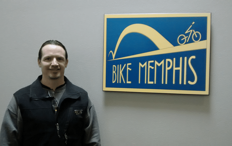
Cowork told me that they had made some efforts in the past to get art on the walls, but those attempts fell through. I mentioned I had some art that would probably work in this environment, so they told me to send it in so they could evaluate it. That same day, they replied and said they’d love to use my ‘Bike Memphis’ poster (the only piece I submitted).
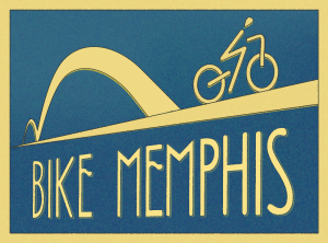 It’s now hanging prominently in the main space. You have to pass by it no matter where you go here, so it gets a lot of views. When people first see it, they just immediately like it. Viewers seem to like the grass roots feel of it, the straight-forward message and the style. It’s not over-the-top nor heavy-handed.
Q: Can you tell us more about the inspiration for your piece, and how you developed it in class?
The Bike Memphis poster was created in the Graphic Design II class taught by Andrew Shalat. Let me first say that Andrew is an excellent teacher; he was always helping us to flesh out our vision rather than pushing his vision upon us. I always felt inspired and free to be very creative in his classes.
The assignment was to create some sort of advocacy poster using classic composition principles like the “golden rectangle”. I wanted to create a poster for something that I’m passionate about: cycling. I raced bikes for many years and still ride regularly. Within the past few years, Memphis has seen large growth in the cycling community, so it seemed a good blending of ideas: Memphis and cycling.
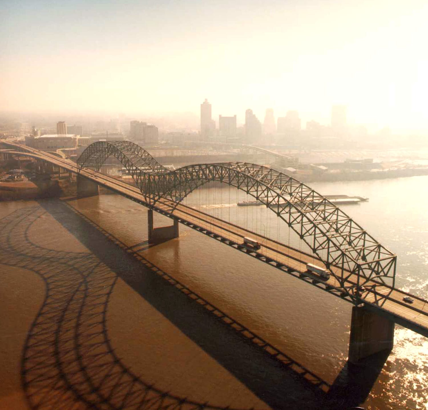
The Memphis bridge (aka the Hernando-Desoto bridge) looks like an ‘M’. It’s a very famous bridge around here and is used as a Memphis icon in all sorts of literature.
Since I’m a huge fan of vintage art (art deco, art nouveau, wpa, cubism, etc.), I designed the piece in that style. Memphis ‘grew up’ around that time, which is visible in local architecture.
Q: I understand that you had this professionally printed and mounted. Can you give us some details?
The Bike Memphis poster, when viewed on a computer, has a texture that implies a velvety feel. Therefore, I wanted the paper to have this feel as well. Standard paper wasn’t going to cut it. After extensive research, I decided upon rag paper, which is made from 100% cotton, that has a real texture when you touch it. The piece actually feels like what you’d expect while also having the bonus of great color depth.
The mounting is black sintra. I didn’t want to go with a framed piece, because there is framing drawn in the actual work. Therefore, there could be nothing surrounding the actual poster. Sintra is long-lasting, stiff and about 1/2 inch thick. They installed mounting hardware on the back, making it easy to mount on the wall.
Since the printed piece is 28″x21″, I had to make a couple of changes to the artwork (the original was only 1000 pixels wide). The texture, when blown up that big, was too much, so I reduced the effect. Further, to make sure it scaled perfectly, I created the image to be exactly 8400 pixels x 6300 pixels – the dimensions above prepped for 300 dpi. This way, when printed, there would be no algorithmic interpretation of the piece: it would print exactly as I saw it on my screen (which is how I realized the texture was too harsh at that scale). InDesign was the best tool to take my now-huge file and prep it for submission to the printer. It all worked pretty well!
Q: What have you learned from this experience in terms of getting out there with your artwork?
I’ve learned to be opportunistic. If I come across a situation where I can get my work out there, then I pursue it: right then, right there. The chance of getting my work seen is zero if I don’t try. Nobody knows I exist unless I keep marketing myself. In the coming weeks/months, I’ll be sending emails, making phone calls and *gasp* – actually walking into a place, to market my work where appropriate.
I’m also learning to give as much as I ask for. When on Twitter, for example, I retweet others’ posts that are meaningful, or help spread the word about other artwork, etc. It can’t just be me talking about myself – nobody wants to hear that. When talking with people, I’m sure to try and help them as well as receive help.
Of course, I just started getting myself out there. I’ll learn a lot more in the future.
Congratulations on having your work put up for display, Patrick. Thank you for sharing your experience!
You can see Patrick’s artwork on his Behance portfolio or read some of his writing on his own website.
Visit sessions.edu for more information on Degree Programs and Undergraduate Certificates at Sessions College. Make sure you request our latest catalog and check out Degree and Undergraduate Certificate admissions.

Sessions Staff is a restless soul who loves to share Campus News stories with current and prospective students.
 What Photoshop’s new AI Tools Mean for the Creative Community
 Gaining Confidence and Working with Clients
 How to Stand Out in UX Design