Graphic Giants: Herb Lubalin
In our Designer Profiles series, we profile groundbreaking 20th century designers who shaped today’s design industry.
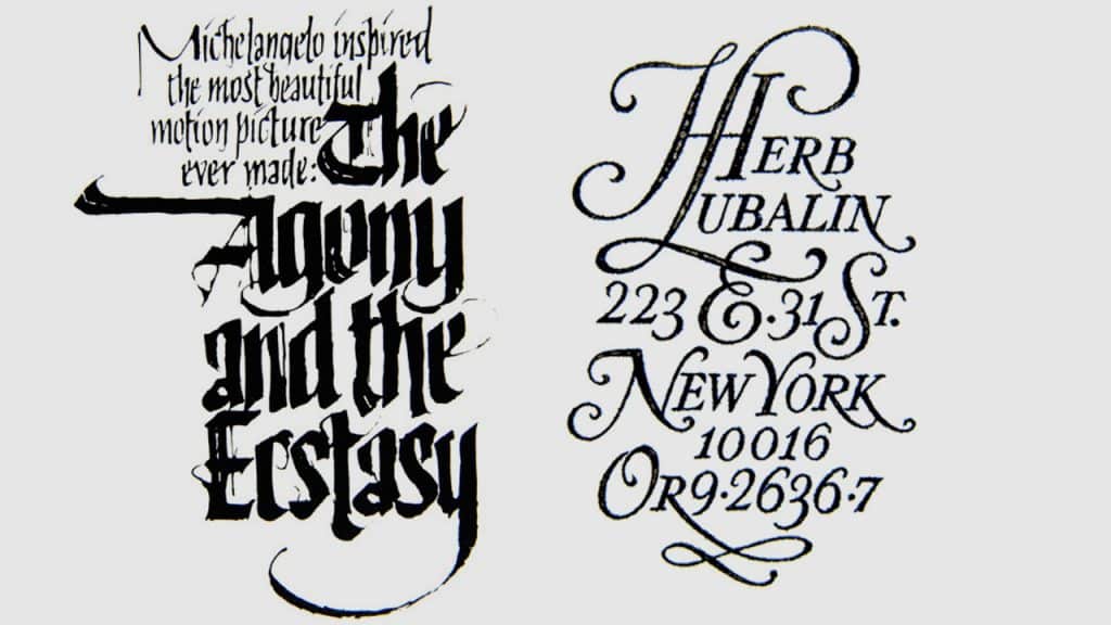
Herb Lubalin, remembered today for his expressive typography and as the founder of the International Typeface Corporation, was one of the most celebrated American graphic designers of the twentieth century. While the name Lubalin has come to be synonymous with a very particular, flourish-heavy aesthetic, Lubalin’s catalog of work as a designer is incredibly deep and varied, with a surprising number of marks and projects credited to his name.
Lubalin’s creative journey began at a young age, with his parents recognizing his artistic talents early on and encouraging his creative development. This would lead to Lubalin eventually enrolling at New York’s famed Cooper Union to study design upon graduating from high school. It was here that Lubalin would first discover the endless world of possibilities presented by typography, thus beginning his lifelong fascination with and exploration of the art form.
After completing his studies at Cooper Union, Lubalin began work as a graphic designer working mainly on advertising and branding projects. For the first five years post-school, Lubalin bounced around, struggling to find his footing in the design world before landing a job at Sudler & Hennessey, a relatively young design agency that was quickly becoming known for its head-turning approach to graphic communication.
It was there at Sudler & Hennessey that Lubalin was presented with the creative challenges that would help to develop his eye for layouts, refine his incredibly meticulous design methodology, and build the processes he would later employ in his own design practice—but only after first playing a pivotal role in propelling the firm to national acclaim and being named a partner.
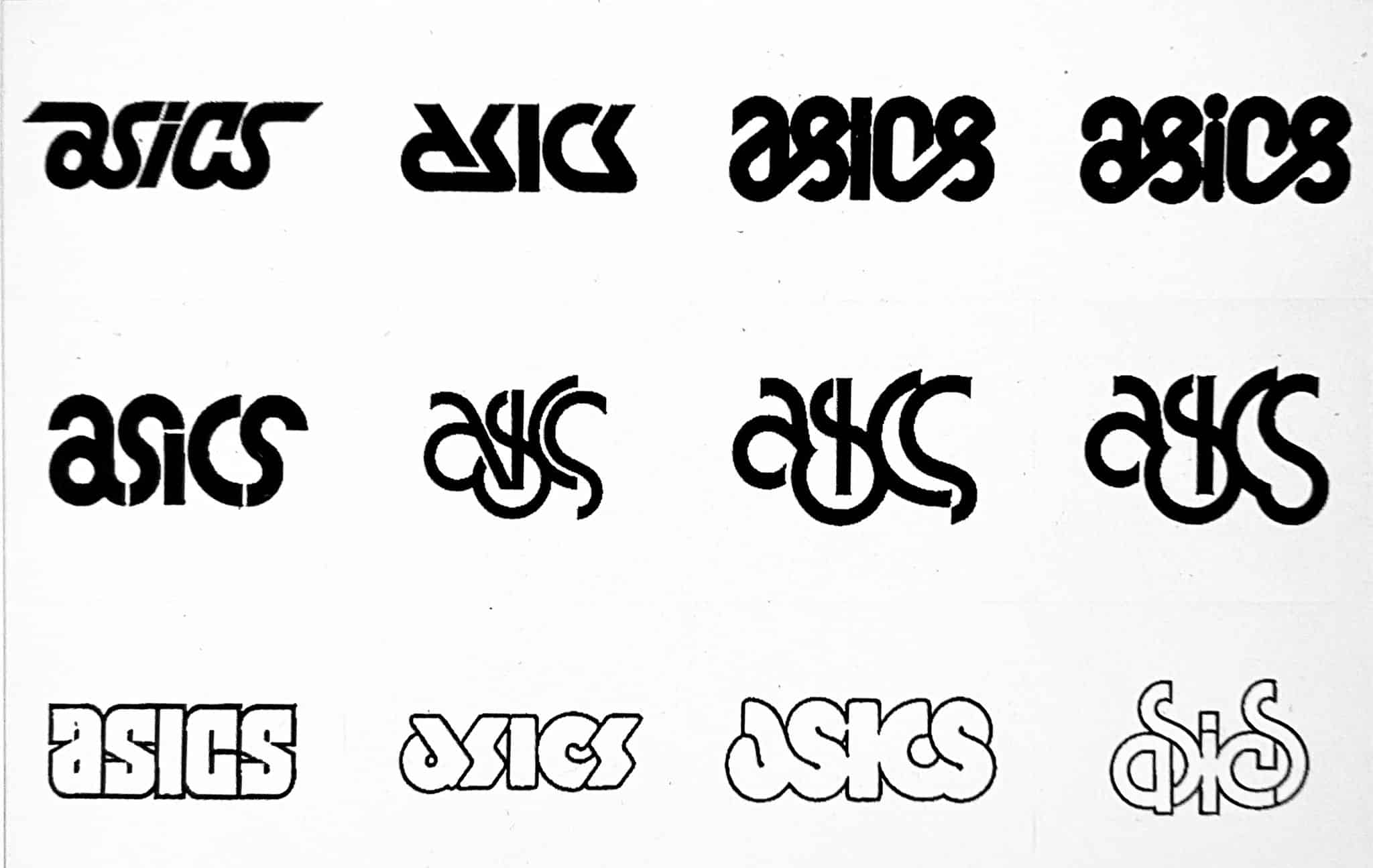
Lubalin’s obsession with finding new ways of conveying nuance and emotion through typography produced iconic typefaces that would come to define the look of the 70s. While today, the name Lubalin might conjure images of monograms and intricately woven letterforms heavily decorated with flourishes, Lubalin was an incredibly imaginative designer and approached each project with fresh eyes, aiming to craft an entirely unique solution for every client.
Despite having worked with a wide variety of clients in different industries, resulting in wildly different outcomes, there are some commonalities across the many wordmarks and logos he produced that give them the signature Lubalin touch. Lubalin was always looking for interesting ways of connecting letterforms—finding ways to create moments of interaction that would delight the viewer or serve to enhance or augment the messaging of the type itself.

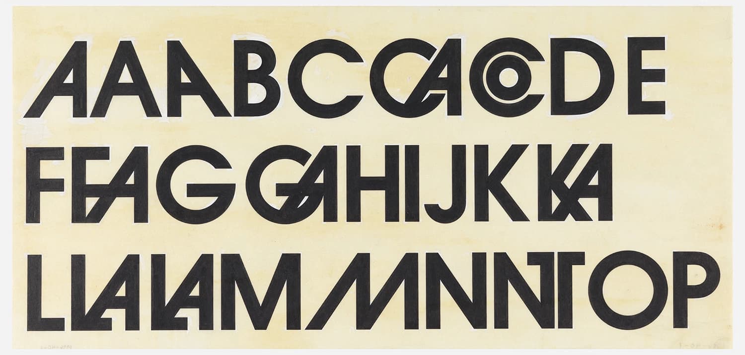
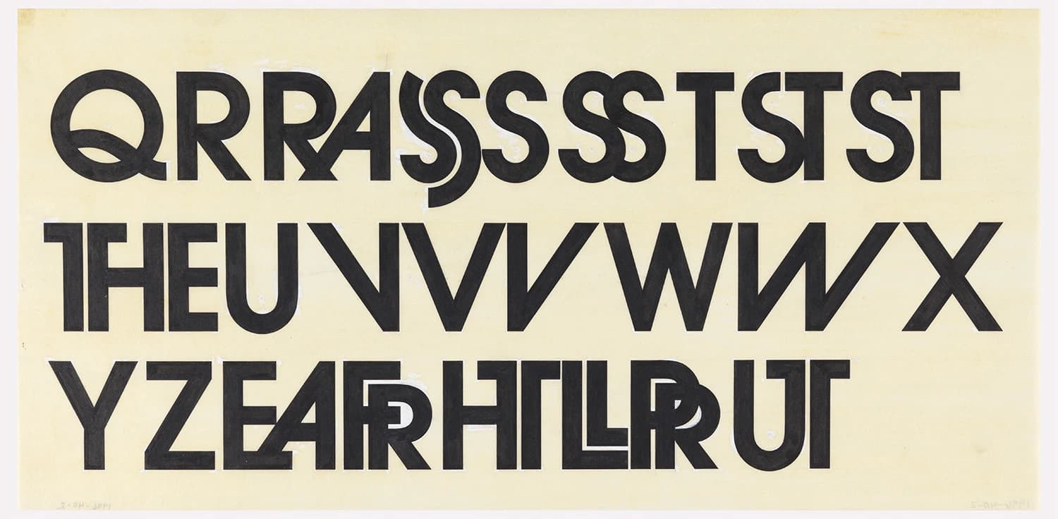
Perhaps one of the most iconic typefaces produced by ITC, and the one Lubalin is most celebrated for, is ITC Avant Garde Gothic.
Before it grew to be the ubiquitous typeface and symbol of the 70s we know it to be today, this bold, geometric work of art was originally created for Lubalin’s frequent collaborator, Ralph Ginzburg’s magazine of the same name. While Avant Garde, the magazine, would have a relatively short run—with its publication lasting just 3 years and ending with Ginzburg’s imprisonment over obscenity charges stemming from a prior Lubalin collaboration, Eros—the typeface bearing the same name would go on to become a cultural phenomenon, appearing on countless publications, record sleeves, logos, and movie posters throughout the 70s.
To this day, ITC Avant Garde remains one of the most popular typefaces in the ITC catalog, nearly 5 decades after its creation.
Taylor is a concept artist, graphic designer, illustrator, and Design Lead at Weirdsleep, a channel for visual identity and social media content. Read more articles by Taylor.
RELATED ARTICLES:
SESSIONS NEWS:
ENROLL IN AN ONLINE PROGRAM AT SESSIONS COLLEGE:
