Type in History: The Egyptian or Slab Serif
What makes type tick? Our Type in History series explores the origins of today’s typography trends.
In the early 1800s, when Napoleon returned from his three year expedition of Egypt all things Egyptian became the rage. The world was transfixed by cartouches, papyrus and the Pyramids. The type founders of the time chose to capitalize on the trend by naming their new font styles the Egyptian Hieroglyph Slab Serifs.
I suppose the base of a cartouche does in some ways resemble the slab of a slab serif—but really there was no such thing as this type style, at least not in Egypt.
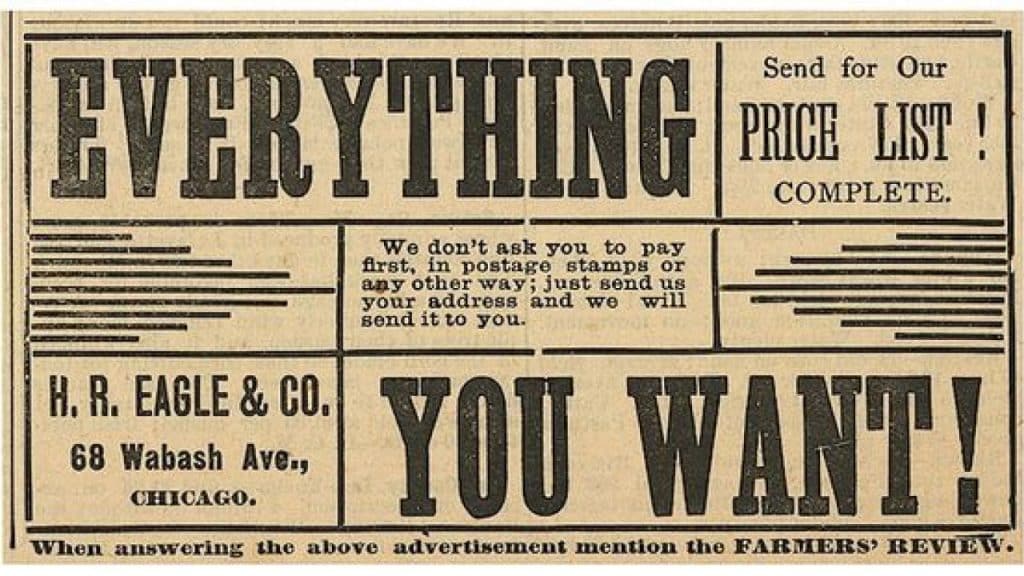
Regardless, the slab serif became quite popular, first in England, where it was the defacto type choice in advertising. The bold weighted letterforms could be seen on every kind of pamphlet, poster and billboard—so much so that when designers want to make a poster that looks vintage today they often choose a big slab serif.
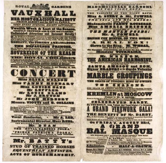
Vintage Vauxhall Playbill
The slab serif was also the first type style to be considered a display type. It wasn’t used for the small text, it was used for when you wanted to yell something loudly from a piece of paper. The slab serif had a lot of visual impact and in a post-industrial world becoming more built-up and crowded, it said “look at me” at just the right time.
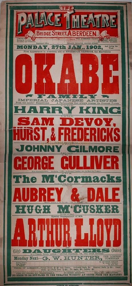
Vintage Palace Theater Playbill
For your retro poster projects, you could do worse than explore the attention-grabbing properties of slab serifs.

Margaret Penney is an experienced Brand Designer and Art Director as well as a teacher, designer, writer, and new media artist and Founder and Principal Designer of The Design Craft and 9& Studio.Read more articles by Margaret.
RELATED ARTICLES:
SESSIONS NEWS:
ENROLL IN AN ONLINE PROGRAM AT SESSIONS COLLEGE:


