Free Font Friday: Zen Dots

Our Free Font Friday series profiles the design characteristics of today’s free downloadable typefaces.
Zen Dots is a futuristic display typeface designed by Yoshimichi Ohira. Its letterforms are wide and stable, giving the text a long, leisurely read. They sport both rounded and sharp corners, which serve to rhythmically break and reinforce the type’s x-height.
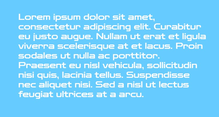
Despite some small counters, the type has great readability even at somewhat smaller sizes, making it a viable option for headlines.
Zen Dots has a strong sci-fi leaning and would do a great job of communicating a subtle sense of confidence to any tech-related project. It’s at once decorative and utilitarian.
Its letterforms don’t sport any unnecessary ornamentation, but at the same time have a strong presence that commands attention.
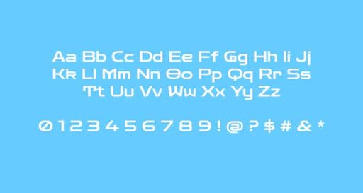
The stroke width is uniform and the type is very low contrast, but the uniformity of the strokes allows for some interesting design opportunities should you decide to use it for a wordmark. Many of the letterforms can be made to connect seamlessly right at the x-height.
Zen Dots has a strong character that limits your options in terms of pairings but makes for an excellent match with just about any geometric sans serif. Zen Dots is part of a 3-face family by the same name.
Zen Dots is available in a single weight and you can find it for free here.

Taylor is a concept artist, graphic designer, illustrator, and Design Lead at Weirdsleep, a channel for visual identity and social media content. Read more articles by Taylor.
ENROLL IN AN ONLINE PROGRAM AT SESSIONS COLLEGE:

