Graphic Giants: Neville Brody
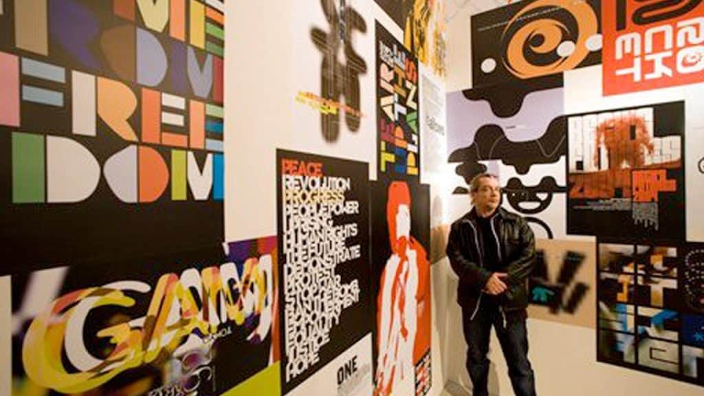
In our Designer Profiles series, we profile groundbreaking designers who shaped today’s design industry.
For anyone interested in graphic design over the last 40-something years, Neville Brody is a name to conjure with. A veritable rock star designer, Brody’s design practice has expanded well beyond his humble beginnings in his 20s designing show posters for local bands in the late 70s London punk scene into his current status as a leading light of design in the UK.
However humble his beginnings, as Brody began to find his voice as a designer—a unique mixture of typography and architecture influenced by Dadaism and Pop Art, others began to take notice, and not long after completing his 3-year graphic design program at the London College of Printing, Brody was offered the position of Art Director at Fetish Records. A new-on-the scene label, Fetish Records didn’t yet have a strongly-defined visual direction and served as the perfect testing ground for a young Brody to experiment and further develop his style.
The aesthetic of the label’s punk-adjacent, early electronic artists proved to be a great match for what Brody was doing visually at the time and the feedback loop created between the two propelled both forward, defining the aesthetics of this newly-developing scene.
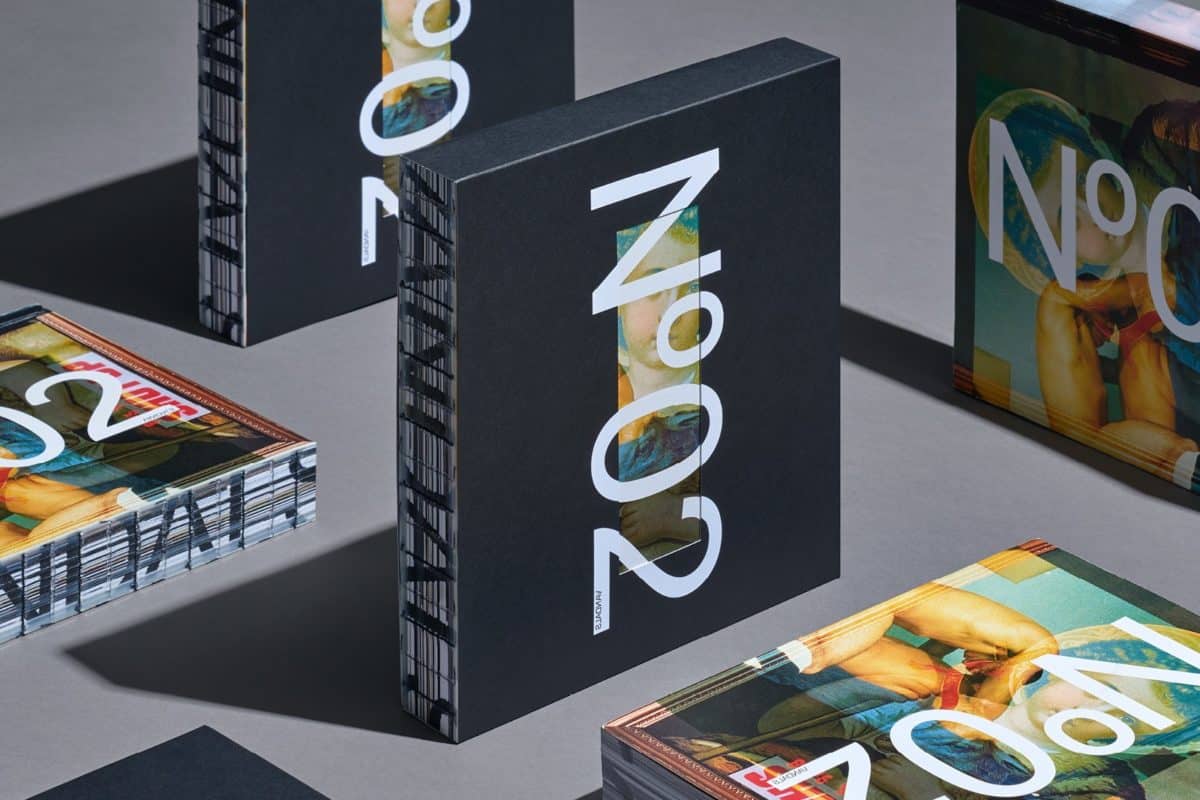
Source: Brody Associates
As Brody’s name became synonymous with everything exciting about early 80s independent British music, it wasn’t long before he was plucked from his position at Fetish Records and offered an even larger platform where he could really spread his wings.
In 1981, he became the art director of The Face magazine. No longer restricted to the confines of posters or record sleeves, Brody was able to explore typography and layout to his heart’s content. With an endless supply of exciting new artists to pull inspiration from, some of which would go on to become some of the world’s most legendary acts, Brody began to produce a body of work that would define a generation.
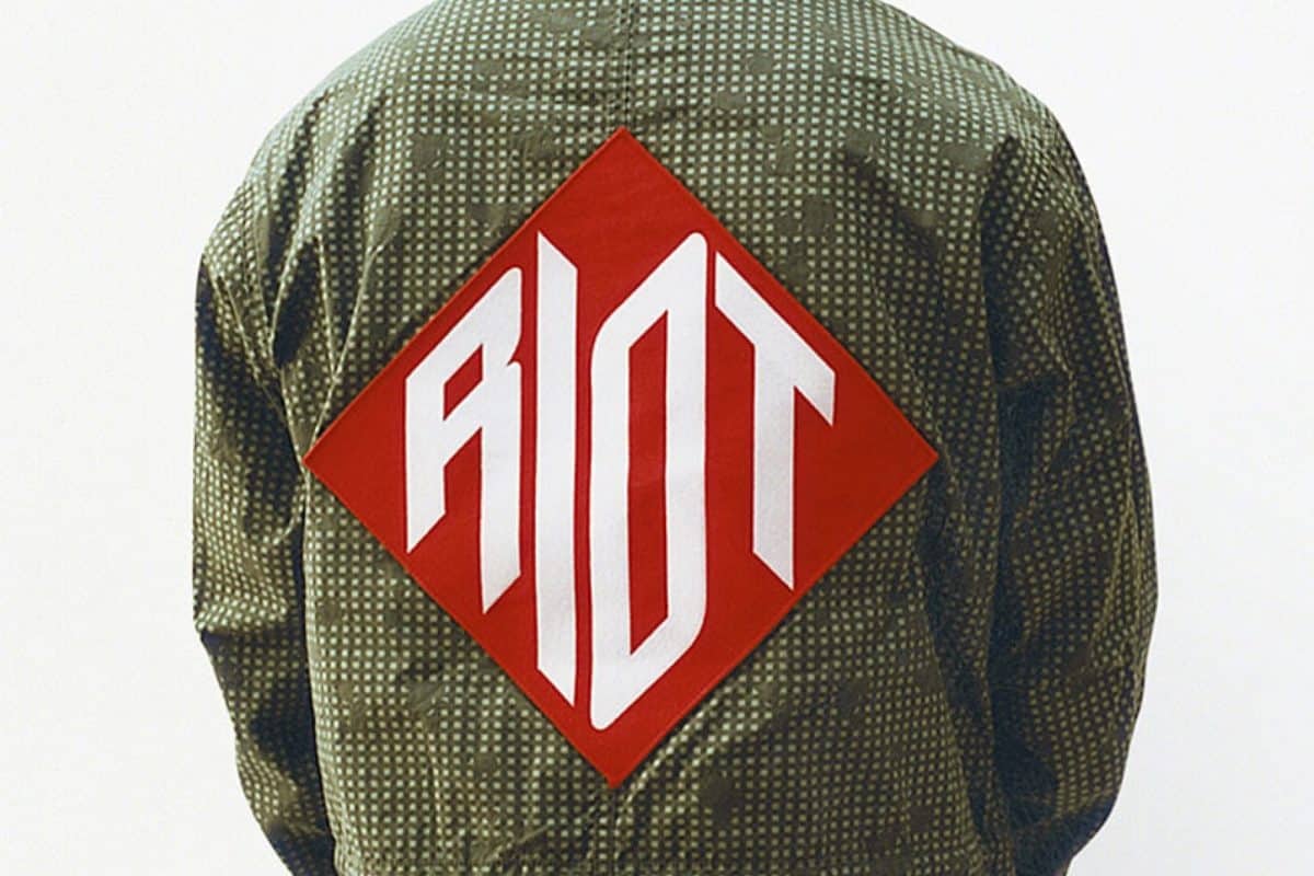
Source: Brody Associates
With each spread offering him a chance to try something new, and an all-star roster of artists to work with, each with their own unique aesthetic, the magazine covers and features Brody made during his time at The Face are just as varied as the acts they feature.
While there are certain visual cliches that come to mind when one thinks of the 80s, none of those are present here—not in the graphic design at least, the photos of the artists themselves are about as 80s as it gets. Brody’s design work, however, manages to effectively capture the gestalt of the era despite a noticeable absence of gradients, pastels, or wacky Memphis Milano-esque patterns.
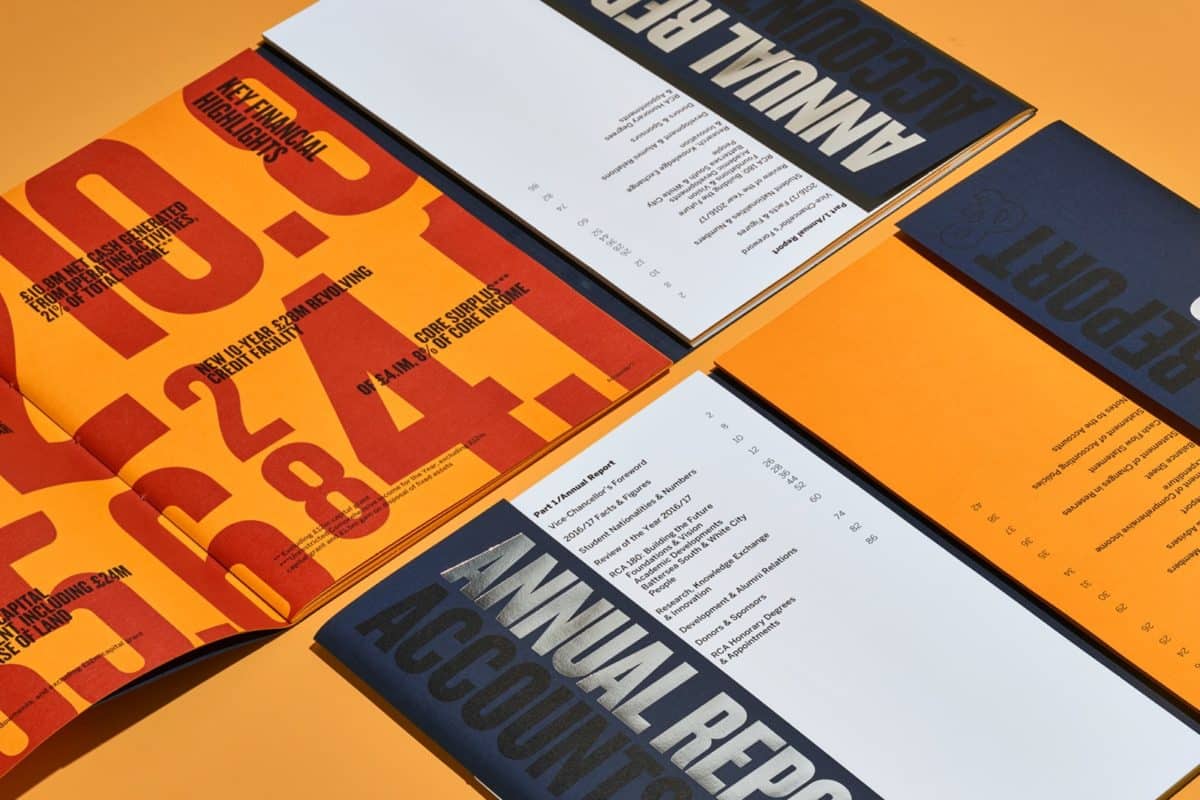
Source: Brody Associates
After his time at The Face, Brody would take on another art director role for the magazine Arena before venturing out on his own, establishing Neville Brody Studio, later renamed Research Studios. He has since worked with just about every major company you can think of, designing visual identities, and providing art direction for an international list of clients across a wide variety of industries.
Brody is also an accomplished type designer and co-founder of FontShop, an online font library and home to 18 of the font families Brody has made throughout his career. In addition to his continued work with Research Studios, and font design practice, Brody also teaches at the Royal College of Art as Professor of Communication where he heads the school’s visual communication program.
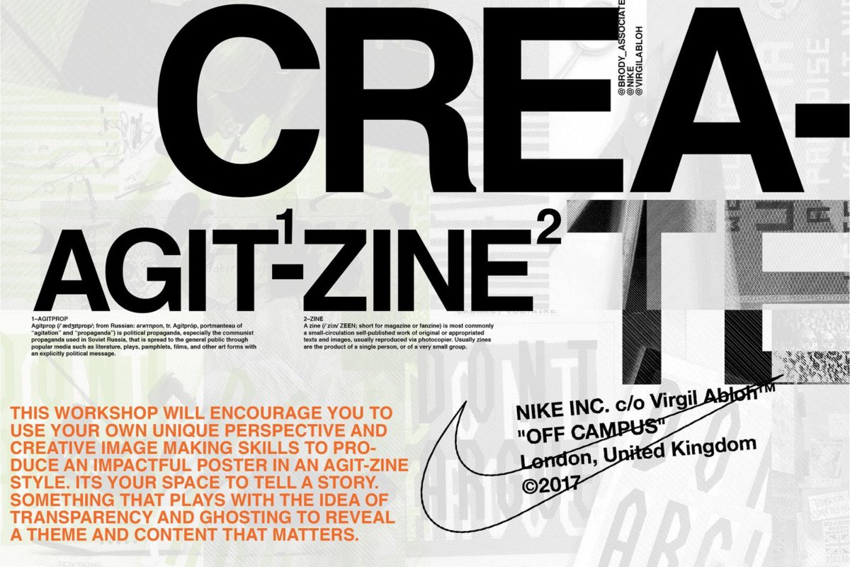
Source: Brody Associates, Header Image Source: Design Week
Taylor is a concept artist, graphic designer, illustrator, and Design Lead at Weirdsleep, a channel for visual identity and social media content. Read more articles by Taylor.
ENROLL IN AN ONLINE PROGRAM AT SESSIONS COLLEGE:


