Minimalist Packaging Design

Creative business tips to kickstart your career as an artist, designer, or content creator.
Minimalism seems to always return as a popular trend in packaging design. Packaging design is a key element of product branding so minimalist packaging’s lack of overt brand presence can make a real visual statement.
Designers who choose to implement this approach have to do so with care and precision since this route can appear unfinished or lacking in visual style if not done correctly. When it’s well executed, a “less is more” approach can appear quite spacious, peaceful, and elegant.
Some find a package design that lacks excess visual information or clutter really appealing. Consumers don’t necessarily want products on their bathroom shelves or in their cupboards that are loud and showy. A minimalist design with beautiful simple typography and a soft and subtle color palette can actually draws the eye.
The lack of visual brand message also speaks to the quality of the product as the deciding characteristic of its value. What elevates the product is itself and not a complex visual brand. Minimalism can represent a kind of brand purity.
Here are some examples of this trend that get it right.
M/F People
MF people, originally known for its genderless apparel, recently launched a new skincare line with a similar brand aesthetic. The skincare line consisting of face scrubs made from eco-friendly materials and vitamin C face serums housed in simple white bottles, tubes, and tubs. The design consists of a two-letter typographic logomark, fine black lines, and a supporting modern sans-serif font with wide letter-spacing.

The minimalist design appears quite austere and stylish primarily via the use of space. The minimalist aesthetic is a perfect choice for a brand that is unisex. A minimalist aesthetic also makes it easy to produce and ship new products quickly without a complex design cycle for each new shampoo or face wash.
Malin+Goetz
Malin & Goetz is another brand that does minimalism right. Their collection consists of products for face, body, hair, fragrances, candles, and also an apothecary line of vintage naturals like pumice stones and Alder texture powder.
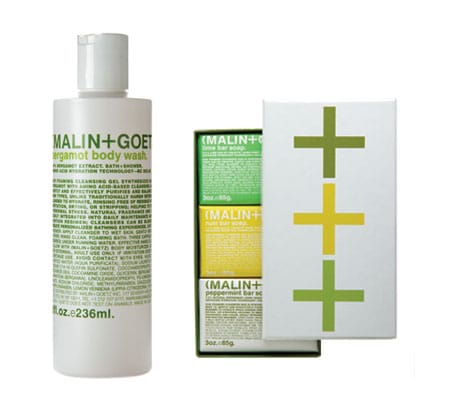
Malin & Goetz differ from MF people in that their design includes a lot of text information and is not so spacious. The type style is a clean geometric sans serif and much of the information they include showcases the premium quality ingredients of their products.
Herbivore
Herbivore is a popular botanicals company out of Seattle Washington started by a husband and wife team. The products are all natural, made from organic materials, and the packaging is recyclable and reusable. Herbivore’s minimalist aesthetic is spacious like M/F People and with fashionable type styling.
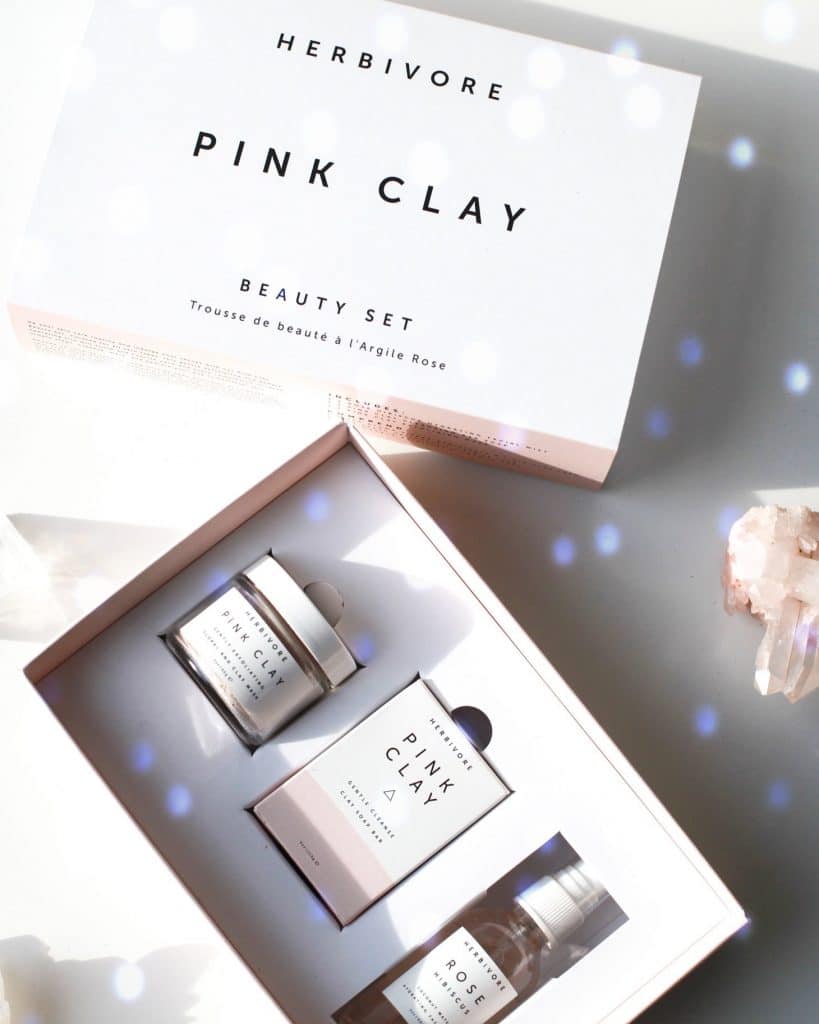

Herbivore does not forego color on their packaging but instead includes some pleasant pastel colors that emulate the soft tones of the products themselves.

Margaret Penney is an experienced Brand Designer and Art Director as well as a teacher, designer, writer, and new media artist and Founder and Principal Designer of The Design Craft and 9& Studio.Read more articles by Margaret.


ENROLL IN AN ONLINE PROGRAM AT SESSIONS COLLEGE: