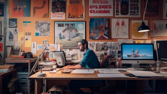


Career Resources
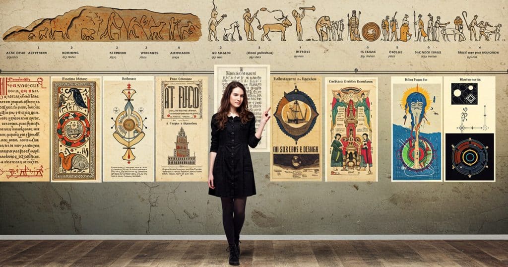
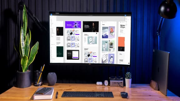
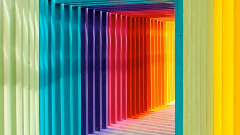
The History of Graphic Design: A Designer’s Guide
Trace the fingerprints of design giants in today’s design world.
June 12, 2025

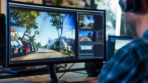
How to Become a Freelance Filmmaker Fast
Pro tips to get from A to Z as an independent filmmaker.
June 9, 2025
Featured Articles
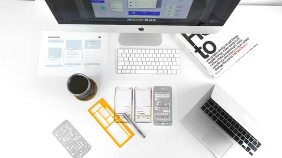
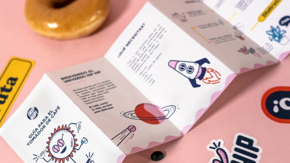
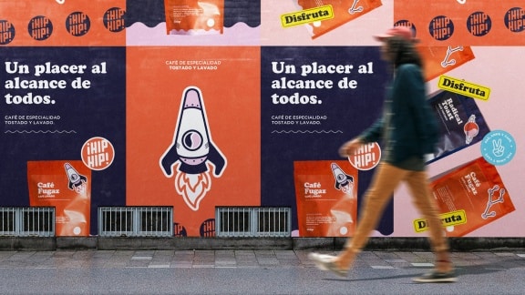
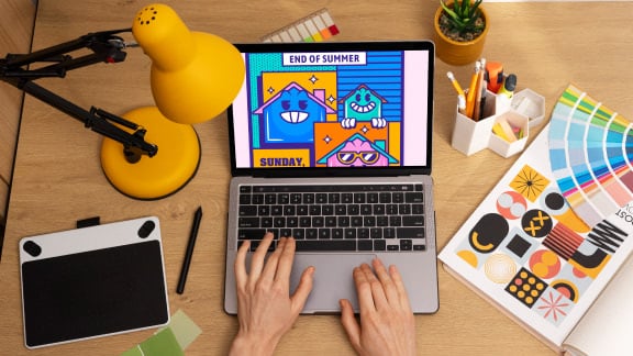
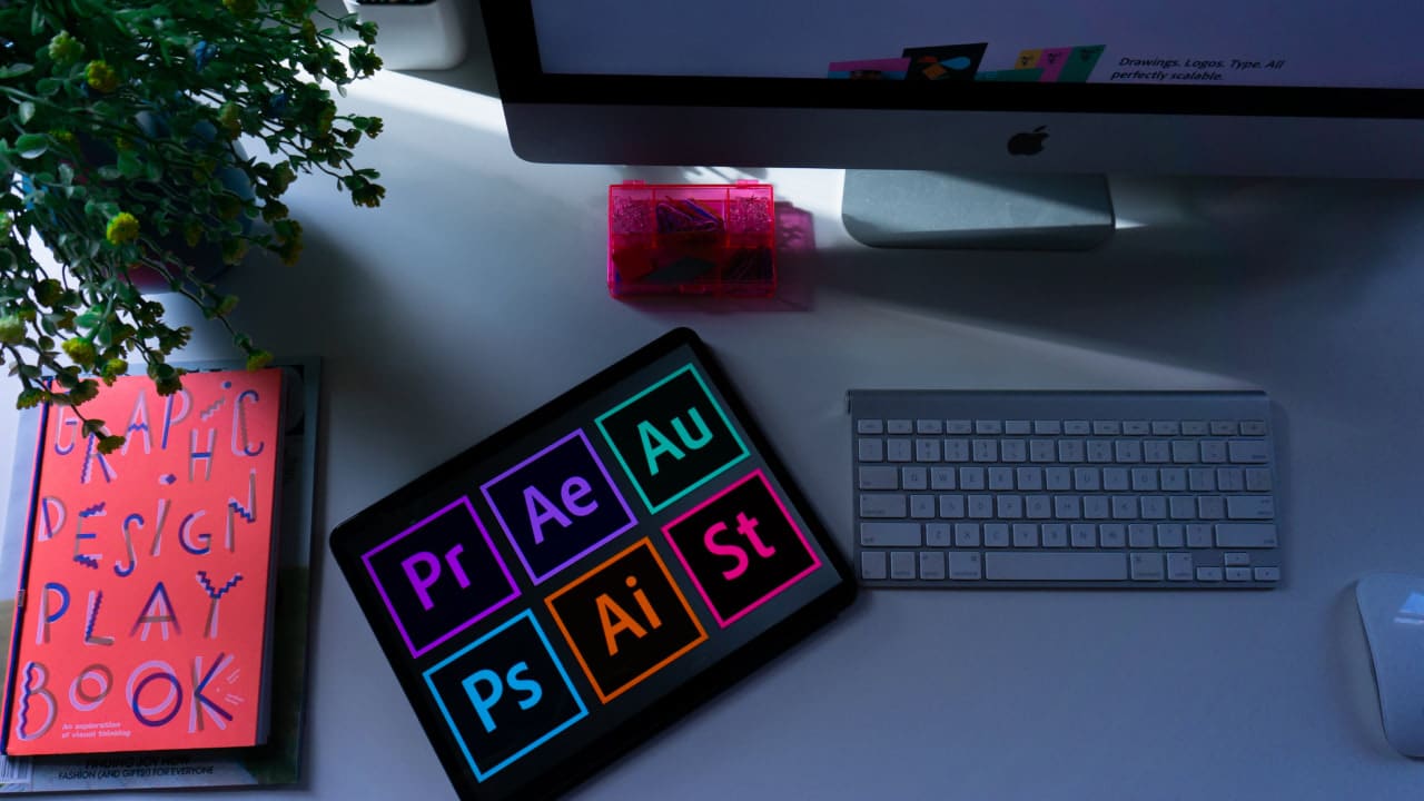
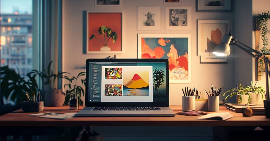
Must-Learn Apps for Designers & Creatives: Beginner’s Guide
What are the best apps for aspiring creatives to learn? We explore some tried-and-true and emerging software options.
Latest Posts

How to Find the Right Design Mentor for Your Career
What a great design mentorship looks like and how to become part of one.
May 19, 2025
What Is Advertising Design? A Guide for Designers
How to get ahead in advertising, by design.
May 18, 2025
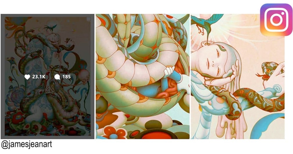
30 Artists to Follow on Instagram for Inspiration
Need inspiration? We help you find good artists to follow.
April 30, 2025

Visual Storytelling Techniques That Engage Audiences
Tips and techniques for creating visuals that captivate.
April 30, 2025
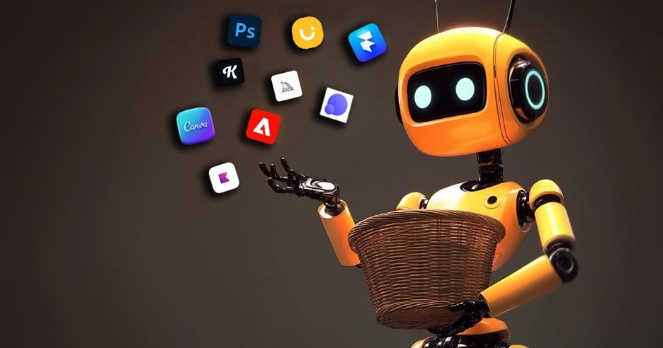
15 Best AI Tools for Graphic Designers
Top tools to boost creativity, automate tasks, and streamline workflows
April 4, 2025
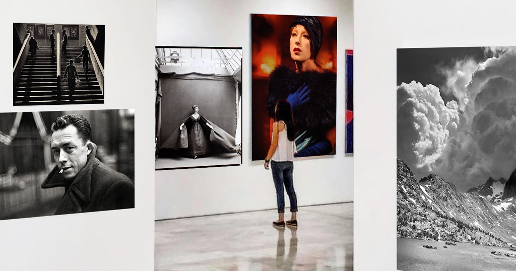
20 Most Important Photographers to Study to Improve Your Art
Our list of the essential photographers to know.
April 2, 2025

What Can You Do With a Digital Media Degree? 10 Career Paths
You have the creativity, how do you turn it into a career?
April 2, 2025
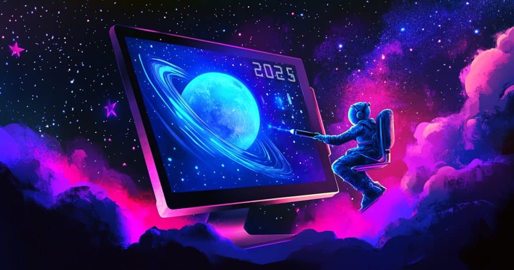
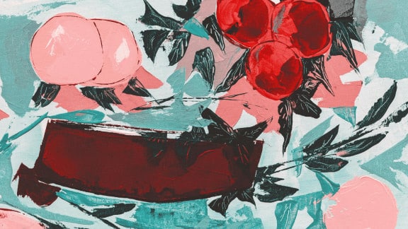
Illustration Trends 2025: What’s Upending Design This Year
Our top illustration trends to consider in your work this year.
March 30, 2025

How to Become a Creative Director
Who doesn’t want to bring a creative vision to life?
March 17, 2025
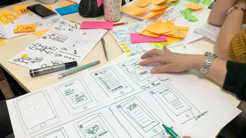
How to Make a Graphic Design Portfolio
The essential steps to put together a portfolio that attracts clients and employers.
March 5, 2025

Top UX/UI Design Tools for 2025
We survey today’s top interface design applications.
February 28, 2025
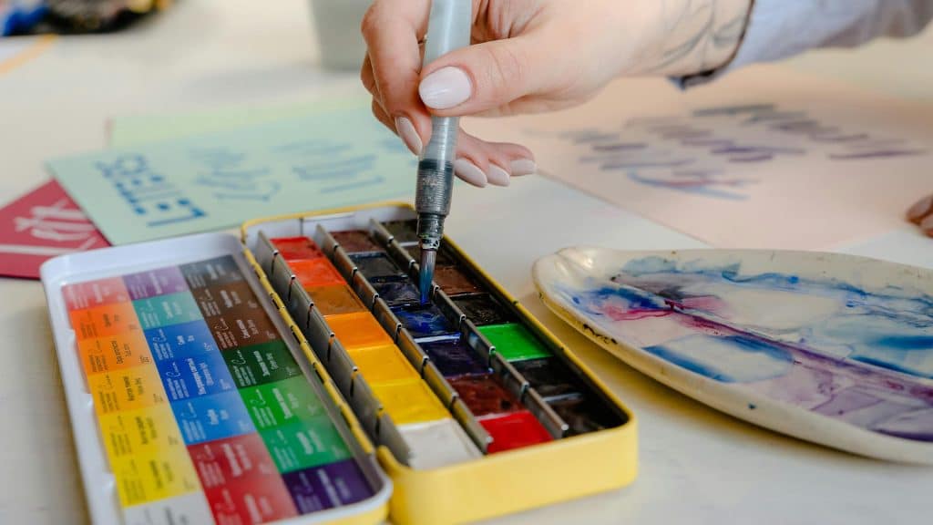
A Guide to Color Theory
Color has a way of connecting with all of us. Color theory explains why.
February 20, 2025
Here’s How to Create an Illustration Portfolio That Clients Love
Tips for showcasing your work to attract top clients.
February 19, 2025