


2016 Web Design Trends
by Margaret Penney | April 29, 2016
We brought you some of the best in responsive designs last year, now we’re going to focus on some key elements of these type of designs that are popular in 2016.
New sites today can have a fairly similar look due to the prevalence and standardization of UI patterns. Some of this is because designers just go with established UI patterns out of ease of implementation, but this is also because these UI patterns just work well and people have grown accustomed to how they look and function.
What are UI patterns? They are basically design patterns that are recurring solutions and usually work within a grid, making it easier for them to be designed and developed in a consistent and clear way.
We probably aren’t going to see too many drastic changes in the layout of responsive sites this year and can assume that large format hero images, left hand or top navigation, masonry or grid portfolio displays, a similar buy and checkout process, to name a few, will be fairly standard in websites for awhile.
Within this design framework though there are innovations being made to add visual style and creativity to websites. Here are some of what we are going to see even more of in the next few months.
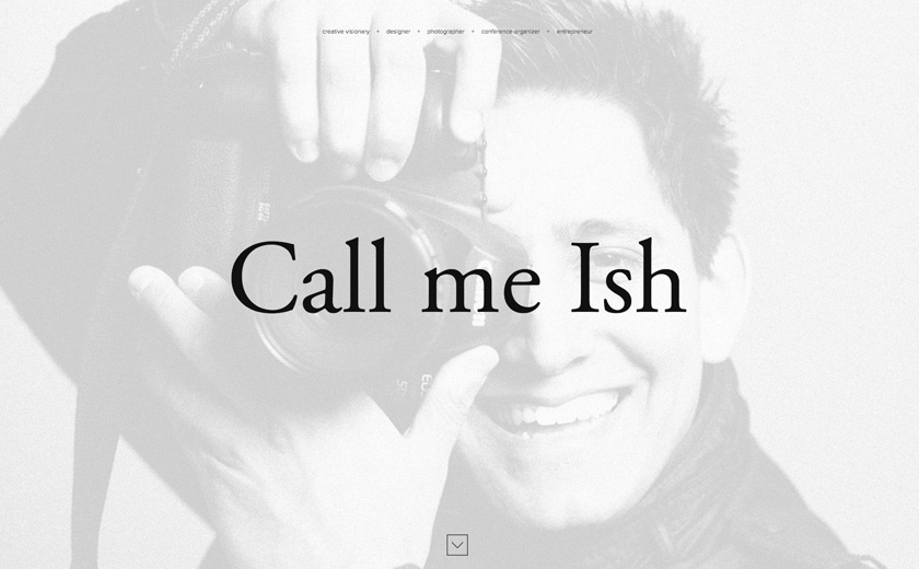
Hamburger Menu, Please
If you’ve seen those three lines usually in the upper right of a responsive site and wondered what they are only to click on them and see a full page menu appear, that is the unusually named “hamburger menu.” I suppose in some very minimalist way those three lines do look a little like a hamburger, but not one with many fixings.
Regardless, hamburger menus are becoming much more popular this year particularly on sites that value visual presentation through large format photography, illustration and typographic compositions. Hamburger menus make room for everything else about a design and do not clutter the page with a text navigation. Here are two good examples of hamburger menus in use.
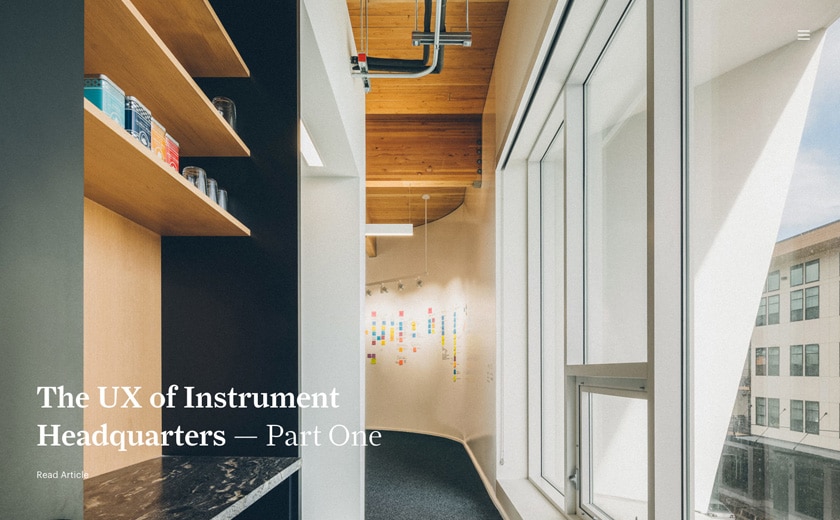
Instrument, a digital creative agency in Portland Oregon, has created a spacious minimalist design for their firm. The photography of their workspace and projects are the focus of the design. The hamburger menu and reductive page title within the spacious header support this liberal layout.
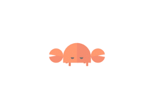
Oh So Clever Loading Animations
Responsive websites have had transitions and animations between pages but this year we are seeing more clever and eye-catching ones. A loading animation can simply be something to look at to bide the time as a page loads or it can be a way to engage the audience and even help establish a brand image, through the use of brand iconography or a logomark.
For a good example of an effective and engaging loading animation take a look at this dancing crab, in their brand’s shapes and colors, from Confederation Studio:
http://confederationstudio.com/
Video Killed the Hero Image
Well not entirely, but we are starting to see more video clips replace where there used to only be hero images. Hero images are here to stay but because of streaming capabilities, more video is used as replacements for or in addition to hero images in the headers of responsive websites.
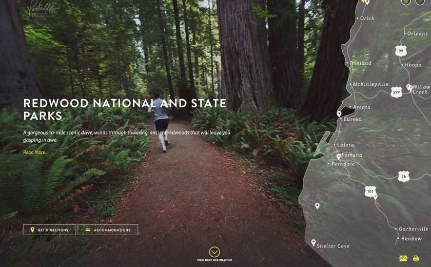
The Visit Humboldt website is pretty much a perfect implementation of using video as a way to take a tour of a place in an interactive way. The website is interesting because it navigates almost like a Flash site of yore, yet it’s an entirely responsive website. Tourism and real estate companies can gain inspiration from this effective implementation of video.
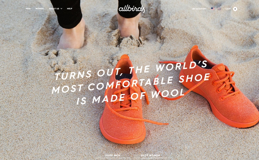
Another development with video in responsive sites is the use of short and small video clips to showcase a product. Take a look at All Birds men’s shoe video clip on the homepage for this feature in action:
Make that Header Stick
Sticky Headers are a kind of web navigation that stays visible at the top of the webpage even as you scroll down the page. Sticky headers are a great navigation choice for responsive sites that scroll and scroll and scroll. Sticky headers also add visual interest to a design and can change color or scale at different points on a page too.
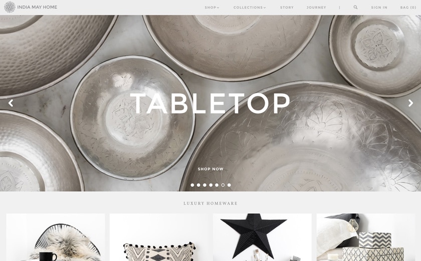
At the India May Home site we see a good implementation of this type of header. Since the website has so much content it becomes even more important to have a way to move back and forth between site sections easily.
The Long and Winding Scroll
This year we are seeing more websites that scroll a lot. A good reason to implement this type of design is for websites on mobile where you can just use your thumb to scroll the content easily without clicking on very small navigation links on the phone. Another good reason is having more content on the first page enhances search engine optimization.
If you combine a site with a sticky header that jumps to parts of a scroll-able page with one click, you are in effect creating a similar kind of experience to a site that has to wait to load a new page.
The scrolling design also has visual storytelling as page sections enter and exit, transitioning one into the other, short text and image animations are triggered and visually arresting images appear, like in this lovely example Burciago.co.

We’ll likely see these trends continue for some time since responsive web design isn’t going anywhere soon. We hope that knowing more about these popular features is inspiring for you, but like with most things design related don’t just take our word for it, try to come up with your own fresh take and approach to responsive website design.

Margaret Penney is the Managing Editor of Notes on Design. Margaret is a teacher, designer, writer and new media artist and founder of Hello Creative Co.
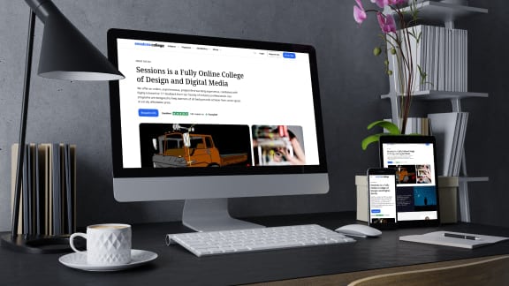
For creatives seeking a thorough training in web coding and front end design, Sessions College offers accredited fully online web design certificate and web design degree programs. Contact Admissions for more information.
 This blog is powered by Sessions College, the leading online school of visual arts.


NoD Newsletter
Enhance your inbox with our weekly newsletter.