Clean Lines: How to Prepare Scanned Line Art

Creative business tips to kickstart your career as an artist, designer, or content creator.
The digital age has presented artists with a lot of new opportunities. The internet has changed the way we learn, and computers have changed the way we work. We’re now able to grow audiences online, work with international clients remotely, and sell reproductions of our work without ever meeting the printer or the buyer.
With this wave of change have also come a new set of challenges. As a medium, the most common means of drawing digitally is via a tablet. In all cases, whether the handheld variety, like an iPad, or the less mobile desktop versions, like those made by Wacom, it can be hard to get the hang of.
For those of us who primarily draw with traditional mediums on paper, using a plastic stylus on a glass screen lacks a certain tactile resistance. When your digital and traditional drawings look like they were drawn by two different people of radically different skill levels, it can be frustrating. The process can feel like learning to draw all over again.
Beyond the difficulty of adjusting to the feel of this new medium, digital art just feels… digital. It lacks the nuances created by the tooth of the paper interacting with graphite, or oil paint being applied so thick that it might fall off the canvas. These subtle visual cues that tell us something was made by a human have yet to be recreated digitally, and without that certain charm, digital art can look sterile.
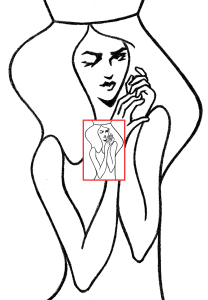
Scanning traditional art to then further work with digitally helps us to utilize the strengths of both mediums, so today we’ll take a look at the best practices for doing so. Let’s start with this drawing.
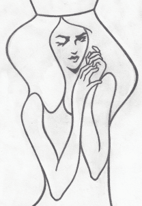
This was drawn with graphite on a 9”x12” sheet of paper and scanned at 300dpi. Now let’s bring it into Photoshop and clean it up a bit. There are a number of tutorials that explain how to do this, and I’ve tried them all. Often, they’ll recommend that you add a levels adjustment layer and adjust the sliders until you see the color of your scanned paper turn 100% white.

While this approach works fine, I’ve found that this next technique will yield a darker, more solid line, putting you in a better position for vectorizing, should you choose to do so. After you’ve added the levels adjustment layer, rather than adjusting the sliders, let’s use the eye droppers to the left of the histogram.
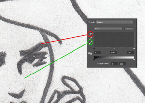
Using the top eyedropper, circled in red, select the lightest part of your line, and with the bottom eyedropper circled in green, select the darkest part of your paper. The levels will adjust with each click, revealing new lighter and darker parts. Continue to select these until you’ve made the line as dark and paper as white as possible.
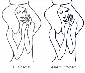
Looking at the images created by the two different techniques side by side, we can see that the eyedropper approach has yielded a much higher contrast image.
Depending on your plans for the image, you might stop here. For the sake of demonstration, let’s take this image a step further and vectorize it. While we could take this image directly into Adobe Illustrator and perform an image trace, we would end up with some undesirable edges caused by the tooth of the paper. Instead of taking the image at its full resolution, let’s first create a copy and reduce its size.
Here I’ve shrunk our image by an arbitrary amount, but the goal is to simplify the job for Illustrator. With less information, we’re reducing the margin for error. Here are the results of the image trace performed on both the full and reduced versions of our image.
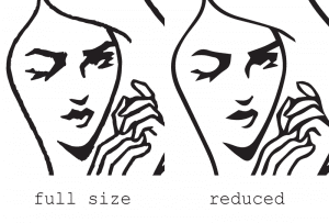
We can see that although the full size may be more loyal to the original, there are lots of tiny jagged edges. Were we to go in and fix those individually, it would take hours. While the reduced version has lost some of the nuances of the original, it will serve as a much better base to work from.
Explore different sizes for the reduced version to find a happy balance, and enjoy your new clean, line-filled life.

Taylor is a concept artist, graphic designer, illustrator, and Design Lead at Weirdsleep, a channel for visual identity and social media content. Read more articles by Taylor.
RELATED ARTICLES:


SESSIONS NEWS:

ENROLL IN AN ONLINE PROGRAM AT SESSIONS COLLEGE: