Iconic Icons: Aicher’s Pictograms
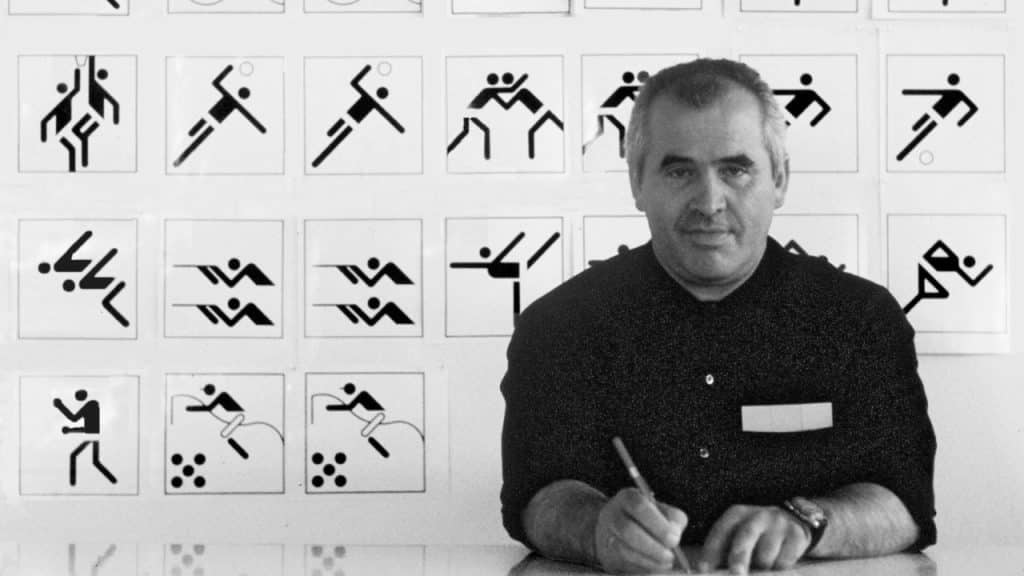
In our Designer Profiles series, we profile groundbreaking designers who have shaped today’s design industry.
Icons, pictograms, and symbols have been used since the start of things. Cave paintings with their outlined reindeer and early hieroglyphics are essentially our first pictograms. In this series we will explore some of the most iconic of the icons, ones that have been used throughout history and affected our collective culture.
A pictogram is a sign that represents something else, symbolizes a real thing. The goal of a pictogram is that it can be quickly understood. Pictograms are used where crucial information must be communicated quickly and efficiently. You see them commonly used in places where expedience is key and where people need a lot of direction, like at the airport when they are looking for their flight. Pictograms of this kind are known as wayfinding signage.
Otl Aicher developed one of the most iconic wayfinding symbol sets in the 1970s for the Frankfurt airport. The set is a comprehensive system for air traffic and travel influenced by the most modern and futuristic design of the time. The symbols are ubiquitous today since they are the original contemporary symbol set for airports and their style and approach has been copied many times over.
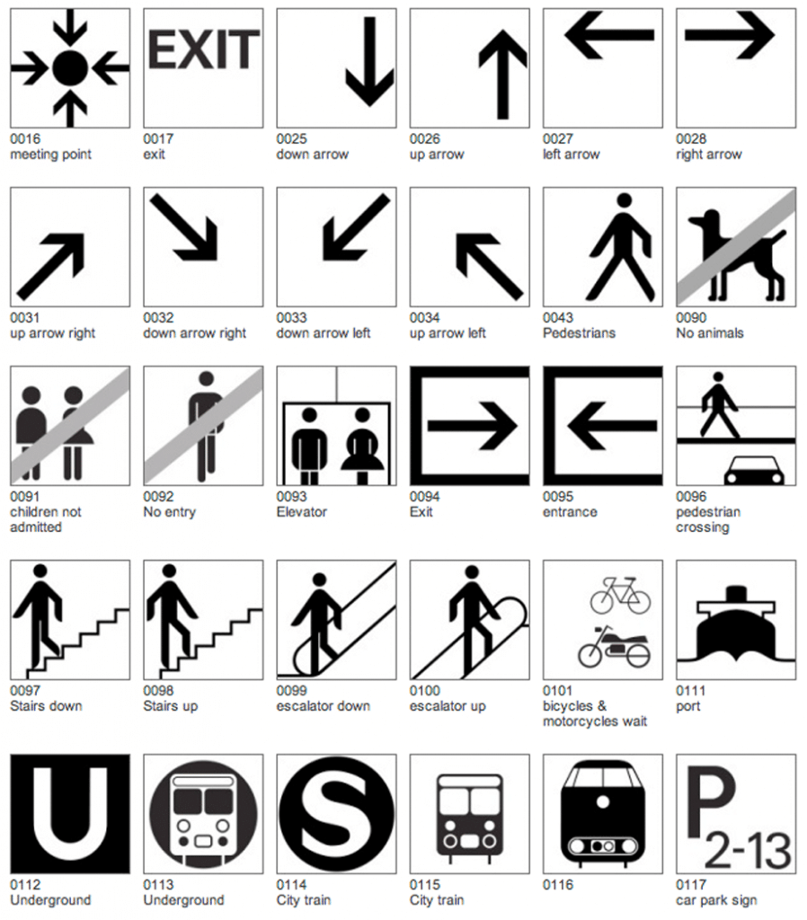
Aicher was obsessed with clarity and went on to create an associated typeface called Traffic that also was quite popular not only in airports but in use in graphic design, particularly in the 1990s. The symbol most known from this set though is the geometric man and woman. Aicher designed a simple geometric figure with a dot for a head and a rounded rectangle body. The form has just enough shape so to be recognizable as a figure yet it does not have any intricate detail.

The genius of Aicher’s design is that the geometric man was capable of communicating so much while being made up of only the simplest shapes designed to a grid. Aicher was able to use the geometric man to represent dynamism of sports for the 1972 Olympic games.

Grid-based geometric design of the cycling pictogram.
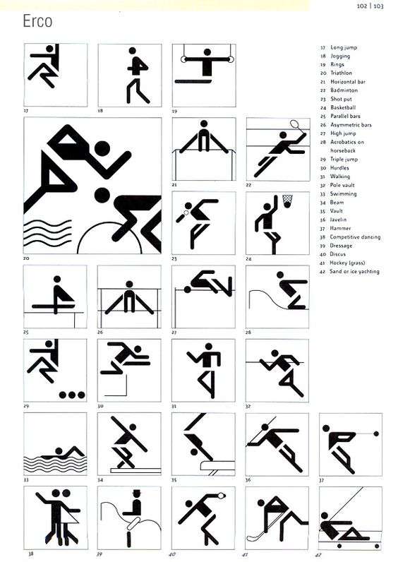
Olympics Pictograms
For aspiring icon designers, Aicher’s pictograms provide an important historical example that less truly can be more, when you are trying to communicate something in a simple, direct, and clear way.
To learn more about his work, take a look at this creative web project about Otl Aicher: http://www.piktogramm.de/en/.

Margaret Penney is an experienced Brand Designer and Art Director as well as a teacher, designer, writer, and new media artist and Founder and Principal Designer of The Design Craft and 9& Studio.Read more articles by Margaret.
RELATED ARTICLES:
SESSIONS NEWS:
ENROLL IN AN ONLINE PROGRAM AT SESSIONS COLLEGE:


