Designer Profile: Jan Tschichold

In our Designer Profiles series, we look at designers who have had a major influence on visual culture.
Everyone has a favorite designer or two. As a new designer, I was a fan of Jan Tschichold. Tschichold’s bold typography combined with artful, asymmetric, and diagonal layouts, was immediately inspiring. At that time I didn’t know that Tschichold was a leader in the modernist design movement; I just knew it was amazing work.
As with other influential designers, Tschichold’s designs stand the test of time and exist long beyond his immediate culture.

Phoebus Palast Poster
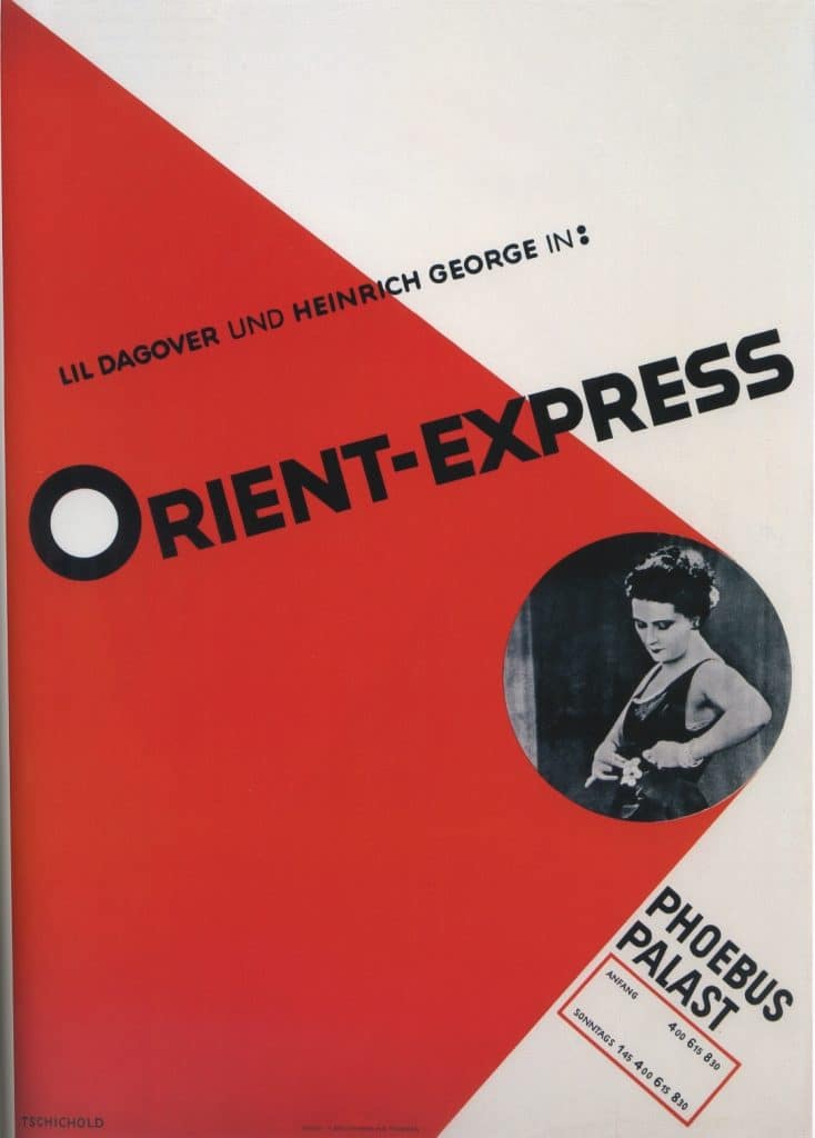
Phoebus Palast Poster
Tschichold, the son of a German sign painter and trained in calligraphy, was well-prepared to be a leader in typography and design. Many of his contemporaries focused on fine arts and architecture for their schooling. To have a knowledge of typography was less common. At the Leipzig Academy of Graphic Arts and Book Production, Tschichold’s teachers treated him more as an equal than an ordinary student.
When Jan Tschichold started out his career as a freelance designer, his style was not worked out yet, and it was not modern. He still preferred the blackletter type of the day. In 1924 he went to see a Bauhaus exhibition and was so inspired he changed his visual direction entirely. He no longer used blackletter and instead went modern—and the rest is, as they say, history.

Tschichold claims to be the most influential type designer of his time, and he’s probably right. Along with Paul Renner, he led the way with Modernist type, especially after the publication of Die Neue Typographie. The publication was a manifesto that claimed all type other than sans serif was no good.
The message was bold and caused a reaction in the design world and in Germany. Die Neue Typographie was not just a sensationalist publication, though, the manual included a number of clear rules that became an important guide for modernist type in general. In The New Typography Tschichold set criterion for standardization and practice for modern type. He advocated for standardized paper sizes and also for rules of type hierarchy.

Die Neue Typographie
Tschichold was an advocate for standardization and clarity in design throughout his career. Later, he designed the iconic Penguin book covers, which are still incredibly well-known, popular, and copied today.
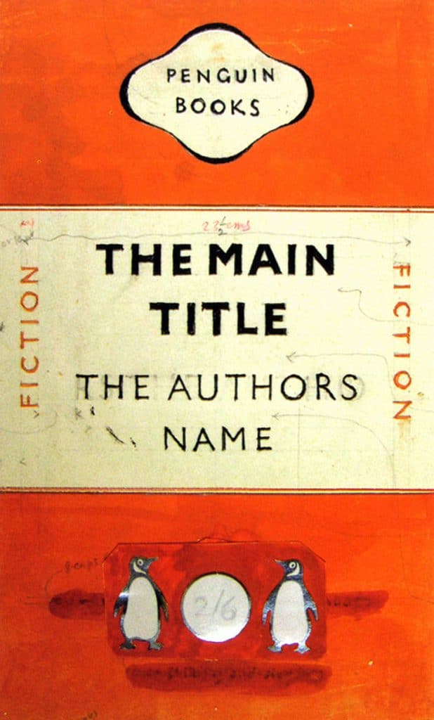
Tschichold’s design draft for Penguin Books.
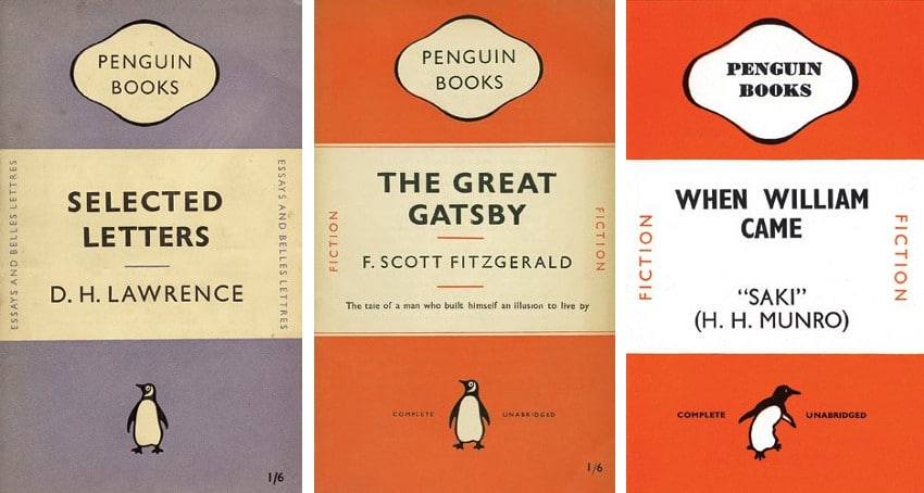
Penguin Book Covers
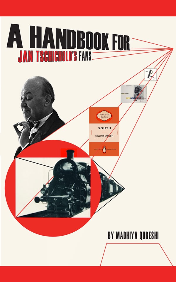
To learn more about Tschichold, take a look at this clever project by Madhiya Qureshi. He designed a book about Tschichold entirely in his graphic style.

Margaret Penney is an experienced Brand Designer and Art Director as well as a teacher, designer, writer, and new media artist and Founder and Principal Designer of The Design Craft and 9& Studio.Read more articles by Margaret.


ENROLL IN AN ONLINE PROGRAM AT SESSIONS COLLEGE: