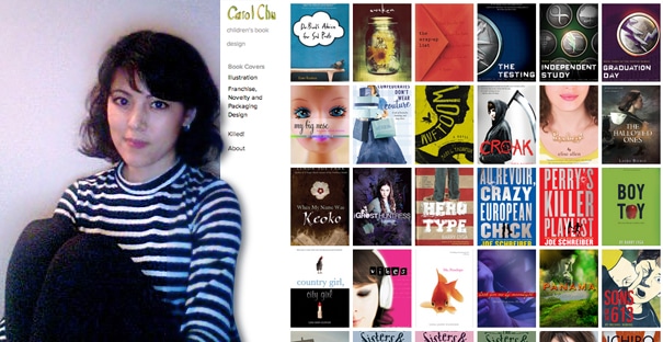
Profile of a Book Designer: Carol Chu
We interview distinguished artists and designers to explore their work and uncover the secrets of their creative process.
Carol Chu is an art director and book designer at Houghton Mifflin Harcourt. Her work has been featured in the Graphis Brochure Book, Print Regional Design Annual, Step Into Design, HOW Magazine, Communication Arts, and Logos, Fonts and Lettering Bible: A Comprehensive Guide to the Design, Construction and Usage of Alphabets and Symbols by Leslie Carbaga, and Color Management for Logos by John Drew & Sarah Meyer.
A nominee for Print’s New Visual Artists Review and the Art Director’s Club Young Guns, Carol has worked in many different publishing environments, ranging from People Magazine to Pushpin and Random House, prior to joining Houghton Mifflin Harcourt. This September, she has a new book coming out called Shoes, Shoes, Shoes, which she co-authored with the legendary Seymour Chwast.
Q: There’s still something magic about books: the cover, turning the pages, the thrill of immersing yourself in lines of type. What role does design play in inspiring people to read? And what excites you about book design?
The cover, more than anything. More than the banner ads, the blog posts, the black and white single column ads—the cover makes the strongest bid for your attention and lives alongside the story; it packages the story. A successful cover signals the story and lets you in on the point of the book.
If a book is a best-seller, you see the cover knock-offs appear. Not just similar themes and genres getting crowded over night, but replicated covers. Those books might get picked up and read, but I’m not sure they’re successful. Cover design has to serve many masters in publishing (the editor, the author, the agent, the publicist, the sales rep, accounts, the marketing team) and it still has to look good. [Finger pointing in air!]
Everyone knows how a book works. You have pages filled with words on the inside. You have a cover on the outside. When you remember a book you read in the past, you remember the cover. You might not remember if the folio was on the bottom or the top or if there were running heads (well, sometimes you do) but you remember the cover. Book design is exciting because of how universal it is and also how specific it has to be. That’s a lot to get done in such a small area. They’re mini posters, mini packages.
Q: You once commented that “people tend to think books are just THERE.” Can you briefly describe the process of designing a book. Is your team responsible for cover design, interior layout, and production?
This is the point in the interview where I lean in and say, “Really? Do you really want to know?”… The manuscript is passed from editorial to design and I look over the materials and have a confirming conversation with the editor. We discuss direction, competitive titles, ideas, and what the author thinks (sometimes the author doesn’t want any influence, sometimes everything is shown to them at every single step).
At HMH Books for Young Readers, we typically design the interiors as well as the covers. I know not all houses are like this. Depending on the book, the cover might be a photoshoot, stock images, illustrated, or a combination of all the above.
Let’s fast forward to when the cover is approved by committee (sales, marketing, editorial, the publisher) and let’s fast forward some more to the point where it’s ready to be sent over to the production department. Production liaises with our printers and gets the paper ordered and arranges for proofs to be sent back to us for review and match for color against the original art and they also arrange for bound books to arrive by specific dates at the warehouse. HMH Books for Young Readers has a total of 13 designers and art directors and a creative director who heads us all.
Q: How are the cover concepts developed? Is it important to read the book or be familiar with genre conventions and competing titles? What dictates the decision to go with an illustration or a photographic image?
I read the manuscripts. I am thankful I’m a speedy reader and have always read relatively quickly. It’s not uncommon for me to take a manuscript to lunch, read it on the commute home, then finish it over dinner that night. By the next day I can start with comping up some directions and ideas—that is, if the other books I’m working on aren’t in some state of emergency, like major edits to the interior, or when sales comes back with feedback that the whole world hates the cover and it’s back to the drawing board ASAP because there’s a major marketing campaign underway and there needs to be a cover!
It is very important to have an idea of how marketing and editorial want to position the book and to have a good understanding of the marketplace for such a story. Typically, illustrated covers are for a younger audience but there are exceptions to that statement all the time and there is great variance in the artistic style of various illustrators. Sometimes an illustrated cover is more conceptual and thus fitting for an older reader. Young Adult covers have become so much more sophisticated.
Q: How has digital publishing (Kindle, Nook, iBooks, etc.) affected the design process?
Designing an image which will work as a thumbnail as well as a zoomed-in picture is a challenge. Designing an image which will attract the reader and smooth over any initial hesitation felt by a reluctant reader is also a challenge. When I first launch my applications on the computer and go “file,” then “new,” that part isn’t so different. I have to start at the same place. I do have to interface with new teams of people whose jobs are somehow tied to those formats, so it’s not just printer talk with the production people anymore.
Q: Can you show us some recent cover designs that you’re proud of and talk a bit about how they evolved?
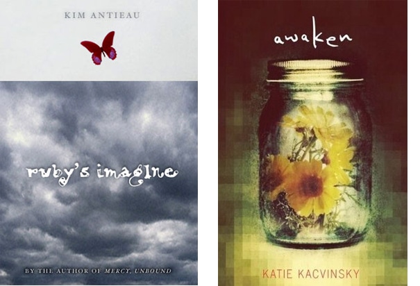
Ruby’s Imagine by Kim Antieau is a book about a girl living through Hurricane Katrina who can talk to animals. It’s sort of a magical tale. We definitely didn’t want to show the character. What you don’t see here is what is under that three-quarter jacket. The wrapped jacket you see is storm clouds—underneath is a flooded landscape. It’s a pretty quiet cover, in retrospect. The sole pop of color is the ruby red butterfly, flying above it all. I was looking for a quiet way to convey the personality of the character and narrator without outright spelling out “she talks to animals!”
Awaken by Katie Kacvinsky. This cover had a relatively easy approval process, just one showing at a meeting. This is a story about a dystopian future where schools are virtual and artificial trees are the norm. I found this image of flowers in a jar and added a bit-mapped element to it, as if it was coming into focus. My point with this image was that reality is in the eye of the beholder.
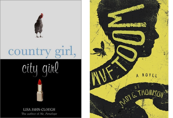
Country Girl, City Girlby by Lisa Jahn-Clough. Initially this cover had several elements, like sushi, cowboy boots, etc. I think it works better with just the two and it’s funnier… maybe even less offensive? 🙂
Wuftoom by Mary G. Thompson. I commissioned the illustrator Neil Swaab (http://neilswaab.com/) for this cover as I showed the editor some of his previous work and it was agreed that his work and style would work for this story which was described as “Kafka for kids.” Previous comps were worm-filled and the feedback from sales, marketing and editorial was, “Um… fewer worms?”
Fast forward, we have this version (which came in originally with a pink background. I changed it to this sickly green to help with maybe attracting boy readers and here it is.
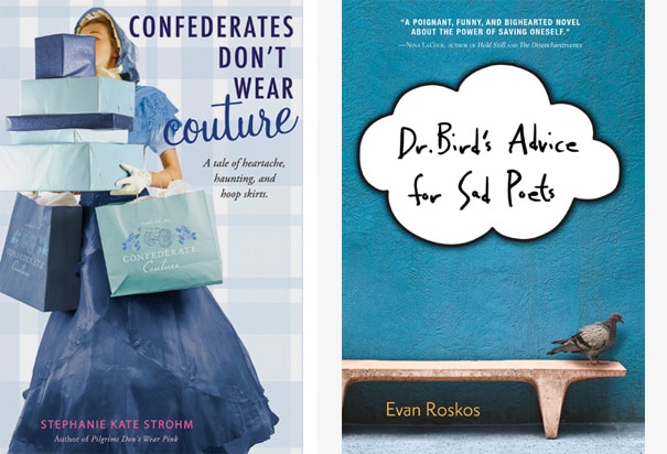
Confederates Don’t Wear Couture by Stephanie Kate Strohm. I worked with Shane Rebenschied on this cover and he found a great model and he procured (i.e. his wife sewed) the costume. This was a perfect photoshoot. Here’s a secret—those were shopping mall bags we recolored and added a made up logo (logo design by my former designer Kayleigh McCann).
Dr. Bird’s Advice for Sad Poets by Evan Roskos. I read this manuscript in an early form and reread it once it was in a final edit because I enjoyed the story so much and was curious to see what and how things were changed. I sent the editor three directions for this cover. We showed two versions at the cover meeting and this direction was approved, although initially the background was a brownish orange and the type was a clean sans serif. The cloud was also initially rendered as a thought bubble.
And then… the tweaking began. The cloud shape works and is less hokey than what I originally drew. That now feels too comic-booky and too heavy-handed. The orange wall, which I rendered on purpose, went nicely with our gray friend, ended up feeling like it sent a different vibe (perhaps coupled with the retro-shaped bench, it just pounded that aesthetic too much and too needlessly). When you see this book at your local bookstore, check out the spine and the flaps, too: the design carries on.
Q: These are some wonderful cover designs. On your site, you have a “Killed” section that shows cover designs that didn’t make the cut. 🙁 How are final decisions made? How often does your favorite version end up on the cutting room floor?
It happens more frequently than you would think! Decisions on cover approval is based on marketing feedback, sales expectations, editorial concerns and even what the book buyers feel.
Covers are also sometimes killed after they were initially approved! The lows are well-balanced with highs, and the highs are seeing a kid on the T reading a book you designed or changing expectations about a book based on how good the book looks.
Q: A couple of years ago you authored your own book, The Fashion Coloring Book, which should be a must for any fashion-oriented youngster. How did that project come about?
Not just authored! I illustrated that one, over 100 illustrations! Some people follow sports teams. I follow fashion houses. I look forward to the fashion week coverage twice a year. I wanted to create a book which was cheeky, irreverent, factual and studied, and make it for both kids and adults.
The content is fashion—actual runway looks—not beadazzle and crafts. But it’s a coloring book, so you get to have some say in the interpretation of McQueen’s Armadillo heel. They’re not just for kids, these books: they’re sold at Barney’s, Colette (hello, favorite Paris haunt of mine), Bookmarc, the MoMA store.
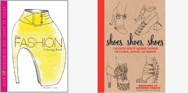
The Fashion Coloring Book, by Carol Chu and Lulu; and Shoes, Shoes, Shoes, by Seymour Chwast and Carol Chu.
Q: I read that your first design gig was at Pushpin, where you had the chance to work with the legendary Seymour Chwast. What did you learn from him? Are there other mentors or colleagues who have directly influenced your career as a designer?
Seymour and I have a new book out this September called Shoes, Shoes, Shoes. I learned so very much from him (Letter spacing! How to pack art! The intricacies of Cheltenham! Why Champion is an amazingly versatile sans serif!) and I’m eternally tickled I had the opportunity to work at Pushpin. In his Seymour way, he let me know on my first day on the job that over 200 people applied for the position.
There are many book designers whose work I admire (Alex Camlin, Henry Sene Yee, Christopher Moisan, Kimberly Glyder, Elizabeth Parisi) and I look online for inspiration frequently, especially after my 5th cover comp has been rejected at a cover approval meeting.
Q: What creative projects at HMH or outside are you working on or have planned that you are excited about?
Shoes, Shoes, Shoes is the latest book I’ve worked on outside of work. I also recently illustrated a cat memoir, Home with Henry, due out this October. As for my work work at HMH, the kind of books coming down the line is EXACTLY what I hoped for when I was a wide-eyed design student at Pratt. That I’d have variety in my projects: problems to solve, classic properties needing a refresh or flat-out, stop-the-presses emergency assignments (that must be the newsroom me which still gets a thrill in tackling unreasonable deadlines).
HMH celebrates its 150th year this year. Back when there was no separate children’s department, less than a dozen children’s books were published. Now? Now we publish 280 children’s books annually (and by children’s, that ranges from young adult novels to baby board books). Curious George, our largest franchise, is celebrating his 75th birthday this year.
This is an amazing time to be the art director of children’s franchise at HMH. Pop-up books? Scratch and sniff? Touch and feel? Tear-jerker young adult tale of of loss and love? We have it all and I am lucky to get to design some of it all. My portfolio has designs I’ve done for all ages as a result. Also? I’m wrapping my head around my next book pitch—there is a need to get people to stop taking good typography for granted. I’m on a mission!
For more information on Carole’s book Shoes, Shoes, Shoes, A Delightful Book of Imaginary Footwear for Coloring, Decorating, and Dreaming, visit Clarion Books or search on Amazon. Carol Chu is currently a member of the advisory board at Sessions College for Professional Design.

Gordon Drummond is the President of a Sessions College. He's passionate about education, technology, and the arts, and likes to surround himself with talented people. Read more articles by Gordon.


ENROLL IN AN ONLINE PROGRAM AT SESSIONS COLLEGE: