Free Font Friday: Bitter

Our Free Font Friday series profiles the design characteristics of today’s free downloadable typefaces.
Bitter, a slab serif, was designed by Sol Matas in 2013 with a priority on digital legibility. As the font was intended for web use, Sol constructed the typeface using a pixel grid. Bitter bears the same geometric serifs as the rest of the Slab family, with the addition of some subtle flavoring that lends it a playful, rhythmic quality.
Bitter has tall x-heights and a mostly uniform stroke weight, leaning a bit on the heavy side, granting it great readability at most sizes.
The heavy nature of the regular style is meant to accommodate for differences between print and digital reading. While this lends itself well to most applications, it can prove to be a disadvantage at extremely small sizes where negative spaces tend to close up. However, considering that this typeface was designed with web use in mind, this issue should hardly arise.

Another aspect of the typeface that makes it particularly well suited for web use is its spacing. Typefaces designed for print typically contain special kerning pairs. The space between each letter combination is carefully adjusted to accommodate for their unique characteristics. Because most browsers don’t support these special kerning pairs, Sol took careful consideration when he designed Bitter’s spacing.
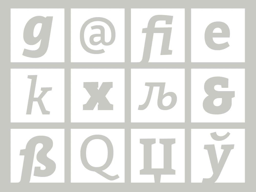
Bitter has both Latin and Cyrillic alphabets and is available in 3 styles. You can find it here.

Taylor is a concept artist, graphic designer, illustrator, and Design Lead at Weirdsleep, a channel for visual identity and social media content. Read more articles by Taylor.
ENROLL IN AN ONLINE PROGRAM AT SESSIONS COLLEGE:


