Free Font Friday: Orbitron

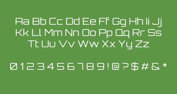
While Orbitron may bear some semblance to the aforementioned typographic heavyweights, its unique sci-fi leanings separate it from the pack in a meaningful way. Whether through video games, movie posters, or the covers of novels, we’ve all been exposed to sci-fi in one form or another. If Orbitron gives a sudden sense of deja vu, it’s no wonder why. To me, Orbitron feels like an old friend, and the sight of it tickles whichever part of my brain is storing all of my childhood memories.
Another way Orbitron differs from other geometric sans-serif typefaces is in its purpose. Unlike Eurostile or Bank Gothic, Orbitron was designed for display use. Given its interesting letterforms and stronger personality, it makes sense. For this reason, if you decide to use Orbitron, it’s best to do so sparingly.
Whether for a movie poster, signage, or book cover design, Orbitron is a great choice. It also has a hidden strength. In addition to its 4 different weights, its weight axis is variable, allowing for a great range of flexibility in use. Orbitron is available for free here.

Taylor is a concept artist, graphic designer, illustrator, and Design Lead at Weirdsleep, a channel for visual identity and social media content. Read more articles by Taylor.
RELATED ARTICLES:


SESSIONS NEWS:

ENROLL IN AN ONLINE PROGRAM AT SESSIONS COLLEGE: