Free Font Friday: Playfair Display
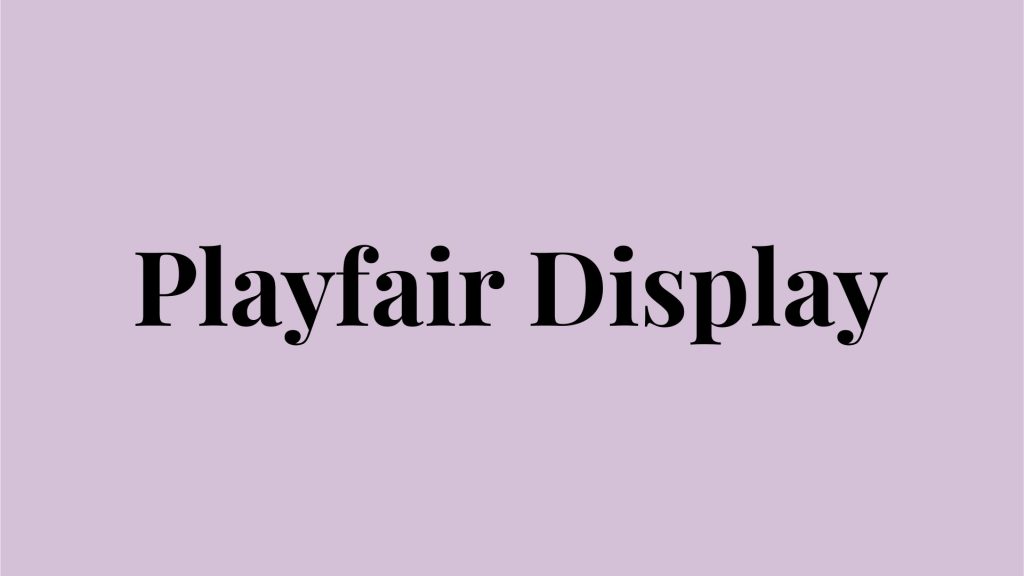
Our Free Font Friday series profiles the design characteristics of today’s free downloadable typefaces.
Created in 2011 by Claus Eggers Sørensen, Playfield Display draws inspiration from Baskerville and in a broader sense, the typographic design from the Age of Enlightenment as a whole.
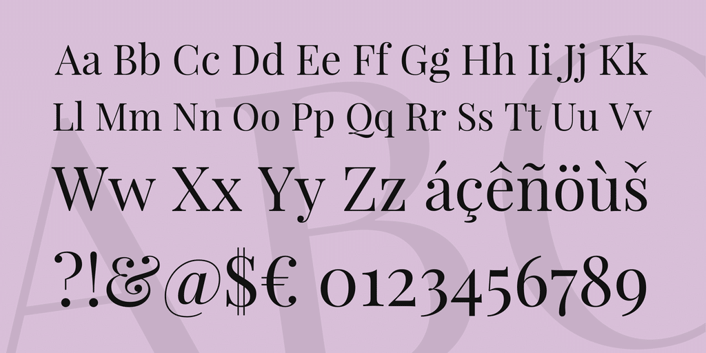
Playfair Display is most at home when used for titles and headlines, with a few unique characteristics that make it particularly apt for the job. It utilizes a notably high x-height (the height of lowercase characters in relation to uppercase), short descenders (the part of letters like p, g, and y, that dips below the baseline), and a similar optical weight between upper and lower case.
The effect is a very uniform feel with great readability, even when used in tight spaces. This makes it a great choice when space is a premium.
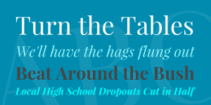
Available in both normal and italic styles, Playfair Display can embody a number of different personalities. Like other transitional typefaces, it pairs nicely with many sans serifs, the contrast of which serves to boost the typeface’s inherent elegance.
The high-contrast strokes feel traditional and refined, yet modern at the same time thanks to its curves. This is something fashion editors have taken note of, as the font can be seen regularly featured in Vogue and other fashion publications.
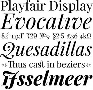
In addition to the simple elegance of the normal typeface, the italic has a wonderful sense of movement with an added element of playfulness found in the flourishes.
Playfair Display is available in 3 weights and 2 styles. Try it out here.

Taylor is a concept artist, graphic designer, illustrator, and Design Lead at Weirdsleep, a channel for visual identity and social media content. Read more articles by Taylor.
ENROLL IN AN ONLINE PROGRAM AT SESSIONS COLLEGE:


