Looking at Light: Value Structures

Our Looking at Light series explores lighting concepts for digital artists and photographers.
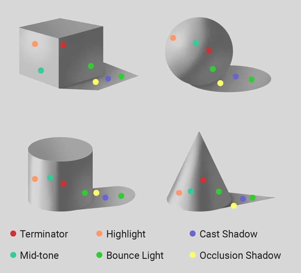
Today we’re going to look at how we can use the organization of values to craft more impactful images. This installation in the series pulls heavily from concepts covered previously, so let’s do a quick recap of some of them to refresh our memory. In the past, we’ve looked at how value is used to communicate form. We dissected the anatomy of a shadow and used its basic components to model the four basic forms from which all complex forms are built.
We also explored atmospheric perspective and shed some light on how color and value work together to affect our perception of space. We discovered that a combination of lighter colors and lower contrast causes objects to appear more distant, while darker colors and higher contrast causes objects to appear closer to us.
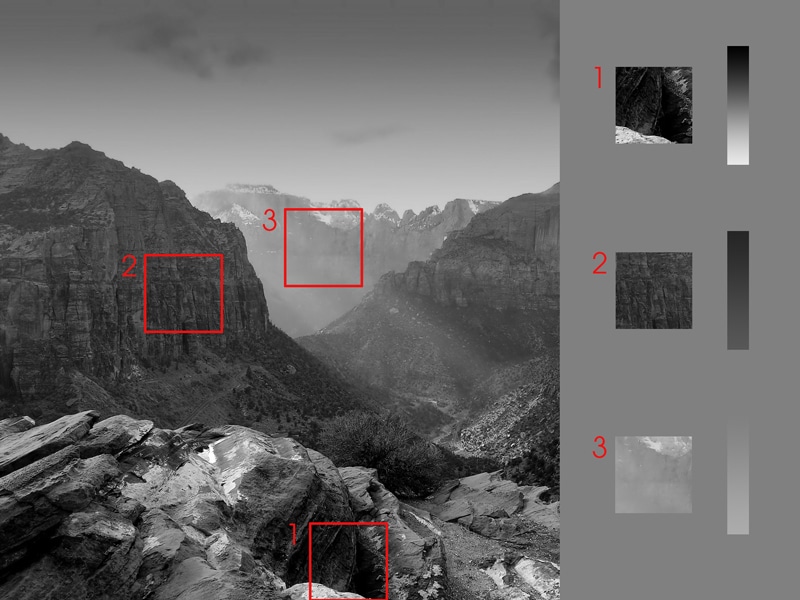
These properties work together to give us a sense of depth and replicating these relationships within our images creates an illusion capable of tricking the human eye. It’s through adherence to these conditions that we can establish the foreground, midground, and background of an image (representing by 1, 2, and 3 below).
We’ve also discussed how the range of values found within an image gives the viewer some information about the location and time of the picture.
The full spectrum of value, from black to white, won’t be found in every image. Depending on the location, the time of day, the season, and weather conditions, an image might occupy only a specific portion of the value scale. Working in tandem with the viewer’s unconscious mind, which pulls from past experiences, these clues help the viewer to understand what they’re looking at.
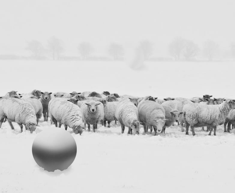
To demonstrate this concept, we used this image of a flock of sheep in a field of snow. By looking at the feet of the sheep and the thick haze of the background, we’re able to deduce that this photo was taken during the day in a field of snow, rather than just an overexposed field of grass. We then discovered how through a combination of overlapping forms, scale, and adherence to the established values in the foreground and background, we can insert objects into the scene without them feeling out of place.
It’s now time to take these concepts a step further and begin to think about the strategic use of value within a composition. Think of these concepts of lighting, atmospheric perspective, and value keys as tools in your toolbox.
Value structure simply refers to the organization of dark and light shapes. This type of contrast is one of the most powerful tools at our disposal when it comes to capturing the viewer’s attention. We actually need only a few values in order to make sense of an image. This image below uses a very simple value structure in which the shadows are all compressed into a single value.

When crafting images of your own, you have total creative license to alter the contents to fit your needs. When Pablo Picasso said, “Learn the rules like a pro, so you can break them like an artist”, this is what he was referring to. We can use the careful planning and placement of values to control the viewer’s eye, to imply detail without rendering it, and make our images easier to understand. With an effective value structure, we can show the viewer at a glance exactly what is and what isn’t important.

To really gain an understanding of effective value structures, try analyzing some of your favorite paintings or photos to see value at play. This can be done in Photoshop by making the images black and white to more easily see what’s happening. You can also use posterize to limit the range of values into distinct groupings like these.
A more reliable, low-tech method is to simply squint your eyes. This will remove detail and compress the value ranges of whatever you’re looking at, turning it simple shapes of dark and light.

An easy practice to start employing right away in your own work is to group your values. Blend similar values in less important areas of the composition and boost the contrast in your focal points.
Notice how in these paintings by concept artist Jama Jurabaev, the artist is able to achieve a believable sense of depth and imply significant detail despite using only a few values. He also employs this technique to break up the silhouettes of his characters and differentiate between materials like skin and clothes. You don’t need to limit yourself to such tight, graphic value keys, but in general, bringing values found within these areas closer together can help to improve the clarity of your image.

These are just some things to start thinking about as you plan your images. Remember, your image doesn’t need to adhere to the same rules as reality. We can build upon what we observe in nature while also bending the rules when we see fit to make our images more impactful. You can find more work by Jama Jurabaev, creator of the paintings featured throughout this article, here.

Taylor is a concept artist, graphic designer, illustrator, and Design Lead at Weirdsleep, a channel for visual identity and social media content. Read more articles by Taylor.


ENROLL IN AN ONLINE PROGRAM AT SESSIONS COLLEGE: