Underground Branding: SVA Subway Poster Exhibition
In February of 2001, fresh out of a bankrupt dot-com, I got the chance to work at an upstart, recently accredited design school called Sessions.edu that was doing an amazing job in online education. Based in New York’s groovy Soho district, staffed by young idealistic creatives who wanted to help other creatives be creative, something that hasn’t changed, though some of us have gotten older.
Each morning, I’d jump on the New York subway and exit at Prince St or Spring, thanking my lucky stars that my job was at the intersection of art and education. I’d get to the office, greet my talented colleagues, tidy up my brushed metal desk, and get to work on one of those ’99 era jelly bean iMacs celebrated in the Steve Jobs biography.
Rewind, though. On the way to work, usually in the spring or fall, I’d be thunderstruck by an ad for the School of Visual Arts (SVA). SVA, as I’m sure you know, is the New York City school that epitomizes the great tradition of graphic design in the U.S. Some of the finest designers in the world have studied there or taught there. And it showed in their subway ads. Right there in the middle of a swathe of ads for skin care and career schools, before subway ads in NYC actually became cool, and then became mainstream, were some jawdropping SVA ads that showed what visual communication was all about.
Here’s four that I remember from a decade plus in New York. Can you spot the floral SVA logo in each poster?
2001 – Milton Glaser’s “I Love New York More Than Ever” poster, based on his iconic original design “I Love New York”, released on October 8th, 2001, less than a month after the Sept 11th attacks. The burn mark on the heart is what we were all feeling. Looking back on it, it’s incredible to think of someone creating such an intelligent and redemptive message at that point in time.
2004 – Stefan Sagmeister’s “I have to live now…” ad. I love this ad because it unites a powerful message with a wildly idiosyncratic design. Hand-drawn, organic, and defiantly irregular typography symbolically lifts you from left to right, evoking the relentless, never-repeating creative sprawl of tree branches. Butterflies land here and there to draw the eye. It’s fantastically difficult to read and also legible. And the message is all about the aspirational and courageous aspect of deciding to live your dreams (as a creative).
2008 – Gail Anderson’s “If someone says you shouldn’t…” poster is a bit subversive. To be an artist, it says, it helps to question authority, reject cliche, and see things from a different perspective. In order to do that, says the poster, you need to create an incredibly detailed composition with hundreds of tiny little colorful icons clustered around a stack of sans serif type. If you look closely, embedded in the sea of icons are the various departments at SVA: Illustration, Graphic Design, Animation, Photography, and more.
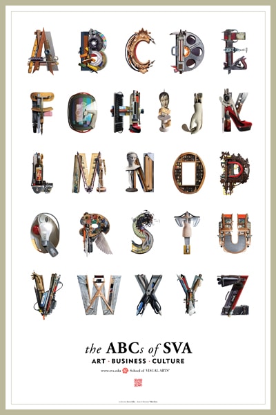
2012 – Viktor Koen’s “The ABCs of SVA…” posters reduce education to fundamentals, the first letters we learn in the Latin alphabet. The power of the ad is its juxtaposition of simplicity and sophistication. The letters are simple. The letterforms are aggregations of images that are intriguing to artists. The poster exudes both wit and a control of typography. It needs no second explanation to reach its audience.
I’m writing about this now because the School of Visual Arts has a traveling exhibition called Underground Images: School of Visual Arts Subway Posters, 1947 to the Present that’s being shown everywhere from Boston’s HOW Design Conference to Serbia, China, and Montenegro. That’s right, SVA has been advertising on the subway since just after WWII.
In the traveling exhibition, SVA brings together 58 posters commissioned since the mid-1950s. The posters feature 29 artists, who they quietly remind you were all “practicing professionals” teaching at SVA when they were asked to “explore what it means to be an artist and hone their own artistic voice.” Take a few minutes to absorb the posters at this Flickr gallery.
The exhibition features 29 major designers included those just mentioned and Ivan Chermayeff, George Tscherny, Mirko Ilić, Paula Scher, and many more. Do you need more big names? The “Underground Images” is curated by SVA Executive Vice President Anthony P. Rhodes, who has served as creative director for the posters since 2007, and organized by SVA faculty member Mirko Ilić and Francis Di Tommaso.
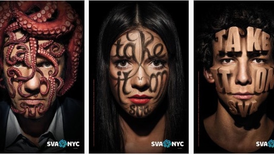
I have a special place in my heart (or on my face) for last year’s SVA subway ads, which feature a set of creative faces defaced by their creative ambition. With supreme Photoshop skill, you see three faces interrupted by the message “Take It On, SVA.”
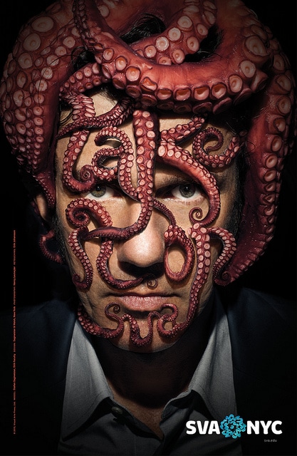
The faces are beautiful and brutalized. One shows a man’s face wrapped in octopus tentacles spelling “Take It On.” A second shows a woman with facial hair all over her face, same message. A third depicts a young man with the message extruded or stamped on his face like a cookie cutter.
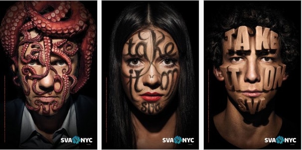
The campaign was created by Sagmeister and Walsh and features photography by Henry Leutwyler and retouching by Erik Johansson. It’s just one of the latest in a continuing tradition of poster design, stopping people on the New York subway in their tracks.

Gordon Drummond is the President of a Sessions College. He's passionate about education, technology, and the arts, and likes to surround himself with talented people. Read more articles by Gordon.
RELATED ARTICLES:
SESSIONS NEWS:
ENROLL IN AN ONLINE PROGRAM AT SESSIONS COLLEGE:


