Color Feel: Jade
How do you use color effectively? Our Understanding Color series explores the psychology of color.
Jade is trending at the moment as a fresh color choice and a new take on green. You can see it in branding projects in tech and online, like in the logo for WhatsApp.
Jade is similar to teal, mint, turquoise, and emerald. The green is more blue than emerald, less blue than teal, and less bright than turquoise. Jade is a 100% saturated color and 66% bright and its hexadecimal value is #00A86B.
In nature, jade is the color of hazy waters on a deep sea dive and of the stone jadeite. In China, jade represents virtue and beauty. Jade works well with hues like navy, chalk, eggplant, and teal.
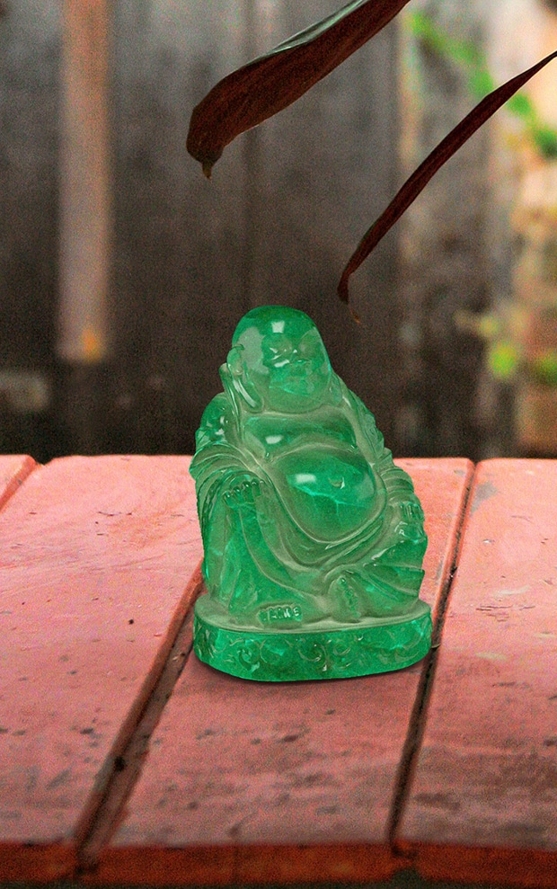
Jade 3D Buddha by Milan Chmelik
Three Jade Design Projects
Let’s look at jade in three design projects and explore this color in action.
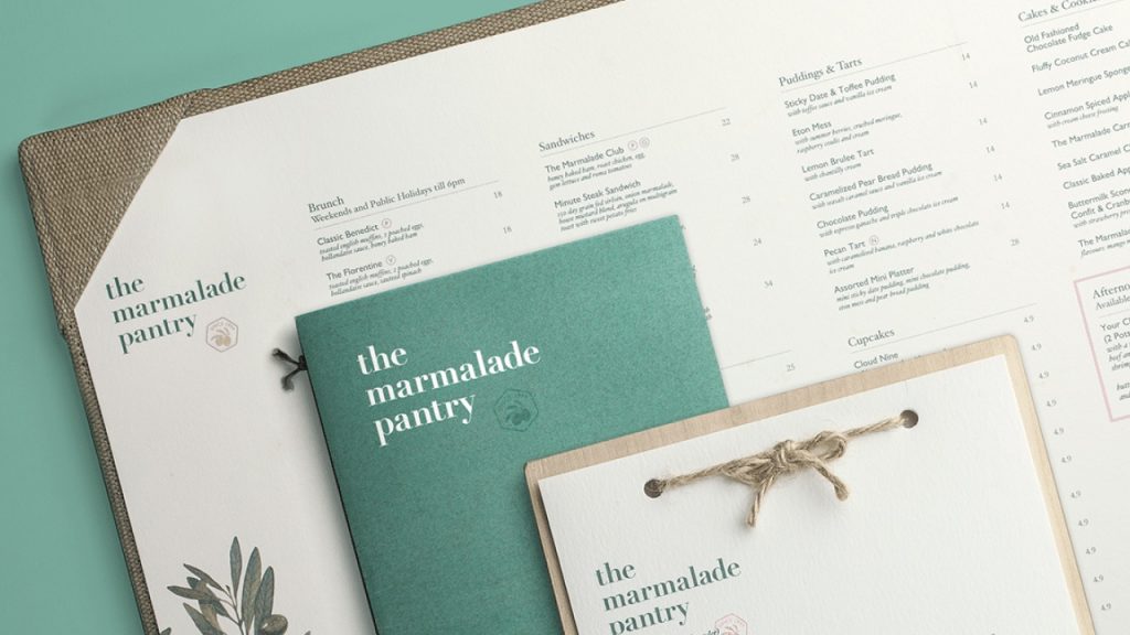
In the Marmalade Pantry branding and identity project, we see jade combined with soft neutrals like light pink, nude and tan. In this palette, jade is the leading color and provides rich contrast to an otherwise soft and rustic color scheme. Jade appears a bit vintage and homey here too since similar palettes were popular in 1950s home decor.
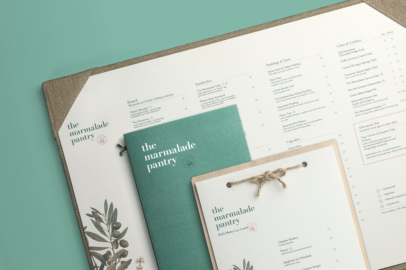
The Marmalade Pantry
For his Jade Eyes project, Bin Yao uses jade as the accent color in a dark primarily grayscale palette. Drops of jade spatter across the cd cover design in a haphazard way and subtly push forward in the design. The color appears mysterious and opulent as the jade in a peacock feather is the focal point of the CD design.
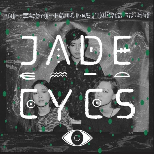
Jade Eyes Project
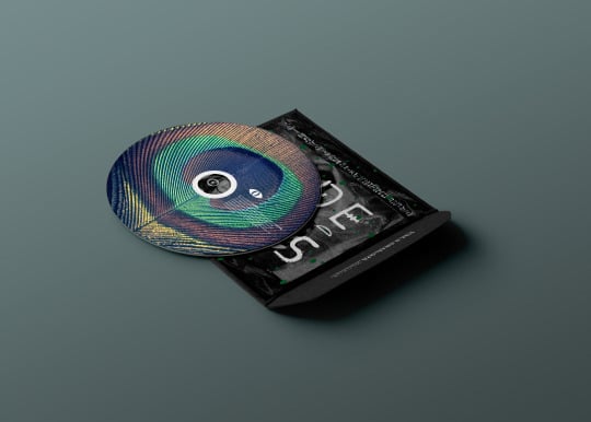
Jade Eyes Project
Reality Lab London, a new company working in the field of virtual reality, uses a bright jade as its central brand color and is a wonderful example of how jade can be used today in a completely modern context.
Jade combined with lots of white space and black and white appears vibrant and crisp, almost clinical and futuristic. Unlike other greens that appear more earthy, jade has a kind of mystique that helps it set this fresh brand apart from more traditional companies.
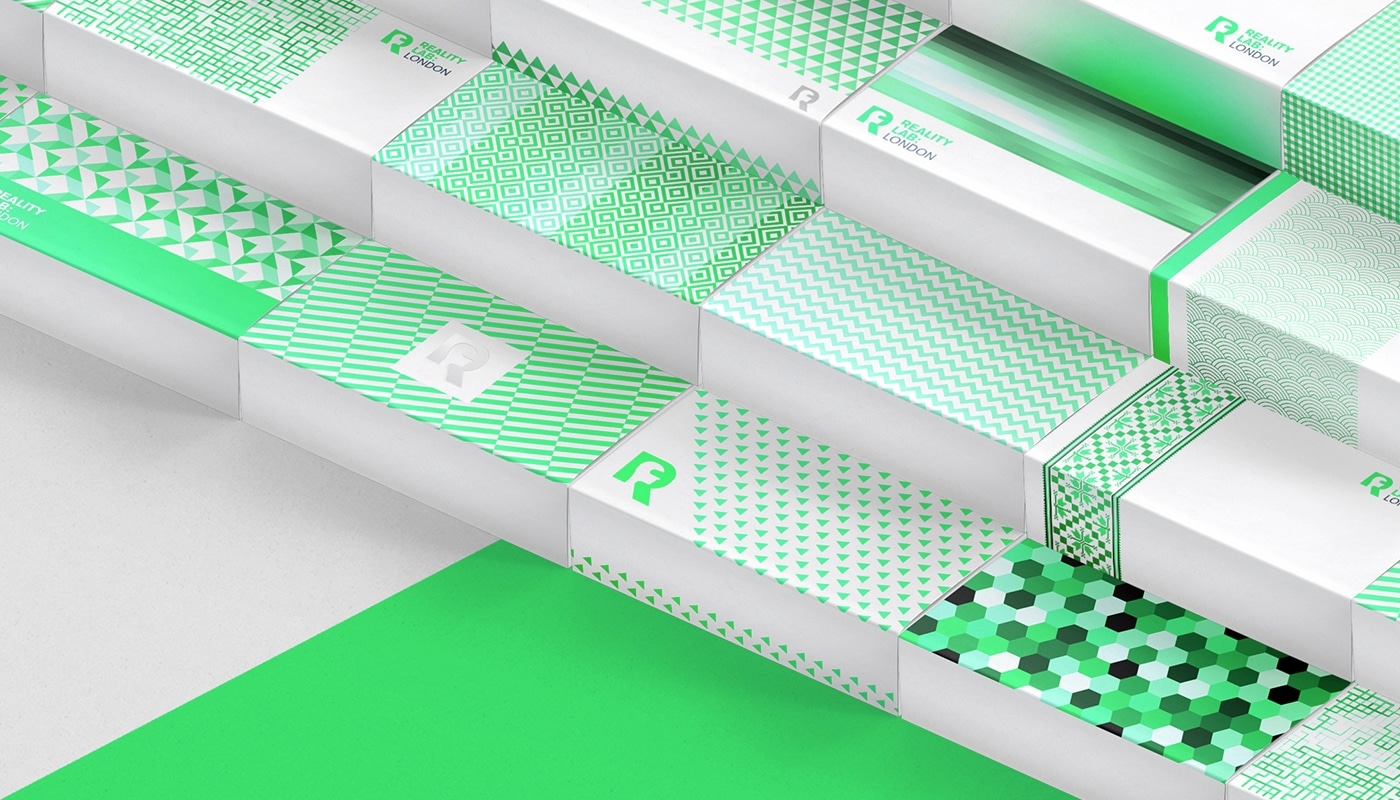
Reality Lab London

Reality Lab London
Jade can be used in a variety of ways from rich and mysterious to soothing and homey. Don’t take our word for it, though— using jade in your own projects and see how it can be applied.
Key Characteristics: Rich, soothing, vibrant, fresh and bold

Margaret Penney is an experienced Brand Designer and Art Director as well as a teacher, designer, writer, and new media artist and Founder and Principal Designer of The Design Craft and 9& Studio.Read more articles by Margaret.
RELATED ARTICLES:
SESSIONS NEWS:
ENROLL IN AN ONLINE PROGRAM AT SESSIONS COLLEGE:


