6 Tips for Designing a Product Label

Creative business tips to kickstart your career as an artist, designer, or content creator.
When in Doubt, Cut it Out
Design-optimized copywriting is important for all projects and particularly label design. Since space is a premium, coming up with concise and clear written copy becomes more important.
A product label usually holds certain key information that includes:
- The name of the product
- A logo for the larger brand, if the product is part of a line
- Units of measurement that denotes the size, quantity or weight of the item
- A short description, or tag line
That’s it for the front of the label. For a package design, more lengthy information is included on the back, and includes:
- A list of ingredients
- A product story
- Directions for use
Of these elements, the two most important to edit and get right are the product story and directions for use because these tend to require more information and so can easily become epic tomes.
If you want to have more information along with your product consider putting it online, or in the case of this example, on the packaging of the case.


Make it Readable
When designing a label, make sure the type is clearly legible through font size and color.
Use a font size that’s large enough, ideally for everyone, including people with reading glasses. The text should be sized above 6 points at the very least, and if you can, try to design the label with the important information at 10 points and up.
The font color should have enough contrast with the background too. If you can, choose a font color that has both value and intensity contrast, so bright + light and dull + dark. Bright colors are considered good choices for type because they are thought to influence a customer to buy. The color choice should really depend on the kind of product though and its existing visual brand style. To explore color options, try using Adobe Color or the Sessions Color Calculator.
When using type on a label, you can probably forego having a photo or pattern background behind it as well—this really affects readability and neither presents the text or the background image favorably.
Use Typographic Pairing
Since label design includes little information and space, combining type, typographic pairing, is also important.
It’s a way to create a visual juxtaposition between different kinds of information in a design. It can help to create a distinction between two or three things, which helps the viewer recognize that these pieces of information are totally different.
On the flipside, it can be used to create continuity between information, through the use of the same font, or only subtle difference, through the use of a slightly bolder or drop caps version of the same typeface.
The ultimate goal with typographic pairing is to present the actual relationship of the information through the type choices.
In the Ingelsta Kalkon project below, type pairing is used effectively to present different information clearly through the combination of a condensed and bold san serif, glyphic, grotesque and retro casual script.

Usually, a design with four+ fonts runs the risk of being visually cluttered, yet with the Ingelsta Kalkon project, it’s able to include so many because of the careful attention paid to how they are combined.
Create Space with White Space
In addition to typographic pairing, white space can be used to separate information and create visual distinction too.
In the Fic Ginger Ale project, the label design uses white space and an understated minimalist type design to present the label information in an understated almost quiet way. White space always lends a design a calming and open feel.

Decorate and Illustrate
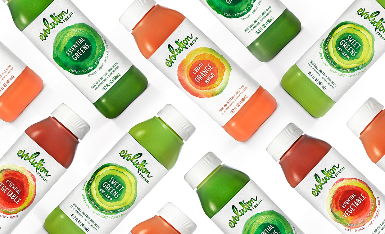
A label design can appear fairly basic without the addition of some kind of illustrative or decorative element. Illustrative elements can also be used to tell us more about a product visually. For the Evolution Fresh project, abstract colorful inky illustrations are used to speak to the fruity flavor of each new juice.
Pay Attention to Print Quality
Last but not least it’s key to print the label using quality card stock to give it the most visual presence and panache. Whether you choose a slick gloss, coated or matte surface are important factors to consider.
You may want to choose something distinct that enhances the look of the product, like in for the Llanos Negros label design, where gold foil and print layering techniques are used to create a label design that is like a work of art:


Margaret Penney is an experienced Brand Designer and Art Director as well as a teacher, designer, writer, and new media artist and Founder and Principal Designer of The Design Craft and 9& Studio.Read more articles by Margaret.
RELATED ARTICLES:


SESSIONS NEWS:

ENROLL IN AN ONLINE PROGRAM AT SESSIONS COLLEGE: