


Free Font Friday: Fruktur
by Taylor Slattery | November 20, 2020
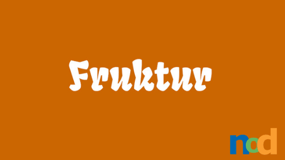
Fruktur is a rounded black letter typeface created by Sorkin Type Co. Like other black letter typefaces, it has a strong heritage feel to it. It feels like the type of font you might find on the hand-carved signage of an old German village, or a German-themed mini-golf course, at least. It has a great deal of contrast in its stroke thickness, which keeps it legible even at smaller sizes and prevents its thick, rounded forms from melting together.
Unlike some of its more serious relatives in the black letter family, Fruktur has a markedly friendly air about it. Where traditional black letter typefaces are consistent in the thickness of their vertical strokes, Fruktur actually features a slight taper, with its letterforms being most bulbous at the top, before slimming down as the approach the baseline. This gives the type a more fun, dynamic feel while still adhering to the general structure of a black letter typeface.
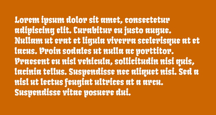
Despite its legibility, Fruktur isn’t something you’ll want to use for body copy. Fruktur will shine brightest in short bursts, so limit your usage to headlines, captions, or pull quotes. Another aspect to consider is it’s character. Depending on the context and pairing, Fruktur can come across as borderline parody, so make sure the occasion is appropriate. Fruktur is available in one weight and can be found for free here.

Taylor is the Managing Editor of Notes on Design. Taylor is a graphic designer, illustrator, and Design Lead at Weirdsleep.


NoD Newsletter
Enhance your inbox with our weekly newsletter.