Free Font Friday: Readex Pro

Our Free Font Friday series profiles the design characteristics of today’s free downloadable typefaces.
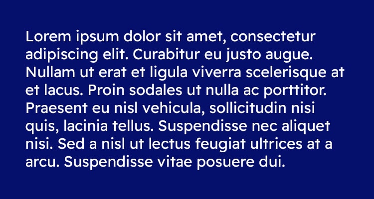
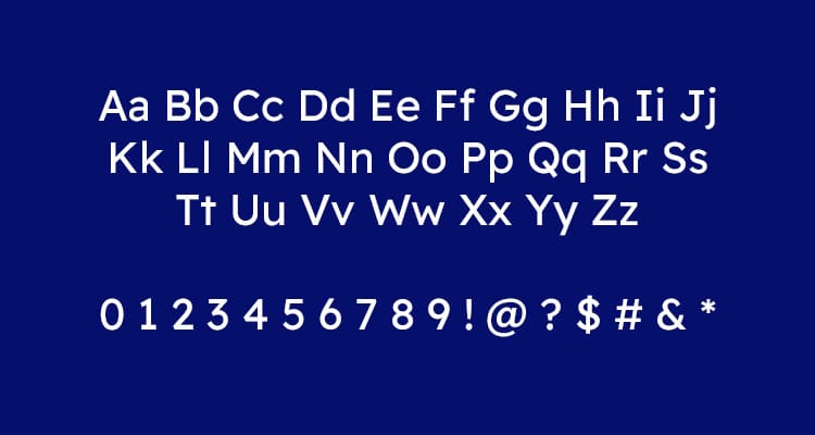
Readex Pro is a sans-serif typeface designed by Thomas Jockin and Nadine Chahine. If it looks a bit familiar, that’s because it’s actually the world-script expansion of the Lexend type family originally designed by Bonnie Shaver-Troup in 2001, and updated with a variable version alongside Jockin in 2018.
Like the original, which was specifically designed to reduce characteristics of type that can be confusing for readers with dyslexia, Readex Pro brings the same accessibility from the Latin character set to Arabic script, which was added by Nadine Chanine in July of 2021.

Shaver-Troup, an educational therapist by trade, first identified these characteristics, now known as the Shaver-Troup Individually Optimal Text Formation Factors, while working with students who struggled with reading. Studies have demonstrated immediate improvements in reading fluency among dyslexic readers when reading Lexend in comparison with other typefaces.
By using a face like Readex Pro or Lexend, that applies the Shaver-Troup Individually Optimal Text Formation Factors, you can ensure your work is accessible to a broader range of readers. In terms of character, Readex Pro has the flexibility to match most applications.

Readex Pro is available in 6 static weights as well as a variable weight version in both Latin and Arabic character sets. You can find it for free here.

Taylor is a concept artist, graphic designer, illustrator, and Design Lead at Weirdsleep, a channel for visual identity and social media content. Read more articles by Taylor.
RELATED ARTICLES:
SESSIONS NEWS:
ENROLL IN AN ONLINE PROGRAM AT SESSIONS COLLEGE:


