Super Systems: Mailchimp
by Taylor Slattery | April 21, 2022
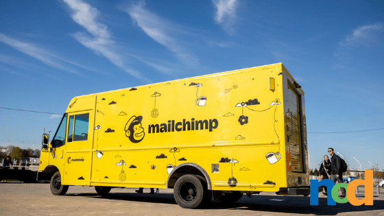
Founded in 2001, Mailchimp is an email marketing service that allows users to create and manage mailing lists and email marketing campaigns. In the crowded SaaS space, Mailchimp stands out for its fun, distinctive brand identity reflective of the creatives and small businesses that make up its user base.

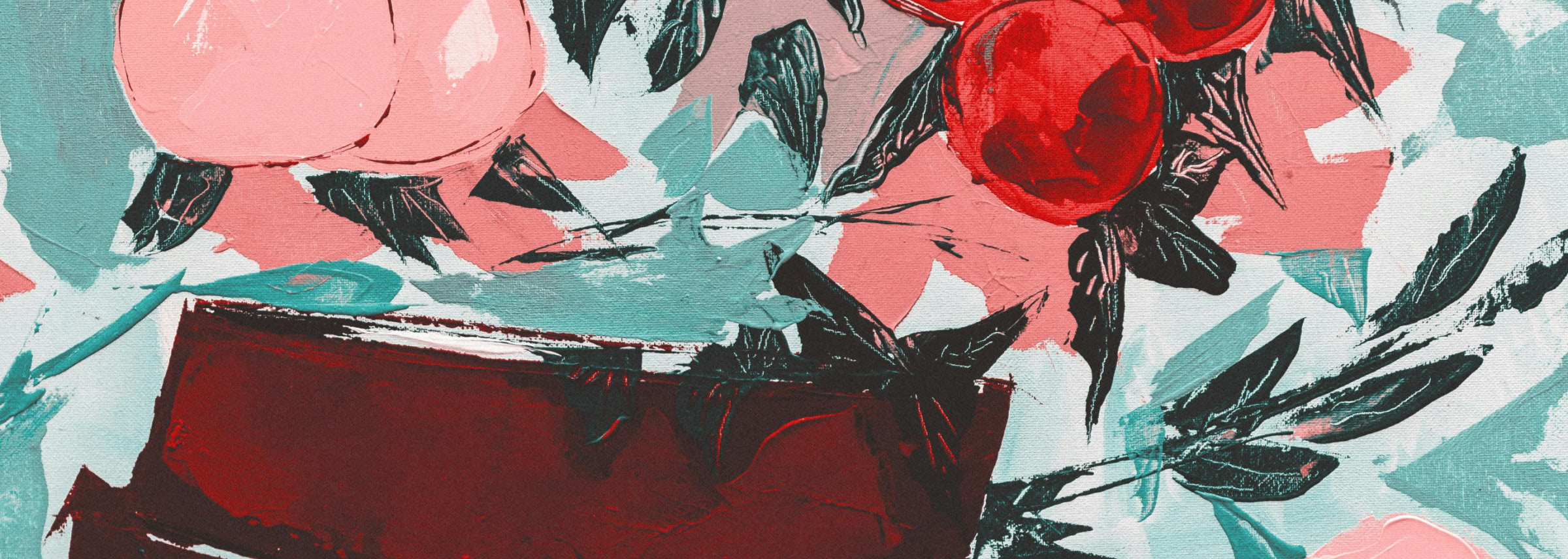
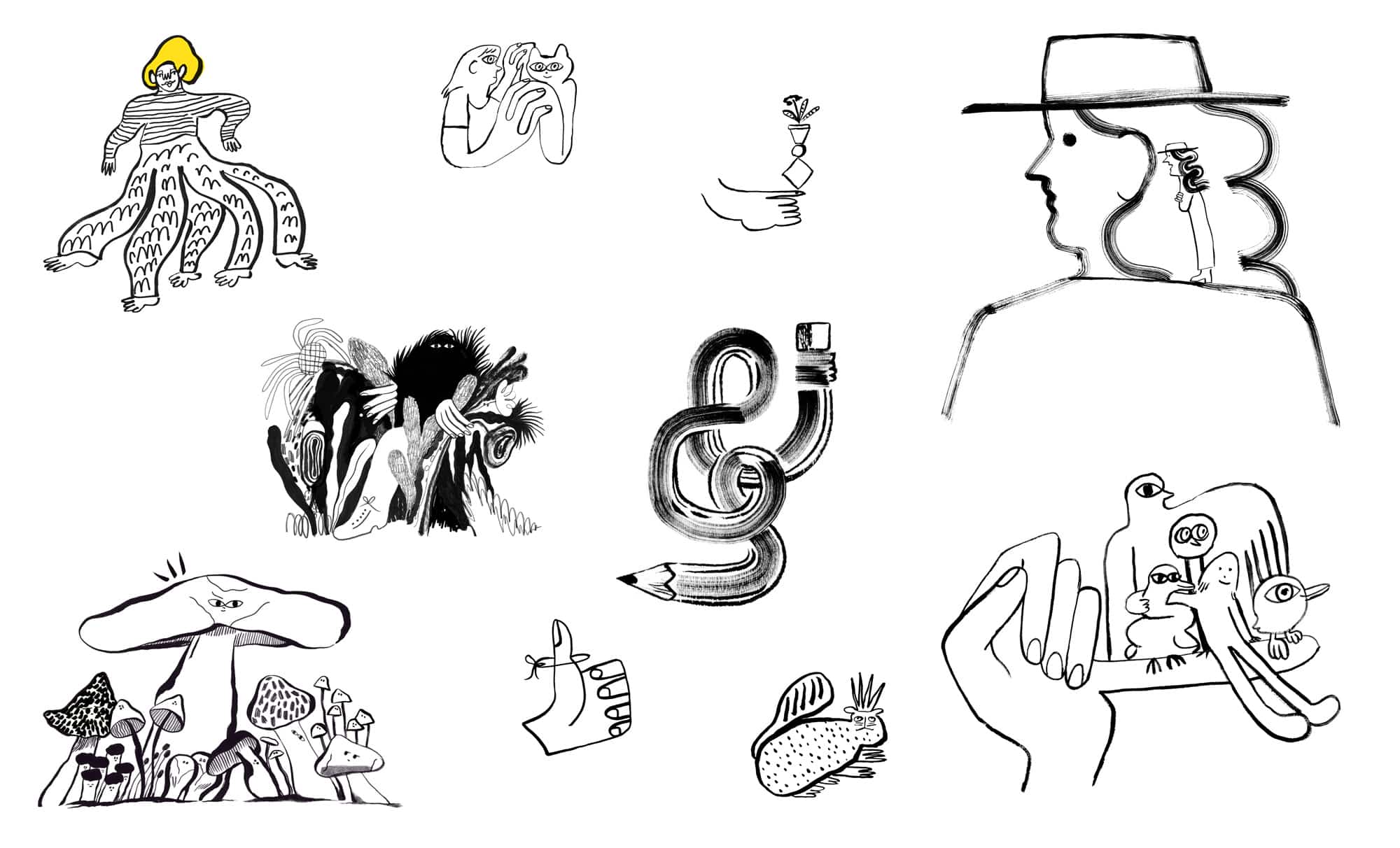
Since its inception in 2001, the Mailchimp brand identity has undergone a number of iterations, the best of which took place in 2018 and saw the company adopt a more simplified version of their logo mark which features Freddie, their mascot, alongside their now-signature Cavendish yellow. Cooper Light also came to be the company’s primary typeface. Striking the perfect balance between casual and formal, Cooper Light is equally well suited for more corporate, editorial purposes like annual reports as well as paired alongside the company’s weird, whimsical illustrations.
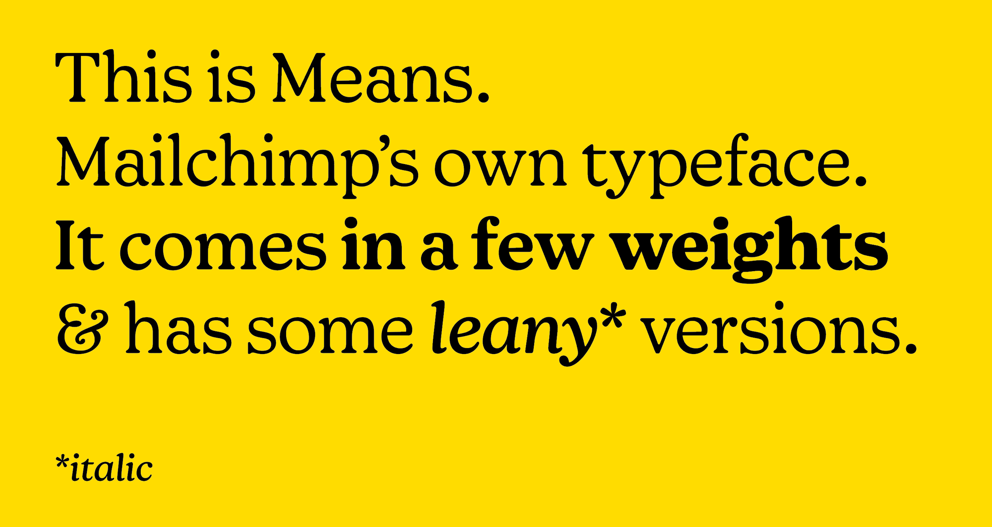
Cooper Light has since come to be replaced by Means, a typeface created specifically for Mailchimp by Commercial Type. The two typefaces are actually quite similar in appearance, enough so that you may not have noticed had Mailchimp themselves not announced the switch in 2020. Means captures much of the same casual energy as Cooper Light, well reducing some of its roundness. The result is a typeface with a slightly more authoritative appearance, making it a bit more flexible in the editorial direction.
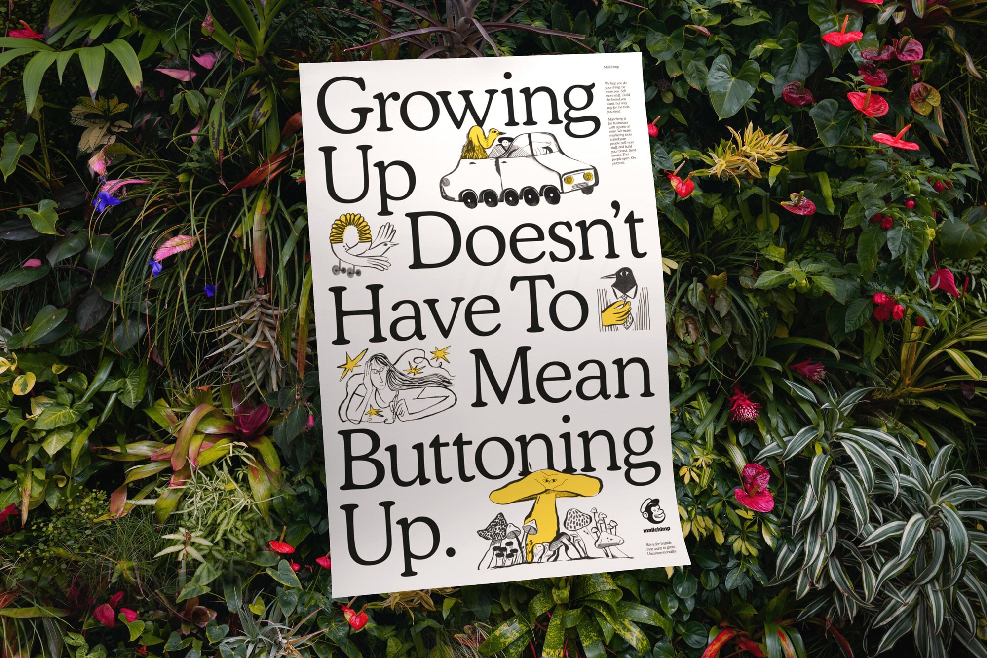
The change was summed up nicely in the copy of a poster design that accompanied the brand identity’s 2018 unveiling: “Growing up doesn’t have to mean buttoning up.” As a company that designs tools to help creatives and small businesses grow and level up their operations, it’s only fitting that they do so too. By serving as a shining example of how a brand can grow in sophistication without sacrificing what makes it unique, Mailchimp truly embodies its brand values in a way that resonates with its customers.
While other companies like Dropbox have also employed illustrations in a bid to warm up the inherently impersonal SaaS experience, Mailchimp has managed to do so to greater success. As a suite of tools designed to help creatives and entrepreneurs grow their businesses, Mailchimp naturally attracts users with a creative, adventurous spirit, and they’ve always done a great job of leveraging this knowledge.
Creativity and entrepreneurship are messy. Seeking progress in either requires one to first make peace with imperfection. As humans, we learn through failure. The process of growing a business or brand is anything but precise and plenty of mistakes are made along the way. The team at Mailchimp understands this and uses subtle visual cues to make its user experience feel about as human as a SaaS experience possibly can.
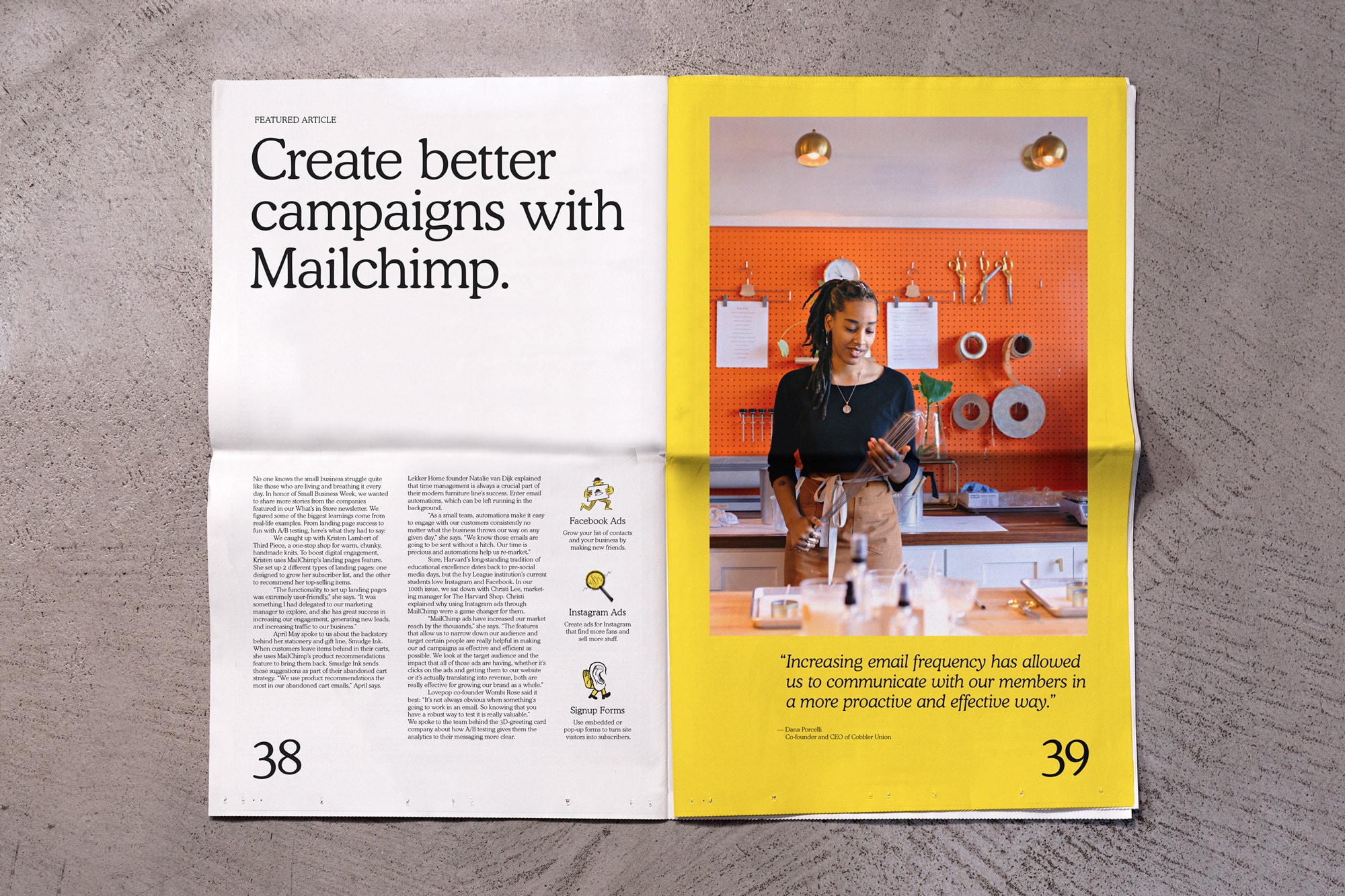
From the mascot, Freddie, who serves as the literal face of the company, to the warm, friendly Cavendish yellow of the landing page with its rough illustrations and round type, the Mailchimp brand identity embodies the company values at every possible turn. With a journey that parallels those of its users, and a radically creative in-house design team, everything about Mailchimp reads as authentic.

Taylor is the Managing Editor of Notes on Design. Taylor is a graphic designer, illustrator, and Design Lead at Weirdsleep.
Are you interested in sharpening your business skills? Sessions College offers a wide range of advertising and marketing courses. Contact Admissions for more information.
