Type in History: The Didones

What makes type tick? Our Type in History series explores the origins of today’s typography trends.
The Didone font styles, which originate in France, first became popular at the turn of the 18th century. The Didone name comes from combining two popular Didone typefaces, Didot and Bodoni, together.

Let’s Talk Type by Herb Lubalin
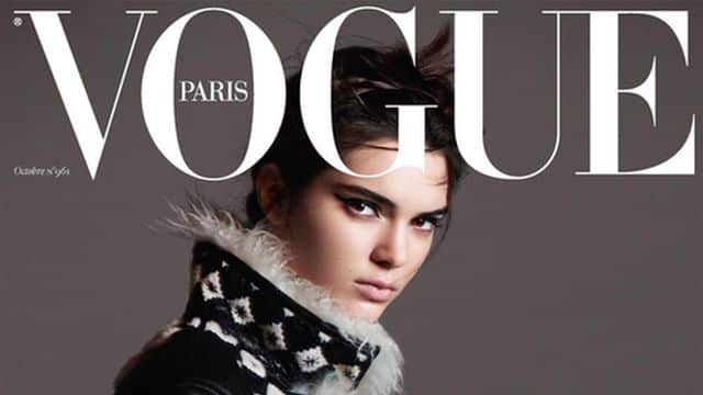
The Vogue cover display type is a Didone.
The Didone typestyles, also called Moderns or Neoclassicals, have never really gone out of style since they are practically synonymous with elegant and sophisticated type design. You can see Didone typefaces in use on the cover of most major fashion magazines. Luxury brands like Cartier and Christian Dior use Didone typefaces for their logo.
Cartier logo in a Didone type style.
Didones typically have contrasted thick and thin strokes, vertical orientation, narrow and delicate serifs, and a uniform modern appearance. Didones are unlike their predecessors, the Old Styles, in that the serifs are simplified and the letters appear more uniform in size and angle, more ‘modern’.
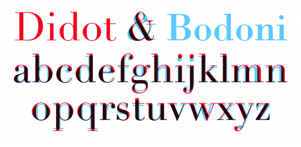
Jacob Smith’s type project that demonstrates the key differences between Didot and Bodoni, the leading Didone type styles.
A particular popular subset of the Didones are the Fat Faces, which are display typefaces like ultra-bold Bodoni (Bodoni Poster), which were used quite commonly for newspaper headlines and in advertisements at the turn of the century since they were easy to read at a distance.
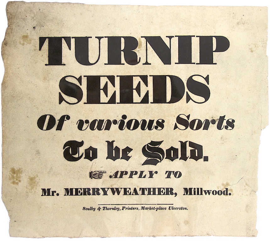
Advertisement in a Didone font style.
Didone Fat Faces were also used in mid-century book cover design and on the cover of Jazz and classical records.

E.E. Cummings book cover design.
In the past year, Bodoni Poster has seen an upsurge in use for a wide range of graphic design project types from product, to menu, flyer, and poster design. The fat faces have become a new retro type style that is popular, especially in combination with simple modern san serifs.

Design project by Marie-Pier Tardif exploring Bodoni Poster.

Margaret Penney is an experienced Brand Designer and Art Director as well as a teacher, designer, writer, and new media artist and Founder and Principal Designer of The Design Craft and 9& Studio.Read more articles by Margaret.
RELATED ARTICLES:


SESSIONS NEWS:

ENROLL IN AN ONLINE PROGRAM AT SESSIONS COLLEGE: