Evolving with Adobe Illustrator

Q: Illustrator seemed pretty limitless 10 or 15 years ago. What continues to excite you about the program?
I can’t believe I’ve been using this bit of software for over 20 years so it’s been interesting to see how it’s evolved over that time. As technology advances so too does Illustrator. It’s not just performance improvements either, which are welcome, but expanded functionality and new tools and abilities. Freeform gradients are just the latest example of this innovation. There are things I can do now that would have killed or significantly slowed down previous computers I’ve used the program on.
There are a number of non-Adobe apps out there that are also Illustrator graphics friendly. The companies that make those apps know how ubiquitous Illustrator is to the creative field so they take advantage of it. It’s been a boon for me with the various apps I use for UX design and motion design.
The team at Adobe is always coming up with new ideas and concepts. You can see this in action by participating in their prerelease program. Through that program, you can attend virtual meetings with the software engineers and see what proof of concept ideas they’re engaged with. Plus, you can try out the latest builds of Illustrator to get a real feel for how the new features behave. What’s more, they listen to your feedback. It’s a fascinating way to help influence Illustrator’s future.
Q: You mentioned Freeform Gradient, one this year’s most ballyhooed new features. What’s exciting about it?
 Traditionally, you’ve had two types of gradients available: radial and linear. They’re nice but limiting in certain ways. Freeform just opens the door wide as far as where you want to have colors change and merge into one another on an object. There are no limitations. As a plus, it’s easier to use than the Mesh Tool which can provide artwork a more painterly or realistic look.
I’ve not had a chance to put these tools to use in a head-to-head project to see what the pros and cons are. It may be that Freeform Gradients are simply better though, I suspect, the Mesh Tool will win out when it comes to abrupt color changes. Since it’s relatively new, it will take time to fully understand its capabilities.
Q: Has the growth of UX/UI and app design increased the demand for Illustrator?
Oh, without a doubt. Illustrator’s strong suit is certainly in creating graphics for use on the web. Icons, buttons, user interface elements and more can all be created in Illustrator. These can all be brought into UX specific apps such as Sketch, Adobe XD, and Flinto, to name a few. Each of these apps all have vector graphic creating abilities but nowhere near as powerful as Illustrator.
The use of vector has only increased since the advent of the iPhone. One of the initial apps with that revolutionary phone was Google Maps. All of the maps were purely vector. Zoom in, everything remained sharp and clear. I couldn’t imagine how many images they would have had to create if Google Maps was pixel based.
It wasn’t too long ago that every colleague and myself were using Photoshop to create comps and deliverables for web and mobile pages. It was simply the tool you had to know to get a job in the design field. Now, everything is vector. Case in point, I recently worked on updating my portfolio and wanted larger examples of some of my work to showcase. Well, almost all of the work I did at Expedia was in Photoshop’s pixel-based format, saved at a resolution that’s lower than what today’s high-resolution displays show. I ended up recreating this work in both Illustrator and Sketch (a vector friendly UX app). I could now zoom in and take screenshots to show details that are high-quality. By creating all of my work in vector, I’ve essentially future-proofed it against ever-increasing resolution screens.

Expedia website prototype made using Illustrator.
Q: How does Illustrator fit into the prototyping process?
We live in a visual world and that’s not changing anytime soon. Is it easier to sell a concept by showing rather than telling? Very much so. To that end, graphics you create in Illustrator can be animated in programs such as Flinto as well as After Effects. To aid me in learning After Effects recently, I came up with an imaginary concept for what an inflight status screen could look like for Delta. If these were just a series of static screenshots, it would be very difficult to talk about your vision for, say, how the panels appear or how the text presents itself. By showing rather than telling, you eliminate so many questions.

Sample website user flow animations.
Furthermore, there’s Illustrator’s ability to spit out HTML code that describes to a browser the graphics you’ve created in Illustrator. This is possible when you export graphics as an SVG (Scaleable Vector Graphics) file. When exporting, there’s an option to get that code. Copy it, paste it into a webpage and, like magic, you can open the page in the browser and see that graphic. It’s a feature that’s been in Illustrator for over a decade but it’s only now getting attention given that SVG graphics are being pursued more and more by web developers. They’re smaller in size than GIF, JPEG or PNG files and they’re scaleable so you always have crisp, clean looking graphics without pixelation that you would get with other formats. And, since it’s code, it can be manipulated on the fly with some smart scripting.
Q: Your top three productivity tips or features for Illustrator users?
First are keyboard shortcuts for tools and menu items you use frequently. I mention in the course material how I delayed learning the shortcut keys for far too long. I’ve certainly not memorized them all but I do know those for the tools I use the most. Not having to keep moving my mouse over to the toolbar or up to the menu does save time and frustration, especially if you use more than one monitor in your workflow.
The second tip is to take advantage of custom workspaces. Illustrator offers a handful of these so, if you’re working on a text-heavy composition, for instance, use the Typography workspace. It gives you quick access to type tools and panels you’ll use frequently such as the Character Panel and the Paragraph Panel. What’s more, you can create your own custom workspace if none of the presets give you just what you need.
The third tip is relatively new. It’s customizable toolbars. For the longest time, you could not change what tools appear in the toolbar and there’s quite a number of tools you’ll never use in a project. Now, you can create and save a toolbar with as few as one tool if that’s your thing. It takes a lot of visual clutter out of your work environment and lets you focus on just what you need.
Q: What kinds of Illustrator projects should an aspiring designer have in their portfolio?
To answer that, you need to know what role you want to take on in the design industry. If I were aiming for a position as a graphic designer, I would certainly showcase a mix of logos, packaging design concepts, posters, and full design systems such as supporting graphics for an ad campaign. If you’re looking for a creative role in the web field, certainly include designs you’ve created for websites down to mobile phones and the tablets in between. The goal for creative work is to show variety and depth. For technical roles on the web, you would want a mix of high-fidelity mock-ups, wireframe flows and, to a degree, icon design.
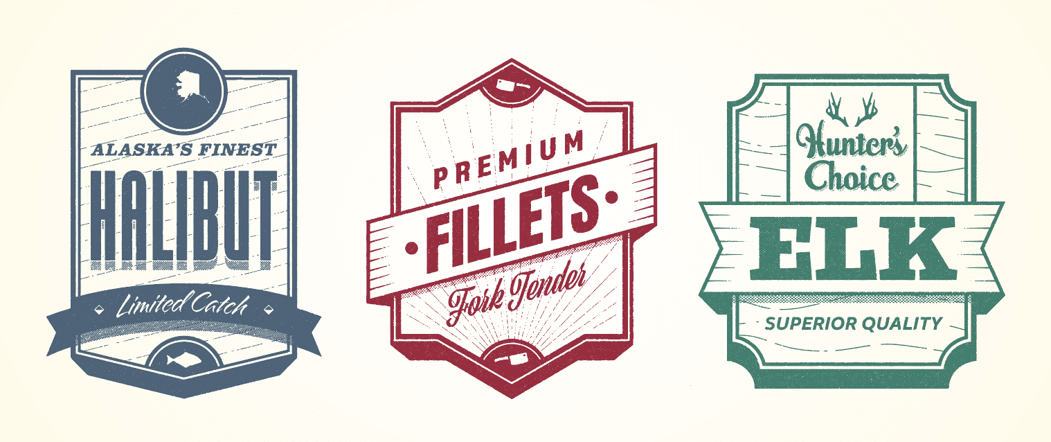
And make up stuff! I’ve done this all my career to fill out my portfolio to snag the attention of employers for certain roles. I recently made the badges above to showcase not only my typographic skills but illustration skills as well. I’ve created logos and collateral elements for companies that don’t really exist. It’s a freeing experience as you’re the only one that puts constraints on a project and call all of the shots.
Q: Do you see more traditional illustrators becoming digital illustrators?
This is a tough one. I tend to believe that a medium you’re comfortable with is what you would use most but I know a number of traditional designers who use digital tools when needed. What’s that saying? Use the right tool for the right job in the right way. I will say that as computer graphics get ever more realistic and the tools to create them become more natural – think digital tablets and styluses – you’ll have more and more hybrid illustrators.
I do feel, however, that there will always be traditional illustrators. There’s a tactile element to applying oil to a canvas or watercolors to textured paper. And, for the foreseeable future, that’s not something that can be replicated on glass canvas.
To learn more about taking online courses or programs in Illustrator, Adobe Creative Cloud, or illustration at Sessions College, visit sessions.edu.

Sessions Staff is a restless soul who loves to share relevant news and design industry information with current and prospective students. Read more articles by Sessions Staff.