


Free Font Friday: Bauru
by Taylor Slattery | August 16, 2019
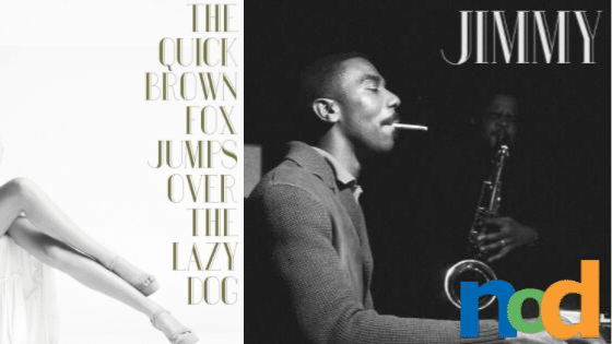
Bauru is a serif font created by Brazilian motion-graphics designer Pier Paulo. The font’s tall, elegant letterforms have a very classic feel, while its hairline serifs read as very modern and contrast nicely with the perceived thickness of the stems. To counterbalance the overall visual weight, the stems incorporate stripes of negative space, which also serve to add a little bit of Art Deco flavoring.
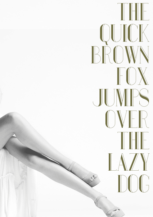
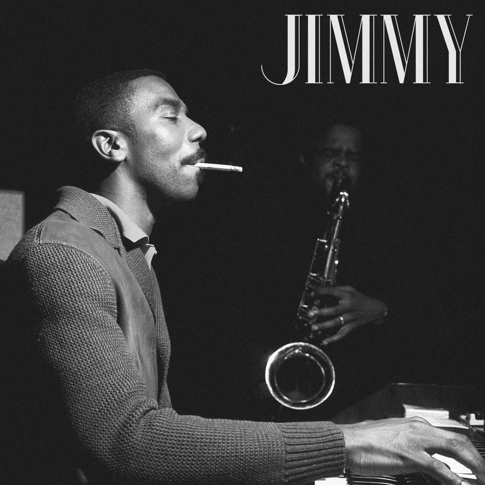
Its refined vintage character carries with it a world of imagery and connotations, from Art Deco posters and advertisements to jazz album covers. As a display font, Bauru is best suited for headers, hero images, or used sparingly for titles in posters or covers. Its simple sophisticated appearance leaves an immediate impression, but it does so without screaming for attention. Bauru is not incredibly legible at a distance but in the hands of a crafty designer, it can be used to invite a viewer to come and take a closer look. Bauru is free to use in both commercial and personal work and can be found here.

Taylor is the Managing Editor of Notes on Design. Taylor is a graphic designer, illustrator, and Design Lead at Weirdsleep.
If you are interested in learning to use typography, Sessions College offers Basic Typography and Advanced Typography courses as well as a course in Web Typography. Contact Admissions for more information.


NoD Newsletter
Enhance your inbox with our weekly newsletter.