


Free Font Friday: BioRhyme
by Taylor Slattery | November 17, 2022
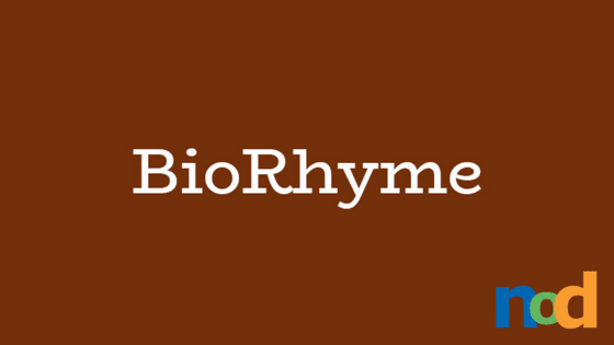
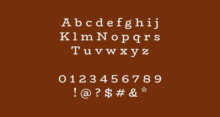
BioRhyme is a slab serif typeface family designed by Ohio-based typeface designer and teacher Aoife Mooney. Its wide-set characters and uniform stroke weight give it a bold graphic feel at larger weights and playful sophistication at lighter weights. It’s got classic styling reminiscent of vintage signage with an interesting twist. When certain characters appear next to one another, the eye detects a subtle line that continues through them, creating a wave-like flowing effect that guides the eye along, while other character pairings reveal mirrored slab serifs—both contributing to the typeface’s strongly unified appearance.
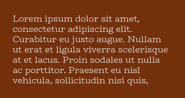
These clever, intentional structural connections found in BioRhyme’s carefully crafted letterforms demonstrate a strong attention to detail and what must have been a great amount of time and thought put into its design. The result is a typeface bursting with personality without compromising on utility. Its roundness contrasts nicely with the visually-reinforced baseline resulting from its wide serifs, making not only for an interesting variety in shape, but in personality as well.
BioRhyme feels at once traditional and modern, sophisticated and playful. Its heavier weights make for a great display typeface and its personality would match well with a variety of product packaging and signage projects. BioRhyme’s additional weights give you an added degree of flexibility for type in other areas of the packaging as well, with its lighter weights working well for medium-sized amounts of copy.
BioRhyme is available in 5 weights. You can find it for free here.
Taylor is the Managing Editor of Notes on Design. Taylor is a graphic designer, illustrator, and Design Lead at Weirdsleep.


NoD Newsletter
Enhance your inbox with our weekly newsletter.