The Dynamics of the Analogous Color Scheme

How do you use color effectively? Our Understanding Color series explores color harmony.
There’s a reason why Claude Monet’s Water Lilies (1906) painting is so revered and undisputed as a masterpiece. Monet’s use of a high key (light on the spectrum) analogous color scheme creates a feeling of harmony to most people. We know that art is always subjective; not everyone will respond the same to each piece, even Monet’s.
There is a science though, to color and to the feelings it elicits when a person focuses on it. The dance of tone and temperature can bring our emotions from relaxation to exhilaration.

As artists and creatives we want to use our designs to affect and inspire people. Let’s extrapolate the power of the analogous color scheme in our quest to engage our audience. First, let’s review color theory 101.
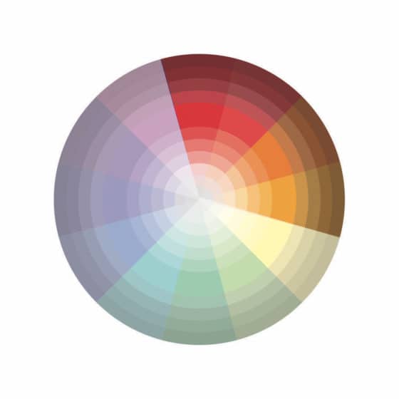
Remember these terms when discussing color:
- Tint: A color that has been lightened by adding white.
- Hue: The color of paint as it appears out of the tube, unmixed.
- Tone: A color that has been lightened or darkened by adding gray.
- Shade: A color that has been darkened by adding black.
- Analogous color scheme: At least three colors are found close together on the color wheel.
Creating a sample or mood board of paint chips from the local hardware store can be helpful when choosing your palette. Planning your color scheme is one of the most important initial steps when designing a room, painting on canvas or creating a digital design.
The analogous scheme goes right and left of your starting color. You can begin warm or cool, light or dark, but always group colors on the wheel. Art pieces like the following works show warm and cool variations of the analogous theme.
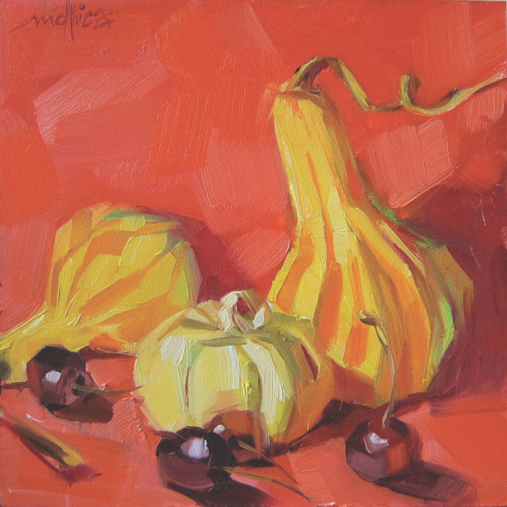
Harry, Mo & Curly by Patti Mollica, Analogous color scheme with warm temperature
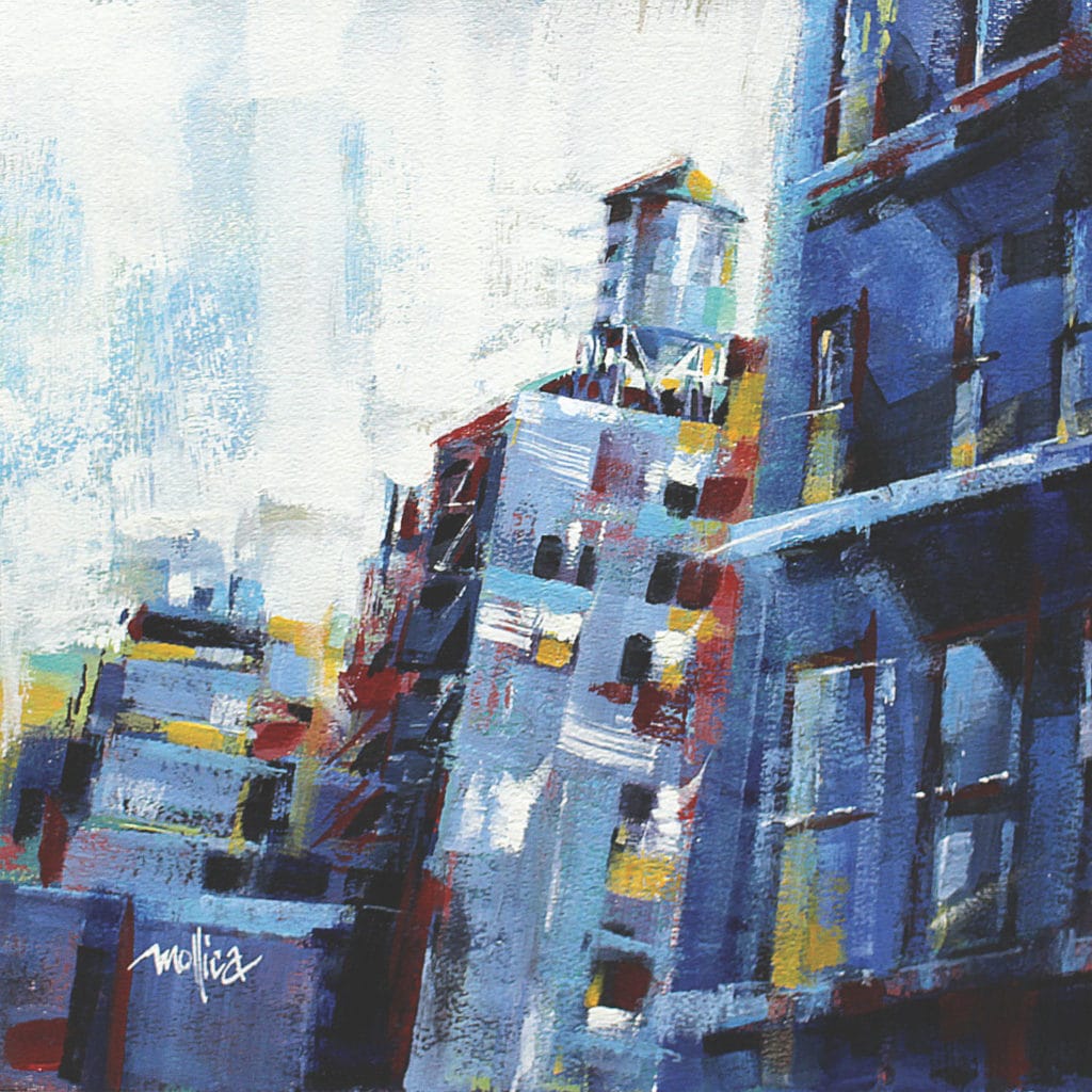
Looking Uptown by Patti Mollica, analogous complementary color scheme with cool temperature
The analogous theme tends to be restful on one’s eyes. It makes sense to our minds and doesn’t jar us. If you venture out of this harmonious area, your audience may feel uneasy. Startling and compelling reactions may be your intention, but being purposeful and understanding the dynamic ramifications of color grouping is all part of mastering your art.
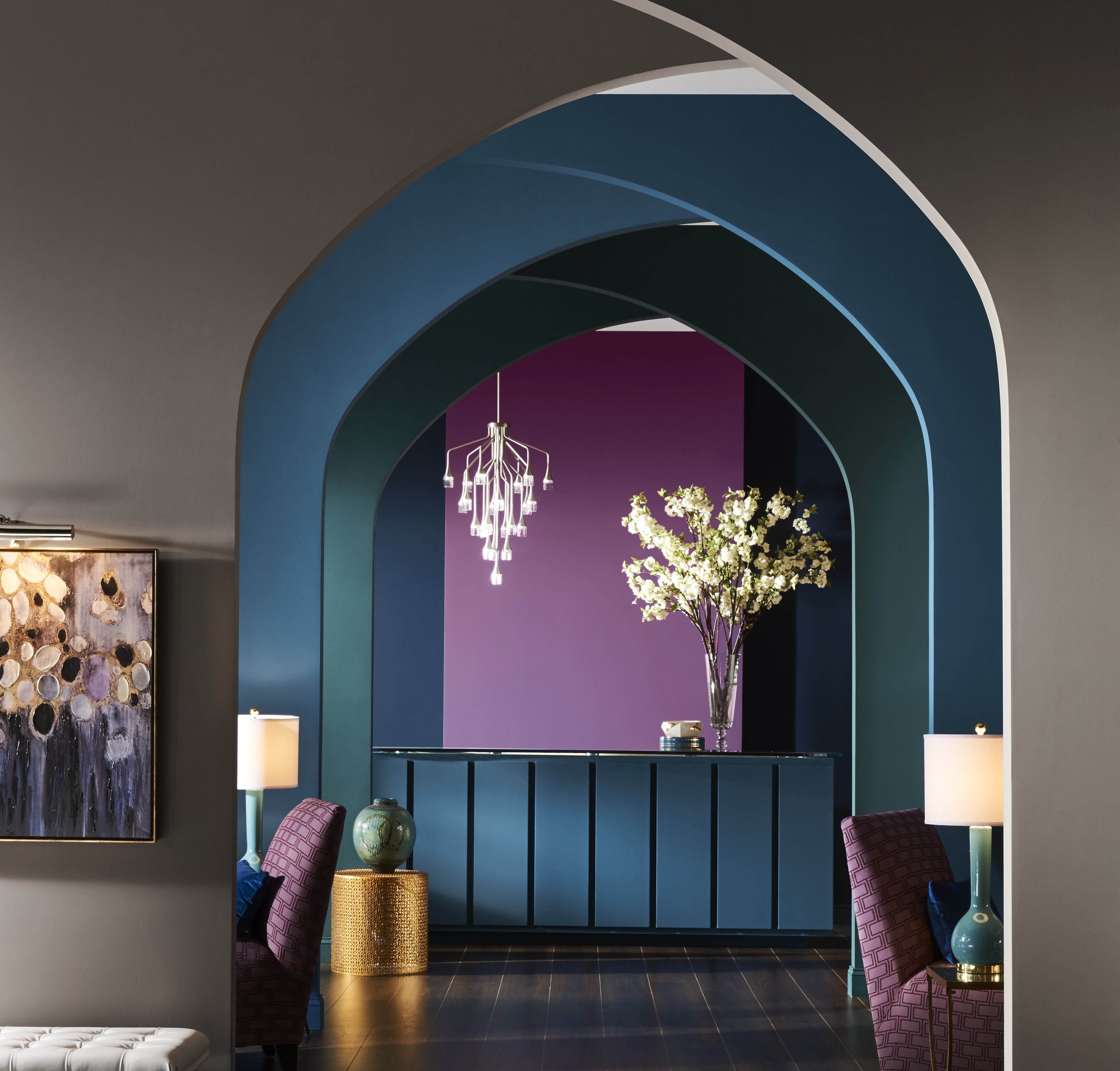
Let’s see how the analogous color scheme translates into our homes. It can be a slightly monochromatic look with just three colors. With up to four or five color neighbors it becomes an energized space. Analogous color themes are one of the most natural schemes to apply. We see plants, rocks and trees in our environment with slight variations; picture Fall leaves or river rocks, their tones and shades are commonly related.
As you work these neighborly tones into your home it feels natural as it would viewing your exterior environment. Your starting position on the color wheel dictates the mood. The following are examples of how the vibe changes with relationship to the position the colors are on the wheel.
Blue-Green, Blue, Blue-Violet = Sexy, Chic and Feminine
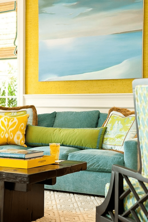
Blue Green, Green, Yellow Green = Comfortable, Happy, Casual
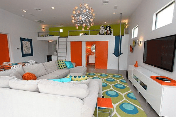
Blue Green, Green, Yellow-Green, (now add Yellow & Orange) = Retro, Vibrant, Youthful
The analogous color scheme can be your best friend; a go-to for designers. It’s easy to build on and develop. It follows a route around the color wheel that is just as easy to follow as Google maps. Consequently, the stunning results will make you look like a design genius.
Being familiar with and implementing this influential color scheme will definitely become part of your dynamic designer’s arsenal.

Sessions Staff is a restless soul who loves to share relevant news and design industry information with current and prospective students. Read more articles by Sessions Staff.


ENROLL IN AN ONLINE PROGRAM AT SESSIONS COLLEGE: