5 Things to Keep in Mind When Designing a Logo
by Margaret Penney | April 15, 2016

Your Sketches Don’t Need to be Perfect
When you are starting the logo design process, you might be inclined to think your initial mark making need be draftsman quality, however, this is not the case. Wobbly rectangles, faint swooshes and Ouroborus-like scribblings are all perfectly acceptable at this stage of the process. The most important thing is, whatever you are sketching is something that makes sense to you, so when you go to further explore the shapeforms you can conjure up your initial ideas. It’s more important to capture the essence of those really creative moments before you forget them than to completely map out the entire logomark in one go.

The lineage of the iconic IBM logo designed by Paul Rand
Your Logo has a Past
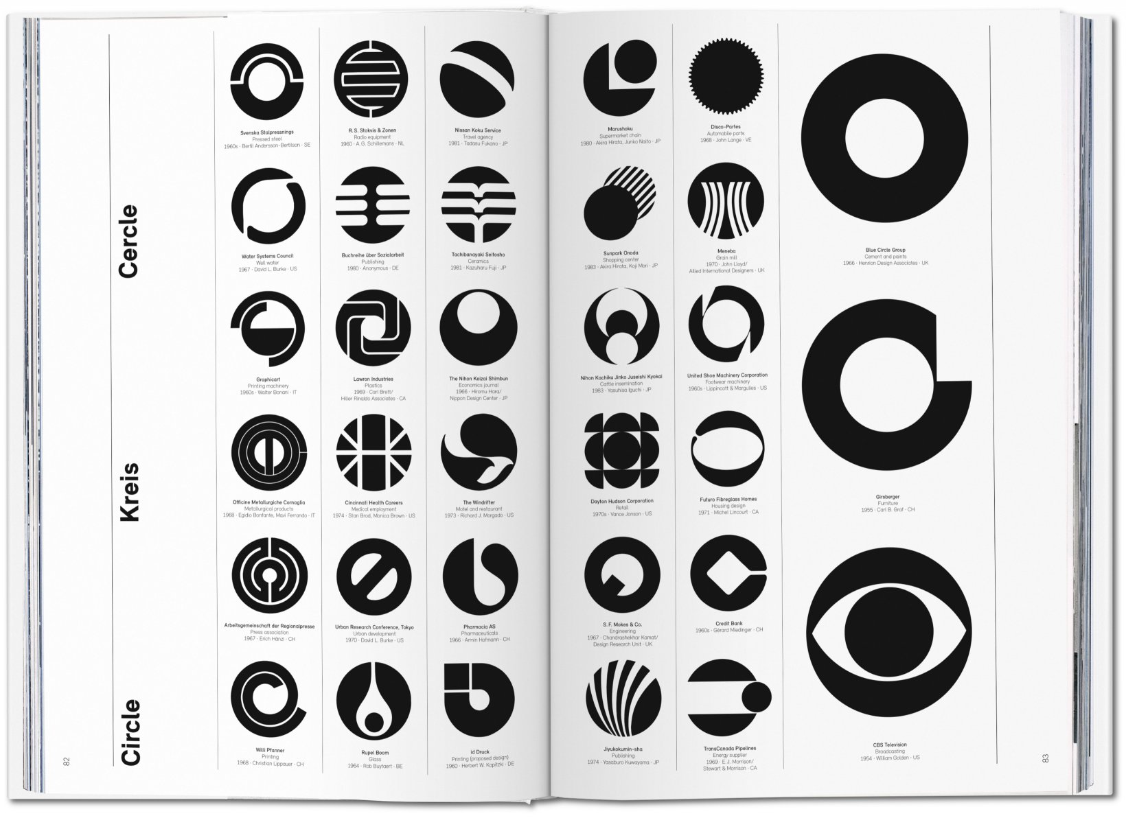
A good logomark isn’t just a knock off of the latest design you’ve seen on a site like Dribbble. Au contraire, your logo should never tell a visual story that isn’t its own. A quality logo design is carefully discovered, researched and should come from a place of design knowledge and history. Your client has come to you to create something completely new for them, but the design also exists within the framework of graphic design history and visual storytelling. A key way to create a striking logomark is to understand how to create visual stories that stand the test of time and exist within a historical context.
150 Pixels or Bust
A common mistake with logo design is to not take into consideration what the logo will look like at the bottom of an event page scaled to about 150 pixels. If a logo is too intricate and detailed or has very thin lines, it will turn into a muddy faint whisper of a logo scaled down very small. So, when you are designing a logo you must make sure it looks beautiful big, and also very small, like 150 pixels.
Work the Letters
One way to stand out as an amateur logo designer is to choose a font and then simply write out your client’s company name in that font, without working the letterforms enough or at all. This process is called Kerning and is something every beginning designer is taught, so it’s really important that for a logo in particular you work those letters until they look good. I would suggest taking a course in typography to learn the fundamentals. Once you understand the basics of letterforms, you could even explore making the letters totally your own and make custom letterforms for each logo design.
Make it New, Too
It’s important to create a design that exists within an historical context and also is a fresh take. Make sure you do thorough research on your client so you can come up with unique ideas for them specifically—you’ll be less likely to create something expected and bland for them if you do. Avoid the clichés like thought bubbles, light bulbs, gestural people, spirals, smiley faces, folded hands, and birds. If you think a dove makes sense for your client’s logo try to find a new way to illustrate this type of bird using a new illustrative technique, for instance.
Source: HOW Design, Taschen

Margaret Penney is the Managing Editor of Notes on Design. Margaret is a teacher, designer, writer and new media artist and founder of Hello Creative Co.
If you are interested in developing your graphic design skills, Sessions College offers a range of graphic design courses for students at all levels. Contact Admissions for more information.


