
Best of Behance: UI Design
by Taylor Slattery | October 13, 2022
Source: Andrew Sevostyanov
Over the past couple of decades or so, we’ve collectively made the transition from carrying a handful of feature-specific devices like music players, GPS navigation, and calculators, to a pared-down selection of a few devices that are capable of doing many things. As the number of devices we carry decreases, digital solutions have come to fill the roles of their hardware predecessors. While the convenience of having to carry fewer devices has certainly changed the way we live for the better, this transition has not been without its hurdles. Without the assistance of tactile buttons and materials to guide users, designers have struggled to find ways to replicate certain tasks on-screen.
However, the transition to digital products has also played an important role in the democratization of design. Due to a more rapid prototyping process and greater access to feedback, design iteration has never been easier. Additionally, without the need to devote budget to costly materials and the screen serving as essentially a blank canvas, the possibilities for ways it can be used are limitless.
With the entirety of our interactions with a digital product taking place on screen, good UI design is incredibly important. Good UI design is quiet—when done well, we don’t even notice it. It simply does its job and facilitates the task we’re trying to accomplish. When done poorly, UI design can be infuriating, as anyone who has ever used a government website can attest to.
I’ve assembled a small collection of interesting UI design projects from Behance that I think serve as great examples of solutions to some of the unique challenges faced by digital products and imaginative looks at where UI design might head in future.
Source: Andrew Sevostyanov
Source: Andrew Sevostyanov
Source: Andrew Sevostyanov
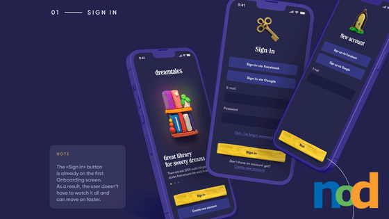
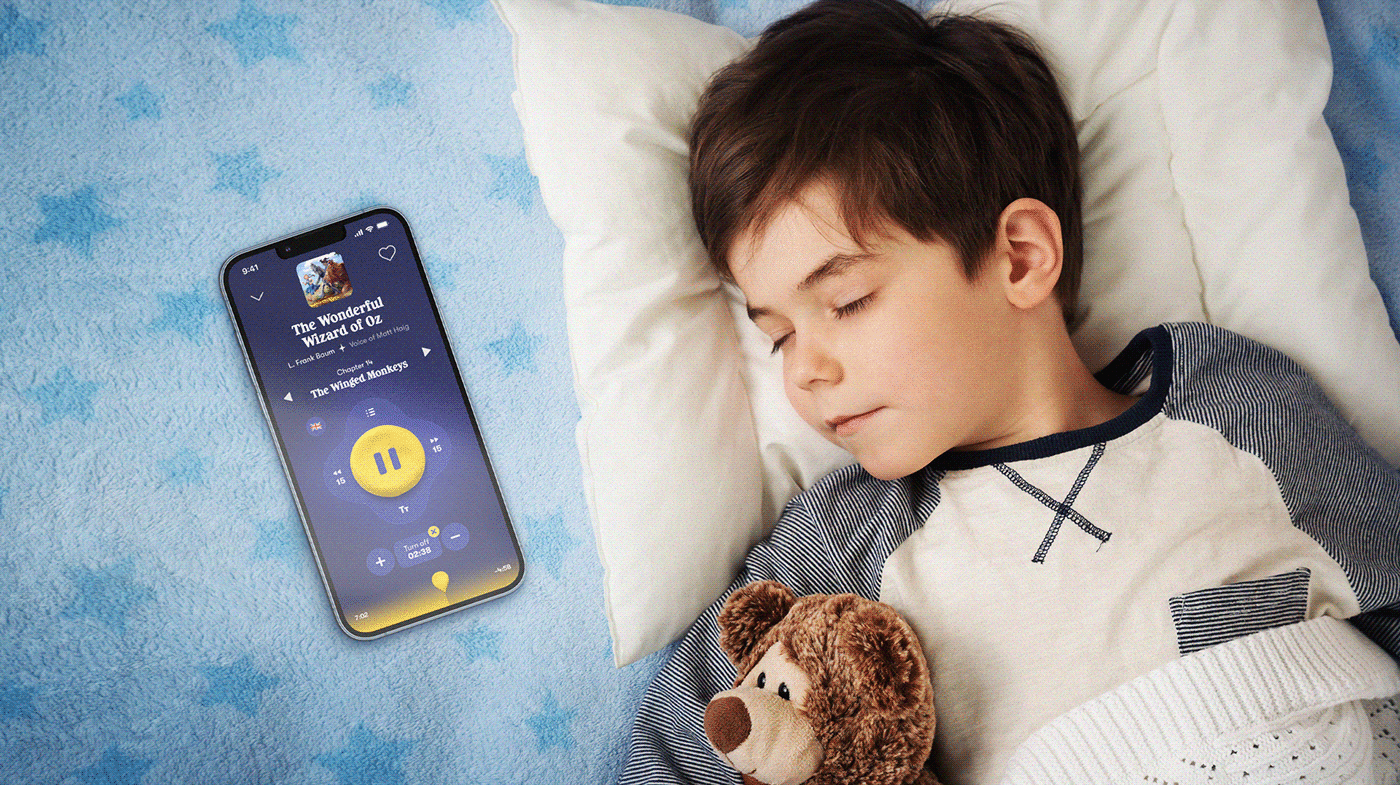
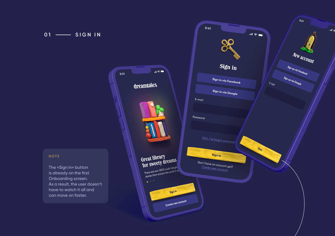
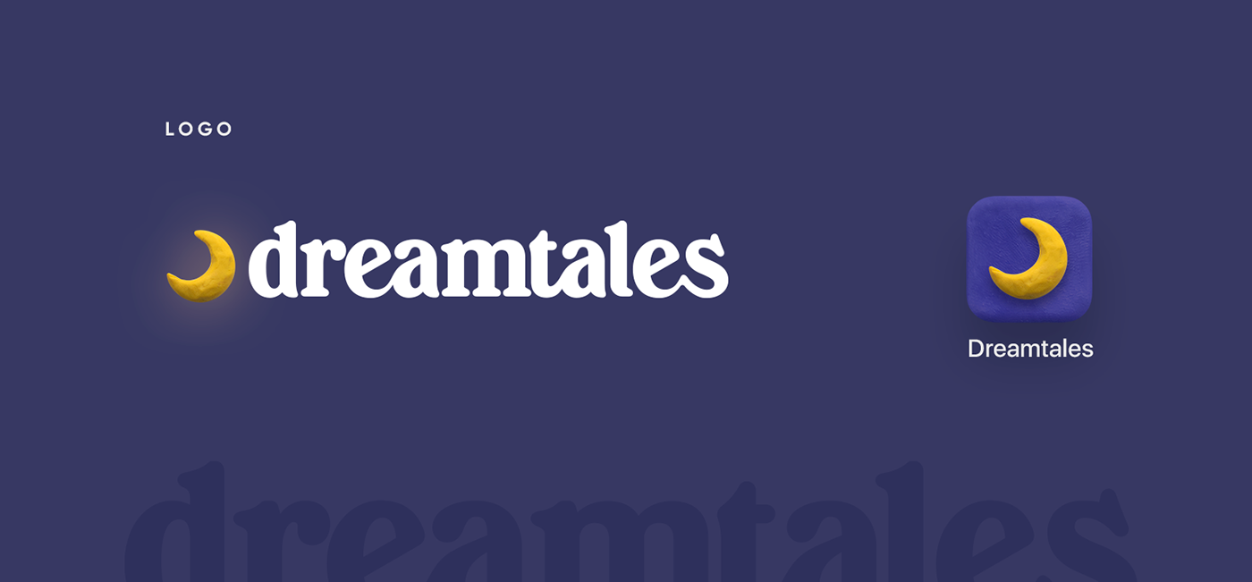
This first project is a concept for a fairy tales app for children created by Poland-based product designer, Andrew Sevostyanov. Aimed at providing busy parents with a means of helping their children fall asleep, Sevostyanov set forth designing a child-friendly app with clever features like an auto turn-off timer and the ability to record audio so children can hear bedtime stories read in their parents’ own voices. However, if you ask me, the star of the show is clearly the branding and UI design. Bursting with character, the app’s unique, playful feel is owed to the inclusion of 3D elements. However, where other designers might have turned to software to create these assets, Sevostyanov used clay to model the app’s icon and various UI elements, giving the app a warm, hand-made feel that helps it to stand out in a crowded marketplace. Be sure to check out the full project here so you can see Sevostyanov’s work in motion.
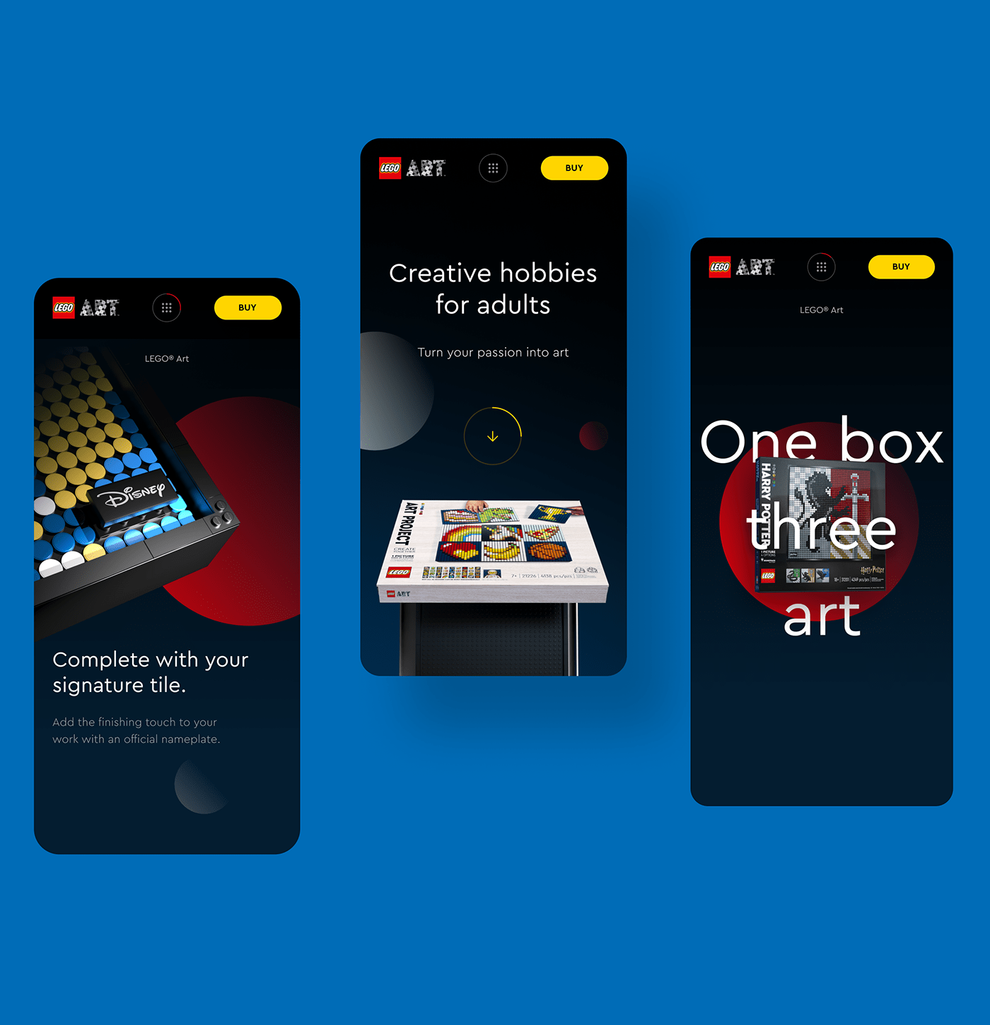
Source: Havas CX İstanbul
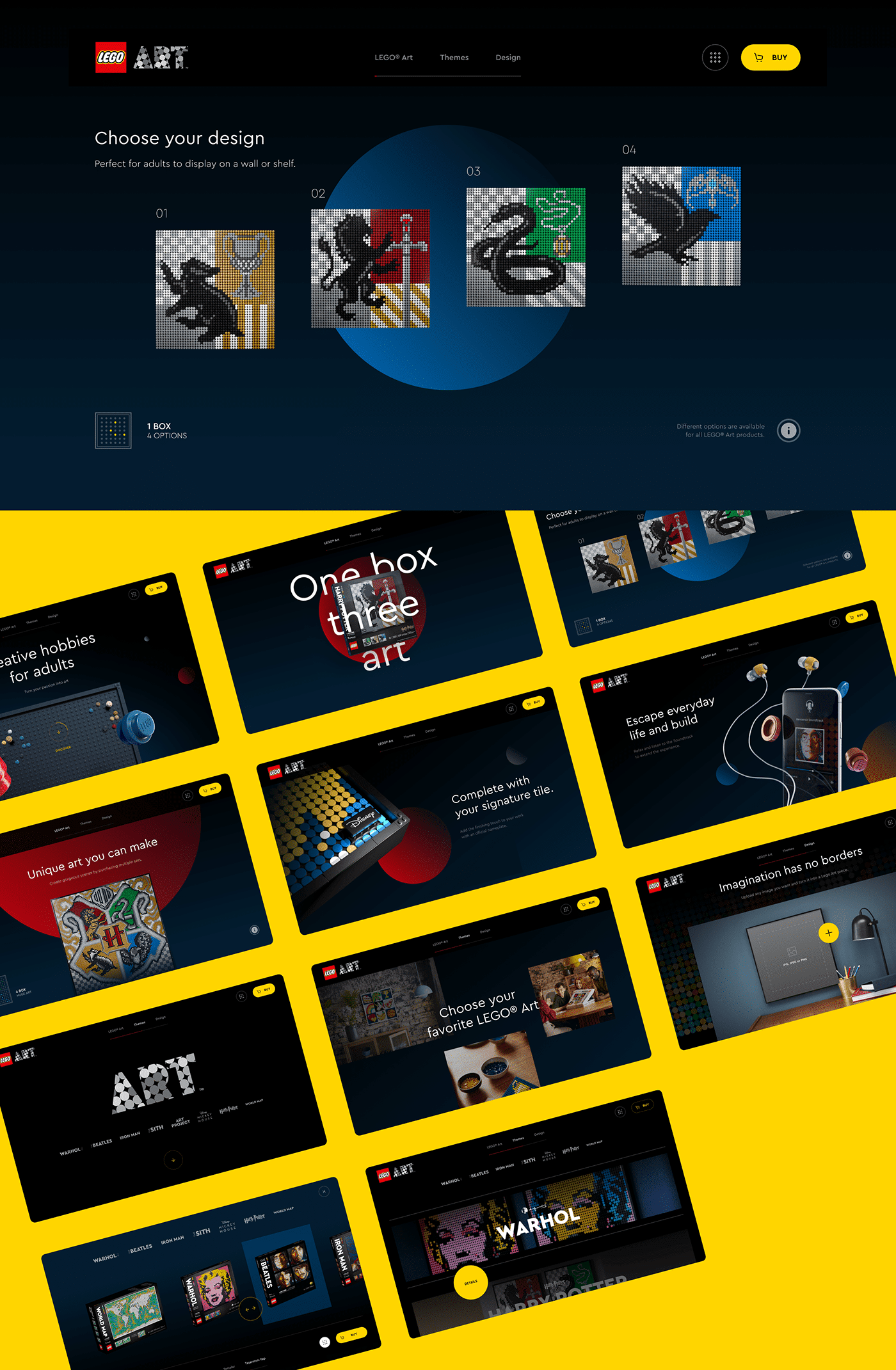
Source: Havas CX İstanbul
Lego Art is a fairly recent addition to the Lego family aimed at capturing an older audience. With themed kits ranging from artists like Warhol to beloved IPs like Harry Potter, Lego Art provides adults with the same fun building experience they remember from childhood but resulting in a display-worthy piece of art. This project from Havas CX İstanbul was faced with the challenge of finding a way to translate the existing Lego brand, which is very bright and colorful, into something with a bit more sophistication and subtlety that would appeal to adults. Their solution makes clever use of circles as a decorative and framing element, referencing the round pegs found on lego bricks, set against a dark backdrop, giving them the effect of a spotlight. The combination lends an air of sophistication to the experience while retaining the brand’s iconic green, yellow, red, and blue brick colors.
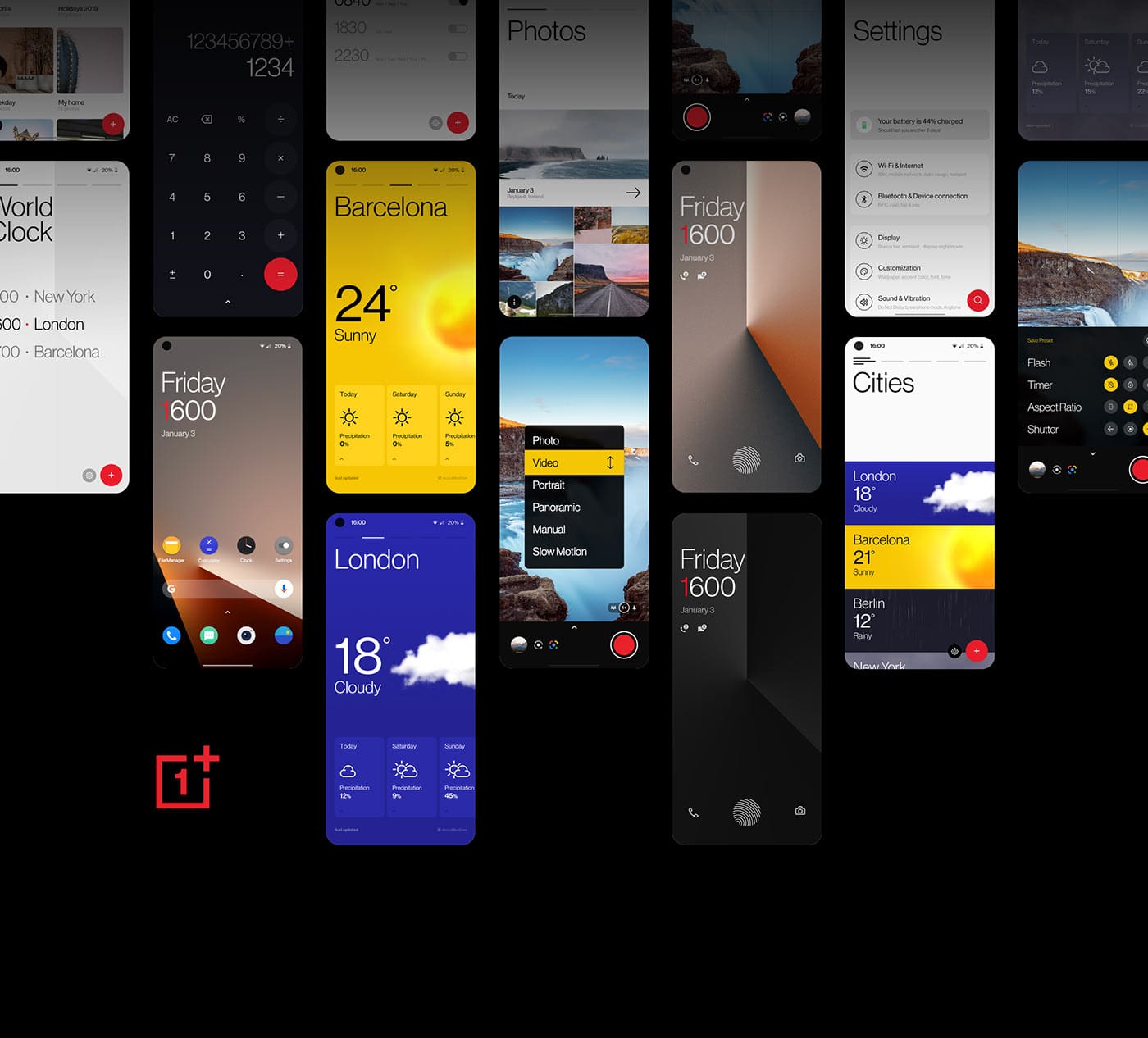
Source: Michael Glass & Andy Edwards
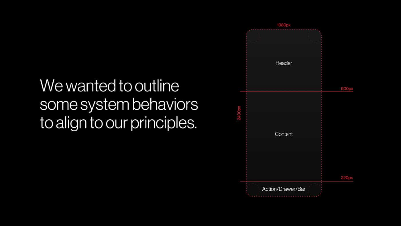
Source: Michael Glass & Andy Edwards
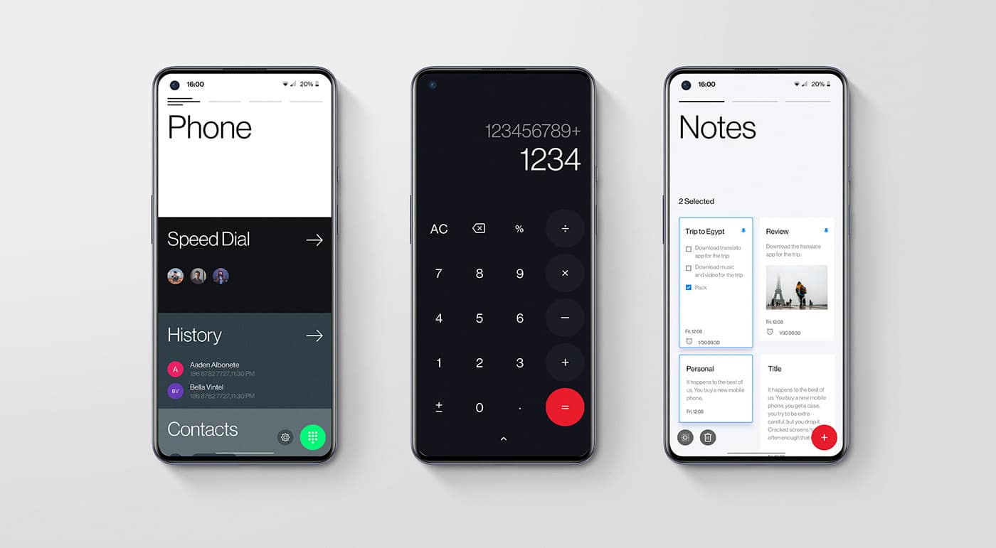
Source: Michael Glass & Andy Edwards
This final project, led by Michael Glass and Andy Edwards, aims to address a very particular design challenge: while our phones are growing bigger, our hands are not. OnePlus Oxygen OS 11 is designed to provide users with the means of tapping into their device’s full functionality without needing to harm their hands in order to access it. To accomplish this, the duo designed a system that designates the upper portion of the screen for headers and places all interactions within the screen’s lower limits, keeping the entirety of the device’s core functionality easily accessible by a single hand. Most OS updates seem to create the illusion of a new product by simply changing the location of things and slightly altering appearances or addressing very specific use cases and bugs. It’s refreshing to see an approach take a swing at a very real design problem on such a macro level.
Taylor is the Managing Editor of Notes on Design. Taylor is a graphic designer, illustrator, and Design Lead at Weirdsleep.


NoD Newsletter
Enhance your inbox with our weekly newsletter.