
How to Use Purple in Your Design Projects
by Margaret Penney | December 18, 2017
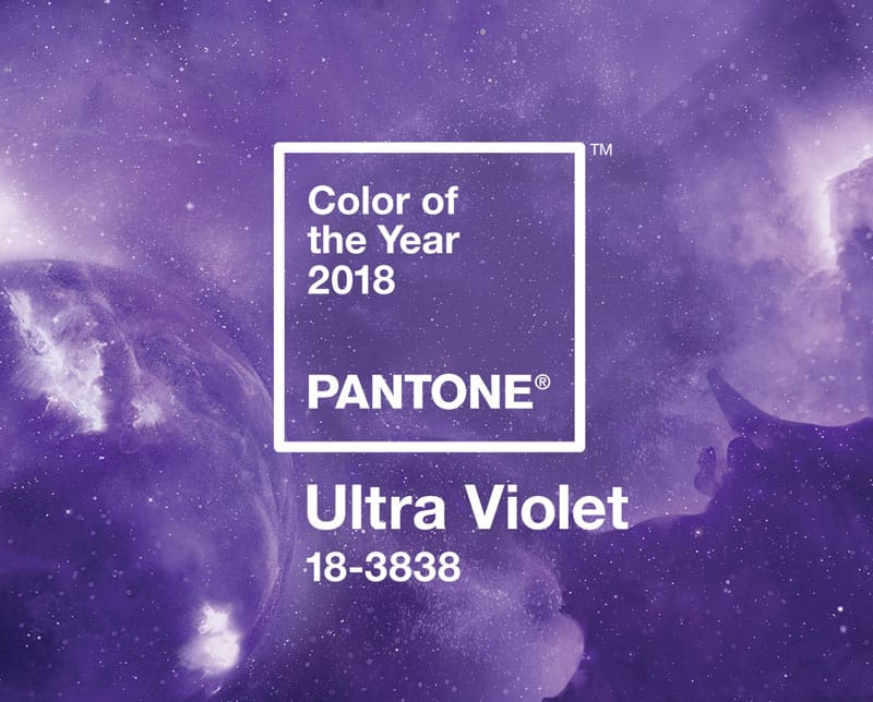
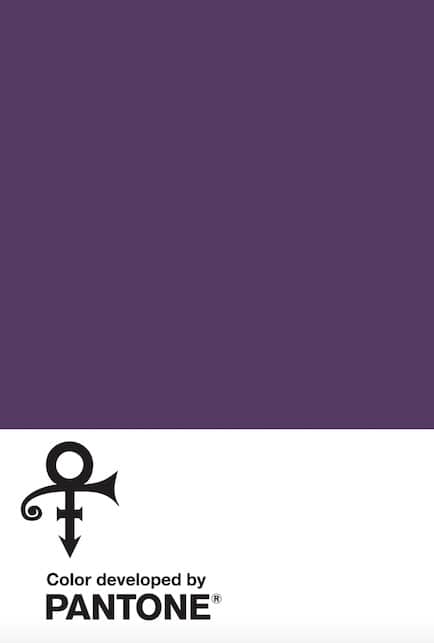
Pantone just released the color of the year for 2018 and it’s a rich and vibrant purple. The color is similar to the one they debuted earlier this year that was an homage to the artist Prince. Pantone expressed they chose this particularly deep shade though to reflect on the complexity of these times and celebrate our eagerness to experiment to find new solutions to old problems.
Pantone has chosen similarly vivid and bold tones in past years. Greenery, last year’s winner, was particularly bright as was the feminine light purple Radiant Orchid of 2014. For designers, working a shade with so much personality into a design requires some clear thought and intention for how to make it present well. Purple is the kind of color that people feel quite strongly about, they usually either love it or hate it, so it’s one of the most difficult colors to make work for the broadest audience. However, there are a few ways to make purples of most shades shine in a design piece. Here are some ideas.
Purple and Neutrals
Purple works quite well with warm neutrals like tan and taupe and these colors really provide the right kind of contrast for purple to work in a design. A tan and purple combination will make the purple appear quite striking but also make it appear more elegant than it would with a zany orange, for instance. If the purple you are using is also darker and more of an eggplant, a purple and tan palette begins to appear more rustic and harvest, like a Fall food tableau.
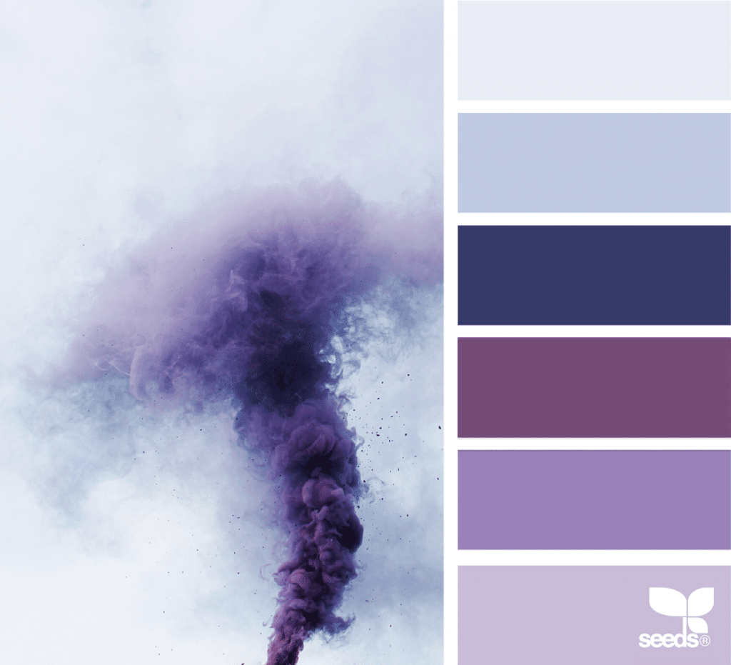
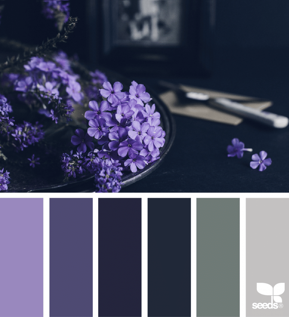
Purple and Dark Blue
Purple and dark blue is a seriously stylish color combination that has an element of mystery and visual drama. The dark blue, especially if it’s cooler in tone, makes the purple appear more sophisticated. Both are traditional and royal colors and together they have a dark and impressive presence.

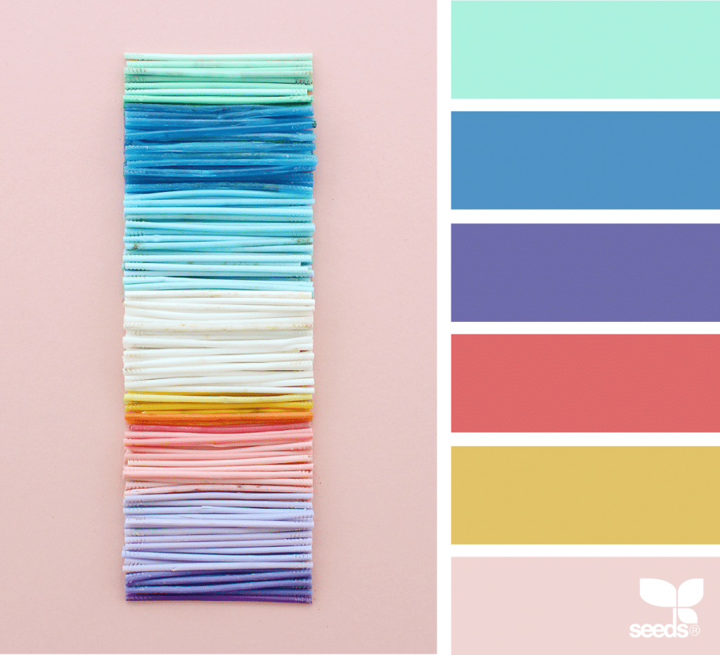
Purple and All the Rainbow Brights
When in doubt, one of the best and simplest way to use purple is to combine it with other bright and vivid hues like mint, bittersweet orange, bright blue, and yellow. A color combination like this is energetic, happy, and quite pop. Similar palettes are commonly applied in design work for children and also for music festival artwork and installations. In this palette the light pink provides a counterpoint to the other bright colors.
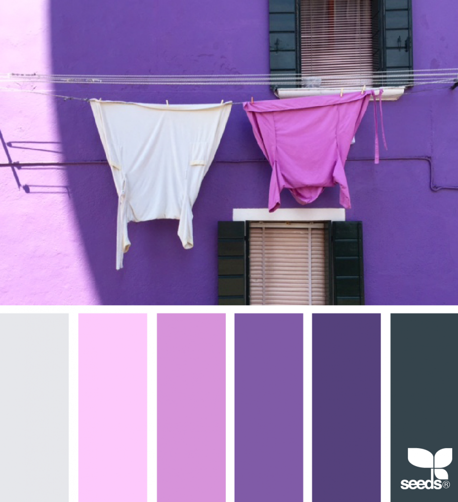
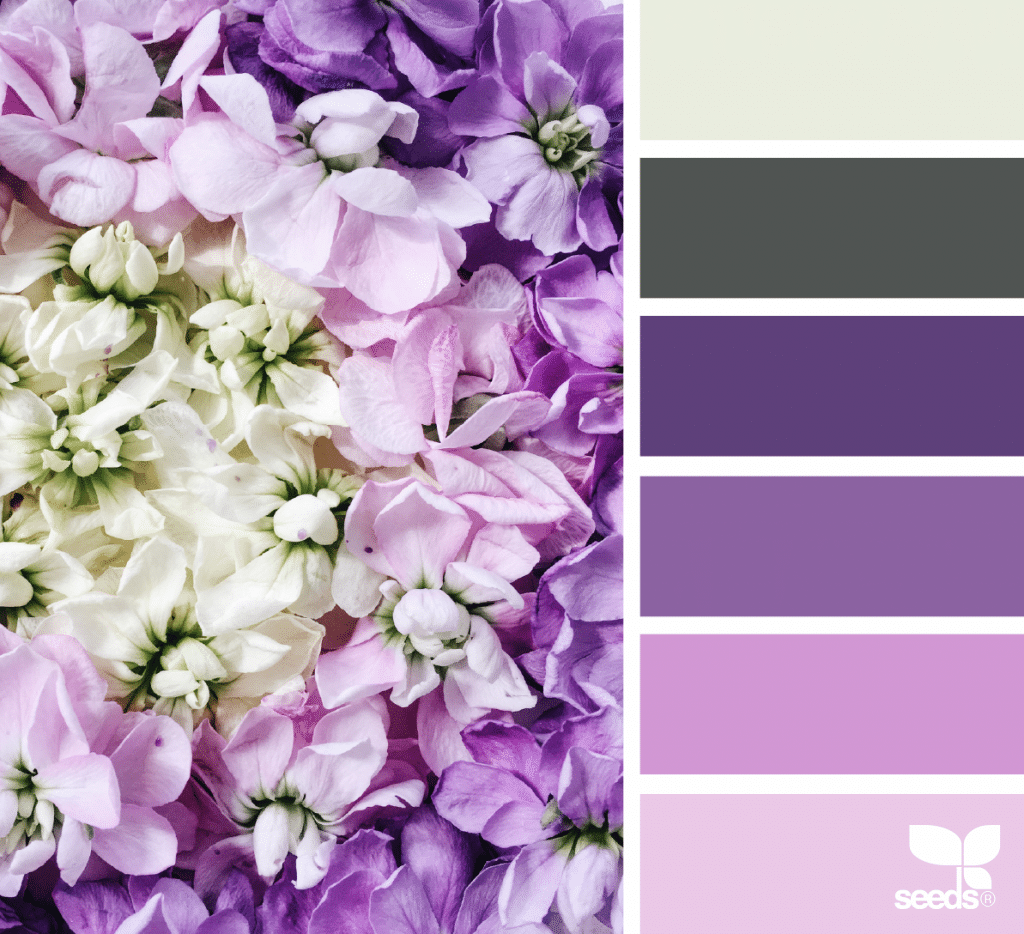
Purple and Pink
Purple combined with pink can be fashionable and feminine especially if darker colors are in the palette to add some contrast. In the palette below the dark blue and light gray provide contrast for the bright pink and purple.
In this palette, a slate gray and alabaster are contrasted against a pink to purple spectrum, from a pale pink, to orchid and ultraviolet.

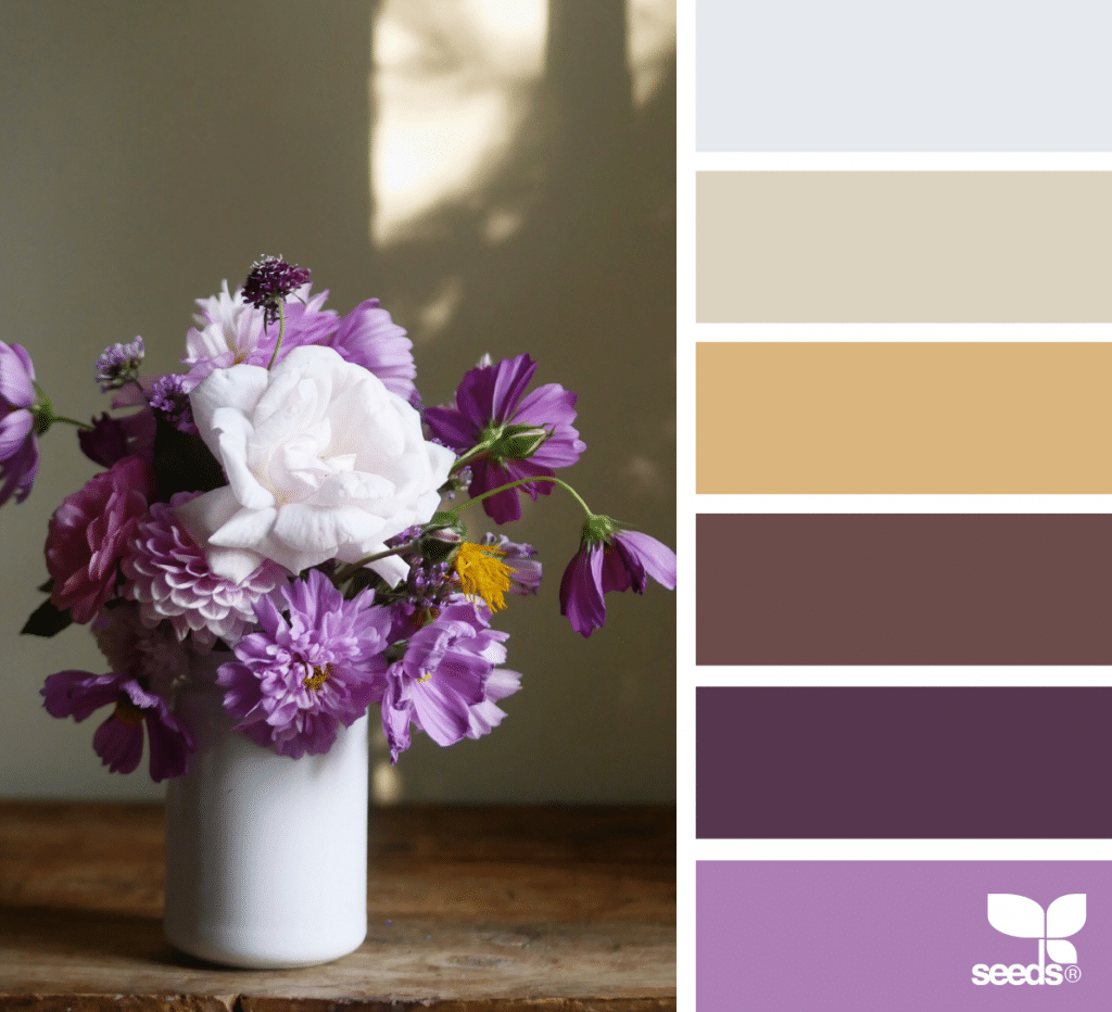
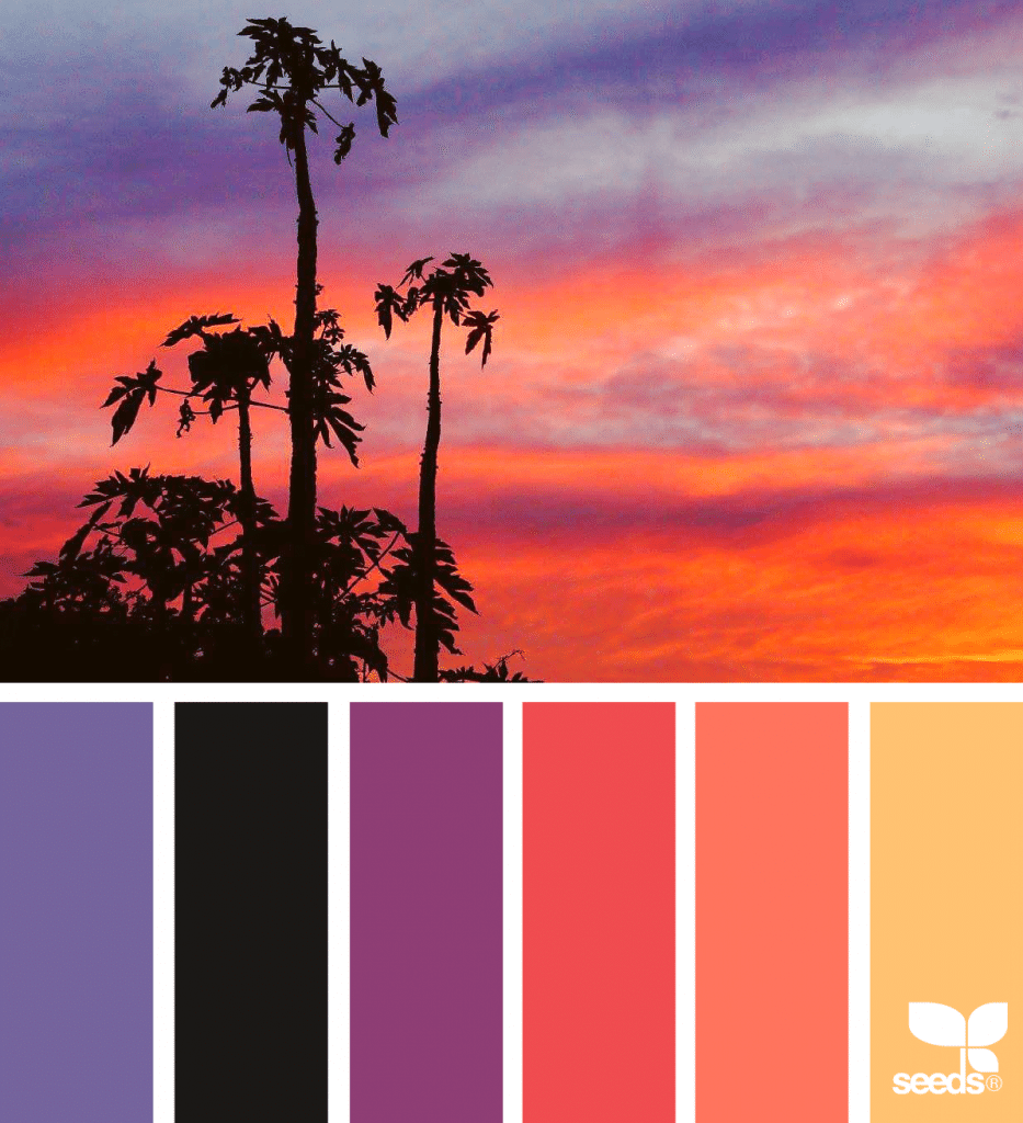
Purple and Salmon Orange
Purple and a light reddish salmon orange work well together mainly because they evoke two primary colors of bright sunsets. The combination is a popular one in summer fashion, and resort or vacation communities for this reason.

Margaret Penney is the Managing Editor of Notes on Design. Margaret is a teacher, designer, writer and new media artist and founder of Hello Creative Co.
If you are interested in developing your graphic design skills, Sessions College offers a range of graphic design courses for students at all levels. Contact Admissions for more information.


NoD Newsletter
Enhance your inbox with our weekly newsletter.